Download
1 / 22
220 likes | 227 Views
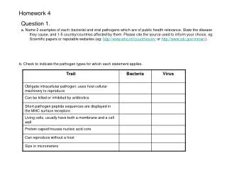
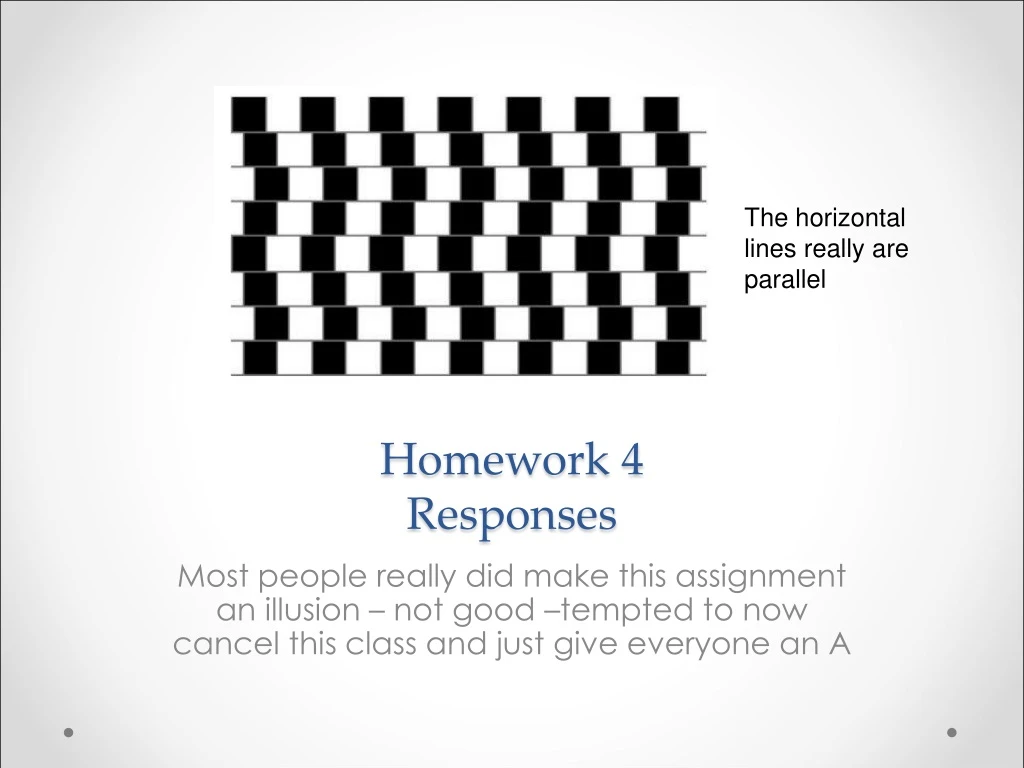
Homework 4 Responses. The horizontal lines really are parallel. Most people really did make this assignment an illusion – not good –tempted to now cancel this class and just give everyone an A. Event Counter. Straightforward – if conditions with grids or thresholds.

E N D
Homework 4Responses The horizontal lines really are parallel Most people really did make this assignment an illusion – not good –tempted to now cancel this class and just give everyone an A
Event Counter • Straightforward – if conditions with grids or thresholds The Six Seattle Events 56.8103 1949 6.50000 34.3604 1965 6.50000 147.875 1980 5.50000 48.8908 1996 5.80000 95.9339 1999 5.60000 70.2530 2001 6.80000
Clustering • This is hard for events clustered in space and time. • Need to utilize a couple of passes first in space then in time. Combining space and time together for automatic pattern recognition is hard and usually unreliable • However, in this case, the input data is chronological so a first pass can be just based on location detection.
Location Plotting Examples Maybe “cool” but doesn’t convey much information
Find an Example Library • Write code to produce right format output and paste it in:
My try – different way a) tries to convey frequency and average together – what does it show?
The Real world by Josh • Yep! I used bootstrap because it looks pretty and I'm not a designer. • It does seem as more data is available that programming is becoming increasingly essential for STEM fields. And someone who wields both scientific knowledge and programming ability would be really powerful. • I do wish my math was better. The brick walls I tend to hit usually have to do with not understanding math.
From a guy named harvey • Nice! I would have killed to take a class like this. • And there are so many great OSS tools out there, both to get things computed and make them pretty, it's a pretty ideal time to do it. • Here's some more stuff students might find helpful to get started, depending how techie they want to get: • pandas / numpy / scipy (you probably know these already) • iPython Notebook (good tool for taking input data and transforming it to meaningful results) • Foundation (alternative to bootstrap) • flotcharts (probably easier than D3 for newbies) • charts.js (another charting alternative) • Flask (simple but powerful web framework to serve up the web stuff) • Just blathering. Need caffeine. Well done!
And now the “cool “way to do it but in reality this is a felixible and efficient kind of interface for dealing with multidimensional analysis of complex data sets. • bootstrap