Download
1 / 2
20 likes | 206 Views
The Sparkmat A Graphical Method of Exploring Spatially Distributed Time Series Jay Emerson and Walton Green , Yale University john.emerson@yale.edu , walton.green@yale.edu http://www.stat.yale.edu/~jay/R/DataExpo2006. The data

E N D
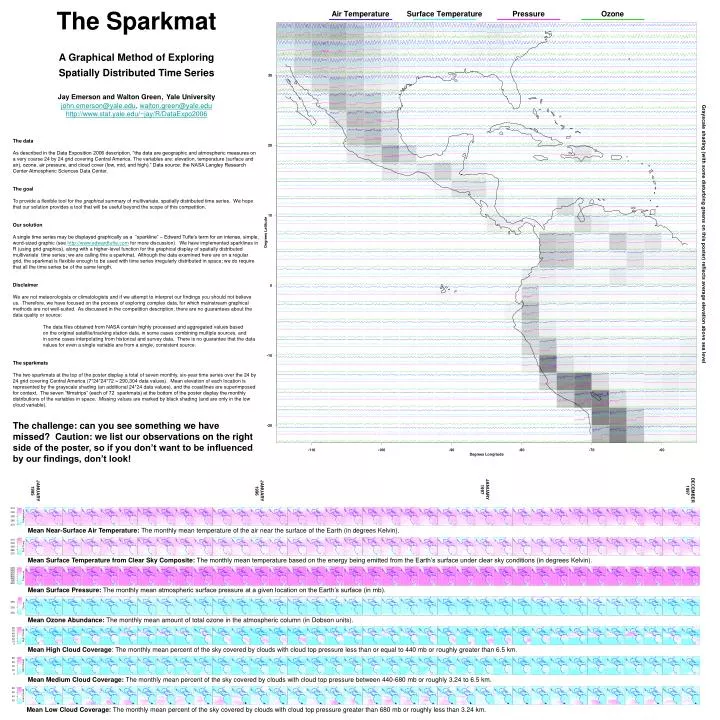
The SparkmatA Graphical Method of ExploringSpatially Distributed Time SeriesJay Emerson and Walton Green, Yale Universityjohn.emerson@yale.edu, walton.green@yale.eduhttp://www.stat.yale.edu/~jay/R/DataExpo2006 • The data • As described in the Data Exposition 2006 description, “the data are geographic and atmospheric measures on a very coarse 24 by 24 grid covering Central America. The variables are: elevation, temperature (surface and air), ozone, air pressure, and cloud cover (low, mid, and high).” Data source: the NASA Langley Research Center Atmospheric Sciences Data Center. • The goal • To provide a flexible tool for the graphical summary of multivariate, spatially distributed time series. We hope that our solution provides a tool that will be useful beyond the scope of this competition. • Our solution • A single time series may be displayed graphically as a “sparkline” – Edward Tufte’s term for an intense, simple, word-sized graphic (see http://www.edwardtufte.com for more discussion). We have implemented sparklines in R (using grid graphics), along with a higher-level function for the graphical display of spatially distributed multivariate time series; we are calling this a sparkmat. Although the data examined here are on a regular grid, the sparkmat is flexible enough to be used with time series irregularly distributed in space; we do require that all the time series be of the same length. • Disclaimer • We are not meteorologists or climatologists and if we attempt to interpret our findings you should not believe us. Therefore, we have focused on the process of exploring complex data, for which mainstream graphical methods are not well-suited. As discussed in the competition description, there are no guarantees about the data quality or source: • The data files obtained from NASA contain highly processed and aggregated values based • on the original satellite/tracking station data, in some cases combining multiple sources, and • in some cases interpolating from historical and survey data. There is no guarantee that the data values for even a single variable are from a single, consistent source. • The sparkmats • The two sparkmats at the top of the poster display a total of seven monthly, six-year time series over the 24 by 24 grid covering Central America (7*24*24*72 = 290,304 data values). Mean elevation of each location is represented by the grayscale shading (an additional 24*24 data values), and the coastlines are superimposed for context. The seven “filmstrips” (each of 72 sparkmats) at the bottom of the poster display the monthly distributions of the variables in space. Missing values are marked by black shading (and are only in the low cloud variable). • The challenge: can you see something we have missed? Caution: we list our observations on the right side of the poster, so if you don’t want to be influenced by our findings, don’t look! DECEMBER 1997 JANUARY 1997 JANUARY 1995 JANUARY 1996 Mean Near-Surface Air Temperature: The monthly mean temperature of the air near the surface of the Earth (in degrees Kelvin). Mean Surface Temperature from Clear Sky Composite: The monthly mean temperature based on the energy being emitted from the Earth’s surface under clear sky conditions (in degrees Kelvin). Mean Surface Pressure: The monthly mean atmospheric surface pressure at a given location on the Earth’s surface (in mb). Mean Ozone Abundance: The monthly mean amount of total ozone in the atmospheric column (in Dobson units). Mean High Cloud Coverage: The monthly mean percent of the sky covered by clouds with cloud top pressure less than or equal to 440 mb or roughly greater than 6.5 km. Mean Medium Cloud Coverage: The monthly mean percent of the sky covered by clouds with cloud top pressure between 440-680 mb or roughly 3.24 to 6.5 km. Mean Low Cloud Coverage: The monthly mean percent of the sky covered by clouds with cloud top pressure greater than 680 mb or roughly less than 3.24 km.
For the geeks: some notes on the implementation Each tile of the large sparkmats contains several sparklines; by default, the sparklines occupy non-overlapping, equally spaced portions of the tile. Optionally (as we have done here), the y-axis scales of these plotting regions may be specified by the user, which can result in the sparklines being plotted outside their area of the tile. For example, the mid cloud sparklines (green) in the southern Pacific off the coast of Chile overlap the high cloud sparklines. To do this, we set the y-scales equal to the 1st and 99th quantiles of the variables (aggregated over space and time). This rarely produces overlap, but greatly improves the level of detail visually evident in the plots. One might even argue that this method is graphically robust to the presence of outliers. The sparkmat() function is used 7*72+2 = 506 times on this poster. The two large sparkmats are obvious, but the sparkmat function also produces each of the individual frames in the filmstrips at the bottom. The principle is simple: a sparkmat places information (consisting of multiple sparklines and tile shading in the large sparkmats, and only the shading in the strips at the bottom) at specified locations. The coastline coordinates were obtained from the National Geophysical Data Center of the NOAA, http://rimmer.ngdc.noaa.gov/mgg/coast/getcoast.html. • SPOILER ALERT: • READ BELOW AT OWN RISK! • We list some of our observations, below. You may have more fun trying to explore the plots on your own, before reading through our list. You have been warned. • Is the positive trend of air temperature data in the Amazon basin evidence of global warming, or could this be the effect of deforestation (probably not)? • There are missing values in the low cloud variable in the latter half of the time series, at several locations in northern Chile. • There are striking change points in the pressure and air temperature time series, mostly in the mountain regions. Why? Changes in instrumentation? Data processing changes? • There is a notable change in cloud patterns in the middle of the time series in the Pacific Ocean near the equator. Is this related to El Nino ’97-’98? • Yes, pressure is truncated above 1000 mb. We don’t know why, there is probably a good reason. Or maybe not. • Seasonal variation is evident throughout, and most obvious in the extreme latitudes over land. • Compared to the other variables, the surface temperature and ozone measurements are pretty dull. • There are changes in amplitude of the variation with topography. • Horizontal streaks in the cloud variables (most obvious in the summers of the strip plots at the bottom) may be related to stable atmospheric circulation patterns (e.g. the so-called trade winds). • SPOILER ALERT: • READ ABOVE AT OWN RISK! DECEMBER 2000 JANUARY 2000 JANUARY 1998 JANUARY 1999 Mean Near-Surface Air Temperature Mean Surface Temperature from Clear Sky Composite Mean Surface Pressure Mean Ozone Abundance Mean High Cloud Coverage Mean Medium Cloud Coverage Mean Low Cloud Coverage Black shading indicates missing values (present in mean low cloud coverage only)