Download
1 / 31
320 likes | 666 Views
Elementary Statistics Q: What is data? Q: What does the data look like? Q: What conclusions can we draw from the data? Q: Where is the middle of the data? Q: Why is the spread of the data important? Q: Can we model the data? Q: How do we know if we have a good model?

E N D
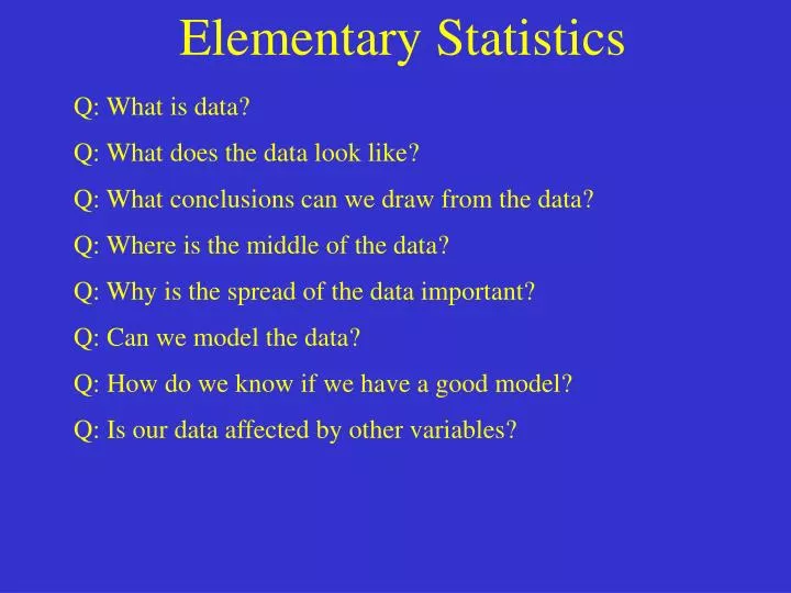
Elementary Statistics Q: What is data? Q: What does the data look like? Q: What conclusions can we draw from the data? Q: Where is the middle of the data? Q: Why is the spread of the data important? Q: Can we model the data? Q: How do we know if we have a good model? Q: Is our data affected by other variables?
Definitions Individuals : Objects described by a set of data. Individuals may be people, but they may also be animals or things. Variable : Any characteristic of an individual. A variable can take on different values for different individuals. Categorical and Quantitative Variables Categorical variable : Places an individual into one or several categories. Quantitative variable : Takes numerical values for which arithmetic operations make sense. Distribution : Tells what values the data takes and how often it takes these values.
Homework 1, 2, 4, 6
Exploring Data Two Basic Strategies : 1) Begin by examining each variable by itself. Then move on to study the relationships among variables. 2) Begin with a graph or graphs. Then add numerical summaries of specific aspects of data. Different types of graphs : Bar graph, Pie chart, Stemplot, back-to-back Stemplot, Histogram, Time plot
Bar Graphs Grade A B C D Other Count Bar graph - A graph which displays the data using heights of bars to represent the counts of the variables. Example : Consider the following grade distribution : 6 12 15 9 3 How could we display the data using a bar graph ?
Bar Graphs 15 12 9 Grade A B C D Other 6 Count 6 12 15 9 3 3 A B C D F
Pie Charts Pie Chart : 1) A chart which represents the data using percentages. 2) Break up a circle (pie) into the respected percentages.
Pie Charts Percent Grade A B C D Other Count 6 12 15 9 3 13 27 33 20 7 B A C D F
Homework 13, 14, 16
Stemplot How to make a Stemplot : 1) Separate each observation into a stem consisting of all but the final (rightmost) digit, and a leaf, the final digit. Stems may have as many digits as needed, but each leaf contains only a single digit. 2) Write the stems in a vertical column with the smallest at the top, and draw a vertical line at the right of this column. 3) Write each leaf in a row to the right of the stem, in increasing order out from the stem.
Stemplot 4 4 5 5 Steps 1 and 2 : 6 6 Step 3 : 7 7 8 8 9 9 10 10 Example: Here are the grades Max achieved while in school his first two years. Grades: 88, 72, 91, 83, 77, 90, 45, 83, 94, 91, 86, 77, 82, 100, 58, 76, 83, 88, 72, 66 5 8 6 2 7 7 6 2 8 3 3 6 2 3 8 1 0 4 1 0
Stemplot 4 4 5 5 5 8 Steps 1 and 2 : 6 6 6 Step 3 : 7 7 2 2 6 7 7 8 8 2 3 3 3 6 8 8 9 9 0 1 1 4 10 10 0 Example: Here are the grades Max achieved while in school his first two years. Grades: 88, 72, 91, 83, 77, 90, 45, 83, 94, 91, 86, 77, 82, 100, 58, 76, 83, 88, 72, 66
Back-To-Back Stemplot • This is a stemplot which allows you to see and compare the • distribution of two related data sets Example : Here are the grades Lulu received during her first two years at college : Grades: 66, 77, 78, 84, 92, 90, 86, 78, 71, 93, 82, 55, 73, 95, 87, 76, 93, 82, 66, 75 • To make a Back-To-Back Stemplot, you make the stem, and the • stems going off to the right and the left. You want the smaller • values closer to the stem.
Back-To-Back Stemplot 4 5 5 8 6 6 7 2 2 6 7 7 8 2 3 3 3 6 8 8 9 0 1 1 4 10 0 Lulu’s Grades: 66, 77, 78, 84, 92, 90, 86, 78, 71, 93, 82, 55, 73, 95, 87, 76, 93, 82, 66, 75 Max’s Grades: 88, 72, 91, 83, 77, 90, 45, 83, 94, 91, 86, 77, 82, 100, 58, 76, 83, 88, 72, 66 5 6 6 5 6 3 1 8 8 7 2 7 2 6 4 3 5 3 0 2
Back-To-Back Stemplot 4 5 5 5 8 6 6 6 6 8 8 7 6 5 3 1 7 2 2 6 7 7 7 6 4 2 2 8 2 3 3 3 6 8 8 5 3 3 2 0 9 0 1 1 4 10 0 Lulu’s Grades: 66, 77, 78, 84, 92, 90, 86, 78, 71, 93, 82, 55, 73, 95, 87, 76, 93, 82, 66, 75 Max’s Grades: 88, 72, 91, 83, 77, 90, 45, 83, 94, 91, 86, 77, 82, 100, 58, 76, 83, 88, 72, 66
Splitting Stems 7 8 9 • If you have a large data set (leaves), then sometimes a stemplot • will not work very well. For instance, if you have a large amount • of leaves, and only a few stems, you might want to split the stems. Example : Consider the following test scores : 71, 71, 72, 74, 75, 75, 75, 76, 77, 79, 80, 81, 81, 82, 83, 83, 83, 83, 84, 85, 85, 88, 89, 90, 90, 90, 91, 93, 95, 96, 97 Normally we would set up the stems as follows :
Splitting Stems 7 8 9 • If you have a large data set (leaves), then sometimes a stemplot • will not work very well. For instance, if you have a large amount • of leaves, and only a few stems, you might want to split the stems. Example : Consider the following test scores : 71, 71, 72, 74, 75, 75, 75, 76, 77, 79, 80, 81, 81, 82, 83, 83, 83, 83, 84, 85, 85, 88, 89, 90, 90, 90, 91, 93, 95, 96, 97 Normally we would set up the stems as follows : 1, 1, 2, 4, 5, 5, 6, 7, 9 0, 1, 1, 2, 3, 3, 3, 3, 4, 5, 5, 8, 9 0, 0, 0, 1, 3, 5, 6 , 7
Splitting Stems 7 7 This stem gets scores 70 - 74 8 8 This stem gets scores 75 - 79 9 9 • If you have a large data set (leaves), then sometimes a stemplot • will not work very well. For instance, if you have a large amount • of leaves, and only a few stems, you might want to split the stems. Example : Consider the following test scores : 71, 71, 72, 74, 75, 75, 75, 76, 77, 79, 80, 81, 81, 82, 83, 83, 83, 83, 84, 85, 85, 88, 89, 90, 90, 90, 91, 93, 95, 96, 97 However, we could set up the stems as follows : 1 1 2 4 5 5 5 6 7 9 0 1 1 2 3 3 3 3 4 5 5 8 9 0 0 0 1 3 5 6 7
Rounding Stems 29.1 29.0 5.7 5.6 5.5 Q: What if we have a lot of stems, but not a lot of leaves? A: One might want to join the stems into larger stems by rounding. Example: Consider the following charges for filling a car with gas : 9.73 10.12 8.72 6.53 12.89 15.67 5.50 16.97 11.38 10.77 7.77 9.00 10.50 8.00 17.12 13.00 21.00 18.11 9.99 25.12 22.57 15.00 23.00 29.11 What would this stem look like ?
Rounding Stems 2 1 0 Q: What if we have a lot of stems, but not a lot of leaves? A: One might want to join the stems into larger stems by rounding. Example: Consider the following charges for filling a car with gas : 9.73 10.12 8.72 6.53 12.89 15.67 5.50 16.97 11.38 10.77 7.77 9.00 10.50 8.00 17.12 13.00 21.00 18.11 9.99 25.12 22.57 15.00 23.00 29.11 We could round the stems to be $10 stems : 1 5 2 3 9 0 2 5 6 1 0 0 7 3 8 5 9 8 6 5 7 9 8 9
Homework 20, 22, 23, 26
Histograms A histogram breaks the range of variables up into (equal) intervals, and displays only the count or percent of the observations which fall into the particular intervals. Notes: • You can choose the intervals (usually equal) • Slower to construct than stemplots • Histograms do not display the individual observations • In case a score falls on an interval point, you must decide in • advance which interval in which the point will go.
Histograms Steps to drawing a histogram : 1) Divide the range into classes of equal width. 2) Count the number of observations in each class. These are called frequencies. 3) Draw the histogram.
Histograms Grade Amount Percent 90 - 100 8 20 80 - 90 10 25 70 - 80 10 25 60 - 70 8 20 50 - 60 4 10 Frequency Table 10 10 8 8 4 Example : Suppose the final breakdown in grades looks like this : 50 60 70 80 90 100
Histograms Grade Amount Percent 90 - 100 8 20 80 - 90 10 25 70 - 80 10 25 60 - 70 8 20 50 - 60 4 10 25% 25% 20% 20% 10% Example : Suppose the final breakdown in grades looks like this : 50 60 70 80 90 100
Homework 31, 32
Time Plot Variable Time A Time Plot is a graph with two axis. One axis represents time ,and the other axis represents the variable being measured.
Time Plot 89 90 91 92 93 94 95 96 97 98 Year HR 33 39 22 42 9 9 39 52 58 70 Example : The following are homerun totals for a certain baseball player the last 10 years : Construct a timeplot for this data set.
Time Plot 89 90 91 92 93 94 95 96 97 98 Year HR 33 39 22 42 9 9 39 52 58 70 Home Run Year
Time Plot 89 90 91 92 93 94 95 96 97 98 Year 70 HR 33 39 22 42 9 9 39 52 58 70 60 50 40 30 20 10 89 90 91 92 93 94 95 96 97 98
Homework 35, 36