Download
1 / 20
200 likes | 337 Views
PowerPoint: Customizing Charts. Computer Information Technology Section 5-13. Some text and examples used with permission from: http://www.jegsworks.com Note: We are not endorsing or promoting religious doctrine, but simply taking advantage of this website for educational purposes.

E N D
PowerPoint:Customizing Charts Computer Information Technology Section 5-13 Some text and examples used with permission from: • http://www.jegsworks.com • Note: We are not endorsing or promoting religious doctrine, but simply taking advantage of this website for educational purposes.
PowerPoint: Customizing Charts • Objectives: • The student will: • Know how to change the chart type • Know how to add a chart title, titles to the y and x axis • Know to change the color of various parts of a chart
PowerPoint: Customizing Charts • Start with a Chart
PowerPoint: Charts • Notice that the chart has a few problems • Only 2 of the 5 names are shown on the x-axis • There are no titles – no chart title, no y-axis title, etc. • A column chart is an acceptable way of showing this data but it depends on what you want the audience to concentrate on
Changing the Chart Type • Let’s say we wanted to show each movie’s relative proportion of the total $s. What kind of chart would show that?
Changing the Chart Type • If you double click on the chart it will “open” the graphing program. Note that the ribbon on the top has changed:
Changing the Chart Type • By clicking on Chart Type we can change the chart to any of the different charts. If we pick Pie the chart will change to a pie chart • Note there different kinds of pie charts
Chart Options • The chart options depend on the chart type. For a pie chart the options are: • Chart Title • Legend • Data labels • Click on Chart Layouts to select the position for them.
Chart Options You can set the chart options on the Layout tab for the chart.
Pie Chart Options • Titles • The only title you can add to a pie chart is a title for the Chart. • Legend • Where to put the legend • Data labels • Adds labels to the pieces of the pie:
Column Chart Options Column charts have additions options:
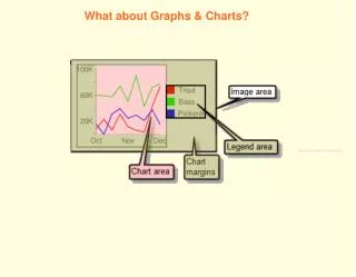
Column Chart Options • Chart Title • Add a Chart Title • Axis Titles • Add titles to the X and Y axes • Legend • Turn the legend on and off and control it’s placement • Data labels • Adds labels to the pieces of the columns • Data table • Show the data underneath the chart
Column Chart Options • Axes • Turn on the labels for the X and Y axes • Gridlines • Turn on or off the X and Y gridlines
Column Chart Options • Adding titles to chart helps make it more understandable
Formatting Items in a Chart • Once you have opened a chart you can click on items and format them (right click or go to the layout tab). For example: • Change the color of columns or pie pieces • Change the fonts • Etc. • We can edit the X-Axis and correct the movie titles so they all show • Smaller font, specific interval unit, rotate text (custom angle)
Summary • Once you create your chart you can customize it. • Adding titles, etc. lets the audience know what they are looking at • Everything in a chart be selected and changed.
Rest of Today • Customize your chart from Homework 5-12 • Add a chart Title • Add a title to the Y-Axis • Make sure all text is readable • Add your name and the period in the footer • Print the slide and turn it in