Download
1 / 31
330 likes | 715 Views
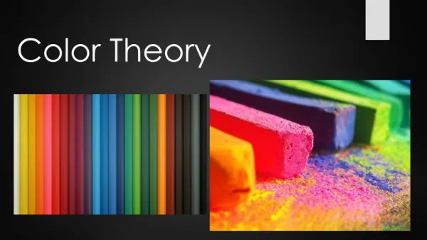
COLOR THEORY. Color Temperature White Balance Color Space And a few other tidbits about color…. Color Balance / Temperature. Introduction to Color Theory There are several parts to “Color Theory” Color Temperature Color Balance Color Space Color Composition and Psychology

E N D
COLOR THEORY Color Temperature White Balance Color Space And a few other tidbits about color…
Color Balance / Temperature Introduction to Color Theory • There are several parts to “Color Theory” • Color Temperature • Color Balance • Color Space • Color Composition and Psychology • In digital photography we deal with each one so let’s start at the top… Instructor: David King dking@sdccd.edu
Color Balance / Temperature Color Temperature • A Few things to remember about Color Temperature • Color Temperature is measured in degrees on the Kelvin scale • It is derived from color changes in a “black body radiator” as it is heated. • The color of the carbon at specific Kelvin degrees is called by the temperature • Color Temperature usually refers to the color of a light source. Instructor: David King dking@sdccd.edu
Color Balance / Temperature Color Temperature Here are several very common color temperatures used by photography. Instructor: David King dking@sdccd.edu
Color Balance / Temperature Color Temperature The most important is “Daylight” at approximately 5600 Kelvin Instructor: David King dking@sdccd.edu
Color Balance / Temperature Color Balance • Color Balance refers to the match between… The Light Source and The Capture Medium (Color Film or Digital) If they MATCH the color in the image will be correctly rendered. Instructor: David King dking@sdccd.edu
Color Balance / Temperature Color Balance • For Example. • Studio shot: Camera set to “Tungsten” • If color is inbalance… thatis, light is 3200and film/chip setfor “Tungsten.” Instructor: David King dking@sdccd.edu
Color Balance / Temperature Color Balance • For Example. • Studio shot: Camera set to“Tungsten” • If color is out ofbalance… e.g.household lightswere used (at 2800instead of tungstenhot lights… Instructor: David King dking@sdccd.edu
Color Balance / Temperature Color Balance • For Example. • Studio shot: Camera set to“Tungsten” • If color is out ofbalance… e.g.Electronic Flashwas used (6000) Instructor: David King dking@sdccd.edu
Too Warm Too Cool Balanced Instructor: David King dking@sdccd.edu
Color Balance / Temperature Color Balance • Digital cameras refer to balancing color as“White Balance” • White Balance can be set several ways… • By “Type” of light as a menu selection. • By the Specific Color temperature of the light (if known) • By doing a custom white balance. Instructor: David King dking@sdccd.edu
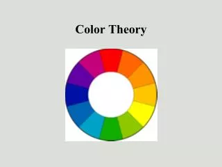
Color Balance / Temperature Color Space • In Art Classes, you are taught that the primary colors are Red, Yellow, and Blue. • In Photography the primary colors are Red, Green, and Blue. Instructor: David King dking@sdccd.edu
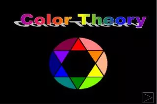
Color Balance / Temperature Color Space • We usually see this arranged as a color wheel “Primary” colors are RED GREEN BLUE “Secondary” colors are CYAN MAGENTA YELLOW Instructor: David King dking@sdccd.edu
Color Balance / Temperature Color Space • Here are TERTIARY colors… Instructor: David King dking@sdccd.edu
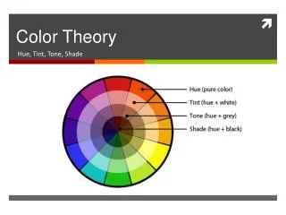
Color Balance / Temperature Color Space • Each Color can have luminosity (Dark to Light) Instructor: David King dking@sdccd.edu
Color Balance / Temperature Color Space • “Color Space” also refers to how many colors can a given medium render (usually compared to typical Human Vision). • Colors have both “Luminosity” and “Chromacity” • Luminosity = how “bright” (from black to white) the color is; also called the “shade” of the color from dark to light. • Chromacity = what the “color” or “Hue” is e.g. red or blue • Color Space is primarily about The “Chromacity” • Various “color spaces” are graphically rendered as 2-dimensional area graphs for comparisons. Instructor: David King dking@sdccd.edu
Color Balance / Temperature Color Space • CIE LAB Space represents all of the colors the typical human eye can identify. Instructor: David King dking@sdccd.edu
Color Balance / Temperature Color Space • sRGB is the color space that can be rendered more or less accurately by the World Wide Web, E-mail, and other online applications. Instructor: David King dking@sdccd.edu
Color Balance / Temperature Color Space • Adobe RGB is a larger color space that can be rendered more or less accurately by many printers. Instructor: David King dking@sdccd.edu
Color Balance / Temperature Color Space • Some other “Color Spaces” are often used by photographers. • One that is especially richer in the warm colors is “ProPhoto RGB.” • It is not available for capture but can be used in editing by converting the file to that space. • If your camera allows, set the Color Space to “ADOBE RGB” to capture the widest range of colors available to it. • CMYK color space is reserved for images destined for reproduction on printing presses Instructor: David King dking@sdccd.edu
Color Balance / Temperature Color Composition • Another Lecture will cover composition generally. But there are some added influences from color. • Color should be used when the color itself is an important part of the image’s “story.” • Adding color to the image has an influence on the emotional response of the viewer. • For example… Instructor: David King dking@sdccd.edu
Color Balance / Temperature Color Composition • Cool but bright colors (blues and greens) are calming to the nervous system In Landscapes, for example Instructor: David King dking@sdccd.edu
Color Balance / Temperature Color Composition • Cool but darker colors (deeper blues and even violets ) are cold like ice but can be regal. Instructor: David King dking@sdccd.edu
Color Balance / Temperature Color Composition • Warm colors (Reds and Oranges) excite the nervous system, increase heart rate and breathing. Instructor: David King dking@sdccd.edu
Color Balance / Temperature Color Composition • Yellows are open and welcoming like afternoon sunlight. Instructor: David King dking@sdccd.edu
Color Balance / Temperature Color Composition • You can use specific combinations of colors based on their locations on the color wheel to help with your message… To really draw attention to asubject or area of the image,useCOMPLIMENTARYcolors. These are colors that are across from one anotheron the color wheel. Instructor: David King dking@sdccd.edu
Color Balance / Temperature Color Composition • You can use specific combinations of colors based on their locations on the color wheel to help with your message… A softer approach is to use ANALAGOUS colors. This is a “family” of colors thatgo well together. These are colors that are close to one anotheron the color wheel. Instructor: David King dking@sdccd.edu
Color Balance / Temperature Color Composition • You can also use specific combinations of colors based on their locations on the color wheel to help with your message… Another combination tolook for is a TRIAD ofcolors. These could be the Primarycolors… Secondary colors, or Tertiary colors. Instructor: David King dking@sdccd.edu
Color Balance / Temperature Color Composition • Here are some examples… Instructor: David King dking@sdccd.edu
Color Balance / Temperature Color Composition • Remember, in digital, where the default view is in color, you should always use it to your advantage to help tell your photograph’s story! • If the color in the scene is not important or using color purposefully does not enhance your message, then consider converting the image to grayscale (Black and White) to present sheer tones and composition. Instructor: David King dking@sdccd.edu
Color Balance / Temperature Color Theory, etc… QUESTIONS? Instructor: David King dking@sdccd.edu