Download
1 / 18
190 likes | 336 Views
SAVE: Sensor Anomaly Visualization Engine. Lei Shi 1 Qi Liao 2 Yuan He 3 Rui Li 4 Aaron Striegel 2 Zhong Su 1. 1 IBM Research — China. 2 University of Notre Dame. 4 Xi’an Jiao Tong University. 3 Hong Kong University of Science and Technology & Tsinghua University.

E N D
SAVE: Sensor AnomalyVisualization Engine Lei Shi1 Qi Liao2 Yuan He3 Rui Li4Aaron Striegel2 Zhong Su1 • 1 IBM Research • — China • 2 University of • Notre Dame • 4 Xi’an Jiao Tong • University • 3 Hong Kong University of • Science and Technology & • Tsinghua University
GreenOrbs Project A Long-Term Kilo-Scale Wireless Sensor Network System in the Forest Sensor Motes Packaging & Enclosure Deployments in Zhejiang Forest University, China
Outline • Problem & Related Work • Data Collection • SAVE Overview • Visual Analytics for the Sensor Anomalies • Temporal Expansion Model (Routing Topology and Dynamics) • Correlation Graph (Dimension Correlation and Dynamics) • High Dimension Data Projection (Dimension Values and Dynamics) • A Case on Sensor Failure Diagnosis • User Feedbacks • Commercialization with SmartMTS • Conclusion
Problem & Related Work • Diagnosis of large-scale sensor networks in the wild is challenging! • Various resource constraints in computing, storage and transmission => Hard to reuse traditional network management approaches • Huge performance variability or even frequent system failures due to the outdoor deployments (sometimes in hostile environment) • Lack of automatic algorithms and models to accurately identify the sensor anomalies • Related work • Network simulators • MOTE_VIEW, TOSSIM, NetTopo, TinyViz • Sensor network tools • SNA, Surge, SpyGlass, SNAMP • Sensor fault classifications • Outliers, spikes, stuck-at, noise • Relevant visualizations • GrowthRingMap, SpiralGraph, StarCoordinate Mote View TOSSIM GrowthRingMap StarCoordinate
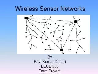
Data Collection • Sensor data is measured at each node (mote) and transmitted as a couple of packets every 10 minutes to a central sink node for data fusion • Sensor Readings • Environmental indicators: temperature, light, humidity, CO2 • Need preprocessing to translate to real-world scales • Routing Path to the Sink • Each node in the path is piggybacked during the packet forwarding process • Used to create the routing topology • Wireless Link Status to the Neighbors • Typical link quality indicators: RSSI, LQI, ETX • Networking/System Statistics • Radio power-on time, number of packets transmitted/received/dropped/etc. • Routing protocol statistics: parent change events and no parent events
Dimension Projection View SAVE Overview TEM Graph Dimension Details View Correlation Graph Scented Time Slider
Temporal Expansion Model • Difficulties to represent the dynamic sensor routing & delivery network • Sensor routing independent to their geospatial locations • Frequent re-routing across time • Delivery topology buried by the network variance • Temporal Expansion Model • Leverage the feature of sensor data delivery: synthesized at the central sink node • Key innovation: split the physical sensor node into virtual nodes according to their delivery paths • Advantages: • Transformed into a tree • Identify topology dynamics • Possible to display a single physical node’s behavior Geospatial Layout TEM Graph Layout Graph-aesthetic Layout
2 T1 4 1 Original Dynamic Sensor Data Delivery Graph 4 1 T0,T1 T1 T0,T1 T1 Node Split TEM Graph sink T1 T0 sink T0,T1 T0 T0,T1 T0 Re- route 3 2 3 2 Re- route T0 4 Temporal Rendering Abnormal Node 2 2 1 1 4 4 Native Packets TEM Graph With GrowthRing Renderer 1 TEM Graph Counting Sensor Packets Generated at Each Node sink sink 3 3 2 2 1 4 4 Normal Node
TEM Graph Visualization Graph overview • Semantic “overview + detail” approach in the TEM graph visualization • “Detail” shows the specific paths from one physical node to the sink node • GrowthRing glyphs visualize the packet forwarding/initiation temporal dynamics • Visual alerts show topology anomalies: loops, major/minor paths, temporal change rings Node path to sink Loops Sending dynamics Forwarding dynamics Temporal anomaly ring Minor path Group re-routing
Correlation Graph • Observations • Sensor data dimensions (system status, routing status, sensor readings) are correlated • These correlations can be a measure of system dynamics and anomalies • Correlation Graph (CG) • Compute the Pearson’s product moment coefficient given the two dimension vectors • Two major type of CG: among sensor reading dimensions, among sensor counter dimensions Mixed Correlation Graph Sensor Readings Sensor Status Counters
CG Visualization • Raw CG • Layout: basic force-directed KK layout model, optimal distance inversely proportional to the correlation coefficient • Link thickness: indicate the correlation coefficient • Allow filtering of the graph by a correlation threshold • Comparative CG • Delta CG – change from the last time slot; Anomaly CG – change from the average CG • Link thickness: indicate the change of the correlation coefficient between two dimensions • Link color: green indicates the increased correlation, red indicates the decreased • Node color: indicate the increase/decrease of a dimension’s overall correlation to others Sensor Reading CG Anomaly CG Raw CG Delta CG
High Dimensional Sensor Data Projection • Dimension Projection View • The dimension anchors are placed uniformly in a circle • The data plots are placed inside the circle • Each plot indicates the high dimensional sensor reading/status in a particular time • The plot is placed according to a spring force model, the values of each dimension is normalized to [0,1] • Show temporal dynamics of the sensor data • Plots of the same sensor node are connected to the path • Time position in the selected range are encoded by color Design Drill-down to Values Temporal Dynamics Basic Projections
View Coordination Coordinated Multiple View • Data filtering through the time range selection on the slider • The TEM graph and the dimension projection view are filtered to the graphs in the selected time range • Data brushing through the node and data dimension selection • Node selection: • The TEM graph and dimension projection view are brushed • The detailed path and correlation graph view are created • The time range slider are brushed with bars, indicating the number of packets transmitted in a particular time on the selected node • Dimension selection: • The correlation graph and dimension projection view are brushed • The detailed value graph are created Node Selection Dimension Selection Time Selection
A Case on Sensor Failure Root Cause Analysis Check the cause of this anomaly Identify an anomaly on Node 543 Double-check another possible root cause Check the symptom of the parent node
User Feedbacks and Discussions • Pros from the user’s perspective • Visibility of the salient sensor data • Ability to drill-down to the source data to discover new type of failures • Dimension projection view that displays the distribution of all the sensor dimensions, and the interactions to show the detailed value upon hovering the plot • TEM graph is an intuitive radial way to describe the topology • Cons/suggestions from the user’s perspective • Graphs like TEM is a little complicated and need some time to understand • Add a report view to automatically display the faults that can be detected routinely • Issues to work under low sensor data quality assumption
Application in SmartMTS • Application in SmartMTS solution • Enable support, management and optimization of large scale & complex Smart Grid IoT Infrastructures. • Infuse new, smarter services and management processes that are vital for • Real-time operations visibility • Quick & precise response to outages • Smart asset performance optimization
Conclusion • We have designed and implemented the SAVE system • Leverage the visual analytics technology to solve the sensor network diagnosis problem • Focus on the detect and root cause analysis of sensor data anomalies and failures • Several novel visualization metaphors are designed, some are generic techniques • TEM graph for the dynamic network visualization • CG graph for the monitoring of temporal dimension correlations • A new dimension projection view for the presentation of the spatiotemporal dynamics of the high dimensional data • SAVE is shown to be useful in the scenario through • A real-life case study for the sensor failure root cause analysis • Domain user feedbacks
Simplified Chinese Thai Korean Traditional Chinese Gracias Thank You Spanish Russian English Obrigado Brazilian Portuguese Arabic Danke German Grazie Merci Italian French Japanese Hindi Tamil 18