Download
1 / 8
100 likes | 293 Views
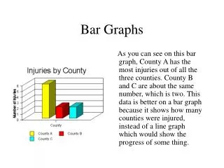
Bar Graphs And Histograms. categories. Bar Graphs compare _______________. do NOT. The bars _____________ touch. Number of Hats Owned. 30 25 20 15 10 5 0. intervals. Histograms compare ________________. DO. The bars _____________ touch. Frequency. 7–9. 1–3. 4–6.

E N D
Bar Graphs And Histograms
categories Bar Graphs compare _______________ do NOT The bars _____________ touch Number of Hats Owned 30 25 20 15 10 5 0 intervals Histograms compare ________________ DO The bars _____________ touch Frequency 7–9 1–3 4–6 Number of Hats
1) Create a Frequency Table 2) Find the frequency of each interval 3) Make the histogram Cost of Items at the Grocery Store 1 2 1.00 – 1.99 4 2.00 – 2.99 1 3 3 3.00 – 3.99 Frequency 4.00 – 4.99 3 2 5.00 – 5.99 1 1 6.00 – 6.99 0 7.00 – 7.99 0 0 – 0.99 1 – 1.99 2 – 2.99 3 – 3.99 4 – 4.99 5 – 5.99 6 – 6.99 7 – 7.99 8 – 8.99 8.00 – 8.99 1 Dollars ($)
1) Create a Frequency Table 2) Find the frequency of each interval 3) Make the bar graph Types of Items at the Grocery Store 6 Produce 6 5 Desserts 3 4 Number of Items 2 Meats 3 Breads 1 2 1 Meats Breads Produce Desserts Grocery Category
YOU TRY! Pause the video
Number of Hours of TV 1 // 2 //// 3 //// //// 4 //// / 5 //// /// 6 /// 7 //// //// 8 /// 9 //// Number of Hours of TV Frequency The table below shows the number of hours students watch TV in one week. Make a histogram of the data. Step 1: Make a frequency table of the data. Be sure to use equal intervals. 1–3 15 17 4–6 7–9 17
Number of Hours of TV Frequency 1–3 15 17 4–6 7–9 17 Step 2: Choose an appropriate scale and interval for the vertical axis. The greatest value on the scale should be at least as great as the greatest frequency. Hours of TV Watched 22 20 18 16 14 12 Frequency 10 8 6 4 2 1 - 3 4 - 6 7 - 9 Hours
Here is a list of the number of laps students ran in gym class: 4, 7, 9, 12, 3, 6, 10, 15, 12, 5, 18, 2, 5, 10, 7, 12, 11, 15 Make a Frequency Table Number of Laps Run 11 3 10 5 - 9 6 9 8 10 - 14 6 7 6 15 - 19 3 Frequency 5 4 3 2 1 0 - 4 5 - 9 10 - 14 15 - 19 Laps