Download

1 / 37
380 likes | 606 Views
GUI Bloopers. Written by Jeff Johnson Chapter 2: GUI Component Bloopers Presentation by: David Farrow and Lance Wellspring 10/4/2007. Introduction. GUI tools The components are too low level. The tools are too unguided. The tools are too focused on appearance.

E N D
GUI Bloopers • Written by Jeff Johnson • Chapter 2: GUI Component Bloopers • Presentation by: David Farrow and Lance Wellspring • 10/4/2007
Introduction • GUI tools • The components are too low level. • The tools are too unguided. • The tools are too focused on appearance. • Causes of GUI component bloopers • Misuse of the GUI toolkit by programmers. • Attempting to build an application’s user interface using a GUI toolkit that is inadequate for the job.
2.1 Complicating Access to Functionality • Blooper 1: Dynamic menus • Blooper 2: Duplicate menu items • Blooper 3: Hidden functions • Blooper 4: No keyboard equivalents
Blooper 1: Dynamic Menus • Problem? Confuses users. • Solutions: • Deactivate(i.e., grey out) inapplicable menu items • Add and remove entire menubar menus • Possible Problem • Rely on generic commands • Think outside-in to greatly reduce the likelihood of making this and many other types of design errors. • Design rule: Menubar menus should be stable.
Blooper 2: Duplicate Menu Items • Users assume that different menu items invoke different functions. • Misleads users into believing that the application is more complex than it really is. • It is OK, perhaps even recommended, to do during development. • Follow industry standards. • Design rule: Menubar menu commands should only appear once.
Blooper 3: Hidden Functions • Examples: • Drag and drop • Key combinations • Context sensitive right mouse button popup menus • Reasons/Excuses: • Programmers design software to resemble software they know and use. • Lack of space • Faster operation
Blooper 3 Continued • Hidden functions are OK, as long as they aren’t the only way to invoke the function. • Not a contradiction to progressive disclosure. • Design rule: Application functionality should be accessible by seeing and pointing, rather by remembering and typing.
Blooper 4: No Keyboard Equivalent • Mnemonics • Underlining a character in every menubar menu and menu item. • Accelerators • Ctrl-X: Cut; Ctrl-C: Copy; Ctrl-V: Paste; ect. • Design rule: GUIs should provide keyboard equivalent means of invoking or controlling all functions.
2.2 Unconventional Application Windows • Blooper 5: Confusing primary windows with dialog boxes • Blooper 6: Commands are only on toolbar buttons • Blooper 7: All menubar commands are on toolbar
Window Feature Primary Window Dialog Box Display Duration Usually long Usually short Modal No If needed Menubar Yes No Toolbar If needed No Resizable Yes Usually not Blooper 5: Confusing primary windows with dialog boxes • Common Errors: • Using a dialog box as the main window. • Having a hybrid primary window/dialog box. • Enabling a dialog box to be minimized. • Design rule: Primary windows and dialog boxes have different roles.
Blooper 6: Commands are only on the Toolbar • 3 Variations: • Menubar menus contain only a subset of the commands on the toolbar. • They contain different sets of commands. • There is no menubar at all, only a toolbar. • Design rule: Primary windows should always include a menubar with its top-level commands organized into categories.
Blooper 7: All Menubar Commands Are on the Toolbar • Its difficult for users to distinguish command buttons from each other. • A tightly packed toolbar requires users to be careful so that they click the right one. • Design rule: If an application has a toolbar, it should contain only those commands that users will use frequently.
2.3 Misusing Choice Controls and Tabs • Blooper 8: Confusing checkboxes and radiobuttons • Blooper9: One-from-N settings with no initial value • Blooper 10: Using a checkbox for a non-ON/OFF setting • Blooper 11: Using command buttons as toggles • Blooper 12: Using tabs as radiobuttons • Blooper 13: Too many tabs
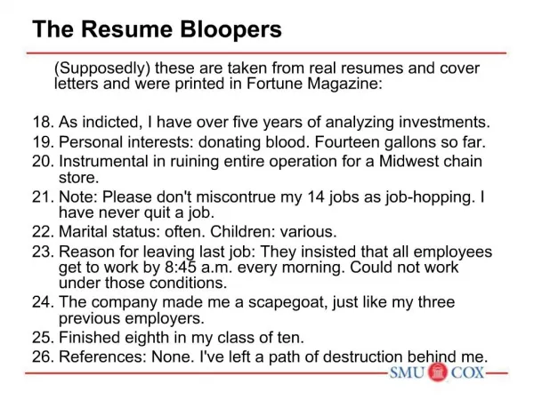
Blooper 8: Confusing Checkboxes and Radiobuttons • 3 Variations: • Mutually exclusive checkboxes • One radiobutton • Radiobuttons and checkboxes in menus look the same • Design rule: Radiobuttons are for one-from-N settings. Checkboxes should represent a single ON/OFF setting.
Blooper 9: One-from-N Settings With No Initial Value • Programmers prefer not to pick a setting for the users. • Violates one-from-N concept. • Allow a ‘None’ choice. • Design rule: A connected set of radiobuttons is a single setting that represents a one-from-N choice.
Blooper 10: Using a Checkbox for a Non-on/off Setting • If not an ON/OFF setting, how is the user supposed to know what is being chosen when the box is unchecked? • Design rule: Checkboxes are not supposed to be used for settings that just happen to have two values, but rather when those two values are natural opposites.
Blooper 11: Using Command Buttons As Toggles • Toggles are supposed to represent and ON/OFF choice. • Command buttons used as a toggle provides no indication of its current state. • Design rule: Command button components in GUI toolkits are for invoking commands or initiating events.
Blooper 12: Using Tabs As Radio buttons • Tabs are an on-screen simulation of tabbed cards such as those in a recipe box. • Using tabs as choice depending on which tab is in front confuses and annoys users. • Some programmers defend using tabs in choice making with the fact that tabs are a one-from-N choice. • Design rule: Tabs are purely navigation controls. They affect where the user is in the application.
Blooper 13: Too Many Tabs • Ways to increase number of tabs that cause trouble. • Widen the panel width. • Have tabs around all sides of the panel. • Shrt lbls. • Dancing tabs. • Design rules: • Avoid large number of tabs. • Use another control instead of tabs.
2.4 Providing Faulty Feedback • Blooper 14: Buttons that trigger on “mouse down” • Blooper 15: Ambiguous Selections • Blooper 16: Not showing the busy cursor
Blooper 14: Buttons That Trigger on “Mouse Down” • 4 main mouse events used with buttons: Mouse Over, Mouse Down, Mouse Up, Mouse Out • 3 common causes • Programmer writes his/her own button code. • GUI Toolkit automatically handles button code. • Programmer specifies the event to occur on mouse down.
Blooper 14 Continued • This applies to other components besides buttons (Radio Buttons/Check boxes). • Design rule: “On-screen 'soft' buttons should provide feedback that they have been pressed on 'mouse button down', but should not invoke their corresponding action until 'mouse button up'.”
Blooper 15: Ambiguous Selections • Some applications display several distinct selections simultaneously. • This is bad because the user doesn't know which selection the next command will affect. • If there must be multiple selections, use one primary selection and multiple secondary selections.
Blooper 15 Continued • Exception: Multiple views of the same data. • This is not ambiguous because the data is the same, and input will have the same effect on the data. • Design rule: "Commands and keyboard keys in GUI-based applications often operate on the current selection, so it should always be obvious what is currently selected."
Blooper 16: Not Showing the Busy Cursor • The busy cursor should be displayed any time the application is going to be busy doing something and can't take input. • You should always show the busy cursor - even for functions that take a fraction of a second to execute. This way even if for some reason the function hangs, the user will know to wait.
Blooper 16 Continued • If another application changes the cursor to something else, it's your responsibility to change the cursor back to busy. • It is also a good idea to show a "working" indicator or a progress bar in the application. • Design rule: "In general, interactive applications should be highly responsive to users. This means keeping up with the users' actions, and keeping users informed of program status."
2.5 Abusing Text Fields • Blooper 17: Using text fields for read-only data • Blooper 18: Overusing Text Fields • Blooper 19: Type-in fields that behave abnormally
Blooper 17: Using Text Fields for Read-only Data • Text fields are input fields, so the user should be able to edit them at some time. • It is incorrect to use a non editable text field to display data. • Design rule: "Software should never display non editable textual data in something that looks even remotely like a text field."
Blooper 18: Overusing Text Fields • Text fields allow too much freedom in input. • If a user inputs invalid data, then the application has to give an error message after the fact. • Programmers should try to use more specific input fields when possible. (Sliders, Drop Down Menus, Radio/Check buttons) • "Text fields should be used only for data that really is unstructured, free-form text."
Blooper 19: Type-in fields that behave abnormally • Two abnormal text field behaviours. • Only being able to replace, not change text. • Having to press enter to set a value. • Design rule: Since text editing is such a common task, "the editing of text has to be totally consistent from one text-editing situation to another".
Give some reasons why an application should provide keyboard equivalents. To avoid switching. People still use pre-GUI software. To save time. In case a person can't use the mouse. There is no mouse. Blind people. Discussion Questions
Explain why a button's functionality should be coded in the “mouse up” event instead of in the “mouse down” event. Buttons should provide some feedback showing that they have been pressed. Also, the user should be able to abort a button press by moving the cursor off of the button before releasing the mouse button. Discussion Questions
Why would a developer use an inactive text box instead of an active text box? When is it appropriate to use a label instead of a text box? Inactive text boxes should be used when a text box needs to be temporarily disabled. Labels should be used when you need to display data that the used should not be able to edit. Discussion Questions