Download
1 / 5
50 likes | 143 Views
My Contents Page. Explained. Layout. I chose to base my layout closely around .

E N D
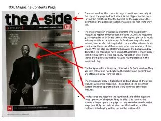
My Contents Page Explained
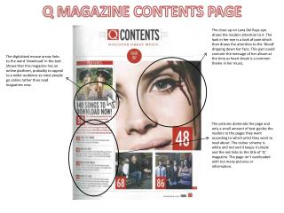
Layout I chose to base my layout closely around Rocksound’scover that I had in my first questionnaire. Because it was easily the most popular. Also, in my second layout questionnaire, I based one closely on the Rocksound contents. Also, because I’m aiming for an audience of teenagers (who I found, from my first interview were most interested in a magazine being about the genre of rock), and the results of my questionnaire showed that this was definitely the most popular. I also made the contents page lest linked to Kerrang’s contents pages, because people in my questionnaire said it was too complex and it proved the least popular.
Type Face(s) Because I found, doing my research, that commonly on Contents Pages, only about 3 type faces are used, I kept the variations of my typefaces to a minimum. Consequently, I only used two – the one I used for the title of the magazine , the Titles of the articles, the subtitle, and the page numbers (here), and the one I used for the quote and the date (here). I took the ( ) typeface from the Rocksound design, and I took the ( ) typeface from the typeface questionnaire – which proved to be incredibly popular. Because Rocksound’s titles and subtitles are in capitals, I chose to have mine in capitals, too. In addition to this, in my first questionnaire, the typefaces that were in Capitals proved popular from both Male and Female audiences (I say that because Capitals are known to appeal to Men in particular).
Colour Scheme I chose the colour scheme from the colour scheme Questionnaire I made, and I chose the one that was most popular with my audience, which was the Black, Red and White colour scheme. This colour scheme co ordinates with the colour scheme for the front cover also. This is the colour scheme for the magazine. To make the picture of Liam co ordinate with the text, I used Photoshop to change his shirt from Green to Red.
Photo(s) Because the most popular contents page, Rocksound, only had one photo, I also only chose to have one photo. Because Liam met me with his usual clothes, this means the picture can connect with the audience, because it’s clothes that, either, they wear, or are able to wear.