Download
1 / 18
180 likes | 281 Views
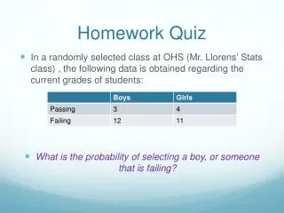
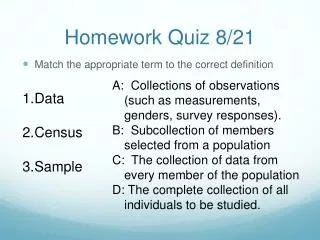
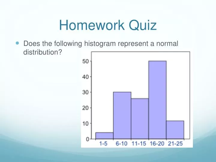
Homework Quiz. Does the following histogram represent a normal distribution?. Statistical Graphics. Section 2-4. Statistical Graphics. Stemplots Dot Plots Scatterplots Frequency Polygon. Ogive Multiple Bar Graphs Pareto Chart Pie Chart Time-Series Graph. Data Collection Activity #1.

E N D
Homework Quiz • Does the following histogram represent a normal distribution?
Statistical Graphics Section 2-4
Statistical Graphics • Stemplots • Dot Plots • Scatterplots • Frequency Polygon • Ogive • Multiple Bar Graphs • Pareto Chart • Pie Chart • Time-Series Graph
Data Collection Activity #1 • Each group of 2 will get a penny to flip • When I say go, one of you will start flipping and continue flipping until they get 4 heads/tails in a row. • You will be timed on a clock on the projector. • Record your number of seconds as soon as you finish
Stem Plots • Represents data by separating each value into two parts: the stem [The left most digit(s)] and the leaf [the rightmost digit]
Data Collection Activity #2 • Each group of 2 will be given a ruler • Each students should measure the length of their index finger in centimeters (round to the nearest whole centimeter) • Make sure to record these numbers
Figure 2-5 Dot Plots • Data points are represented as dots over their respective spot on the number line. Repeats are accounted for by stacking dots
Quick Collection Activity • With a partner, measure and record your height and your arm span in centimeters. • Enter these numbers onto the computer when you are finished.
Scatter Plots • A plot of paired (x,y) data with a horizontal x-axis and a vertical y-axis
Mini-Project • Think up one or two questions you would like to survey our class about. • Whatever you pick should be something that could be represented on a scatter plot, dot plot, or stem plot. • For homework tonight, organize your results in whatever type of table you want.
Figure 2-7 Pie Chart • A graph depicting qualitative/categorical data as proportional slices of a pie. • Determine measure of central angle by multiplying the percentage ofthe total data forthat categoryby 360. Wastes ink Less effective than Pareto
Figure 2-3 Frequency Polygon • Created using line segments connected to points directly above class midpoint values. • Starts and ends on the x-axis • midpoint= Otherwise same setup as histogram Beneficial for determining if something has a normal distribution
Figure 2-4 Ogive • Line graph representing cumulative frequencies • Above every lower class limit is the total number of subjects below that mark (not just members in that class) Otherwise same setup as histogram Beneficial for determining number of subjects below a particular number.
Multiple Bar Graphs • Each class has at least 2 bars representing different populations. Otherwise same setup as histogram Beneficial for comparing multiple demographics
Figure 2-6 Pareto Chart • Bar graph for categorical/qualitative data • Bars are ordered left-to-right from greatest to least frequency Otherwise same setup as histogram Beneficial for comparing several categories
Figure 2-8 Time-Series Graph • Represents quantitative data that has been collected over several different points in time. • Represented with time being proportionally scaled on x More like an x-y graph than a histogram. Could be used to recreate the data table
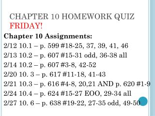
Homework • P.68: 5, 6