Download
1 / 44

E N D
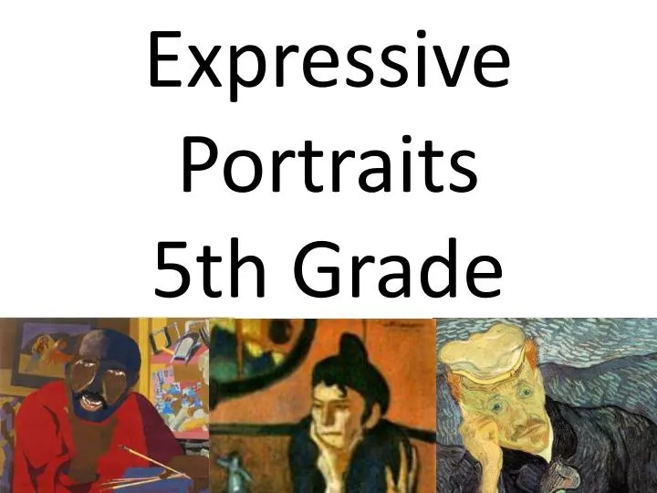
This is a self portrait by Jacob Lawrence. Lawrence uses bright lively colors in this painting which can describe a lively happy person. He places himself in a room that is full of things, for example, in his hand there are paint brushes that describe that he has a passion for painting. He is also in a room that looks like place that can be comfortable because the person seems happy in the painting. Lawrence reinvents the concept of portrait because its not traditional in the sense that it doesn't look realistic but more cartoonish.
This is a portrait of Dr. Gachet by Vincent Van Gogh. Van Gogh uses dull cool colors to portray the person that contrast against the warm colors of the table. the table holds books that seem that they can be important to the person and that is the reason that they are there. The background seems blank and dull like the person is lost or bored and not happy with what they are doing. Van Gogh is not a traditional portrait artist, here the person doesn't look realistic because of the way that he uses the brush strokes, so he is an artist that reinvents the concepts of portraits.
Pablo Picasso's Blue Period • The color blue Some people believe that, by nature, man associates colors with emotions, the color blue being associated with melancholy.
Identify any complimentary Colors that you see.
What did Frida Kahlo add To make this portrait more Emotionally expressive?
Portrait Complimentary Colors Tints/Shades Two Contrasting Emotions Distortion and/or Exaggeration Your Creative Personality
Exemplars from Ontario Level One Level Two Level Three Level Four
Appropriation What is being appropriated?
Has Romare Bearden Used distortion, Exaggeration, Or both?
Open Discussion • Distortion or exaggeration or something else? • What is going on in this picture? • What do you see that makes you say that? • You decide!
I used purple and yellow for my complementary colors. On my happy side I used yellow with mostly bright intensity for cheerfulness. The background on the yellow side has bright colors. I mostly used dull intensity colors to show sadness. On that side I used dull yellow to match the dull purple. The temperature on the purple side is mostly cool and on the yellow side I chose a warm color to show happiness. My two emotions are happy (yellow side) and the sad side (purple). I used tints in the happy side. I used bright (tint) colors for the hair to show excitement on the happy side. The eyes are a big focus so they are really bright on the yellow side. The mouth I exaggerated with a light tint. On the purple side I mostly used dull colors for a gloomy feeling. When you are sad you are a dull shade. In the hair there is a brush stroke with really dull intensity. The eye is placed low for sadness. I used a dull shade of purple because when I am sad I am a cool-feeling color like a dull shade. When I am sad the eye is really low, the mouth is really low and exaggerated. The bright side is yellow which is my favorite color. When I am happy I am excited. I remember when I went on a boat I was really happy and excited and that is one reason why I chose yellow. Yellow is a warm color which goes in a fire or the beautiful sun. I like purple too so I chose yellow and purple.
The complimentary colors I chose for my portrait were blue and orange. The intensity was higher on one half of my portrait since I was trying to show more energy. One side has high intensity but the other half doesn’t. Light and dark colors played a large role in the way I expressed emotions. I used light colors to express more energy. I used darker colors to express a relaxing sort of emotion. I used cool colors to make a calm mood. I think using warm colors make the other half look more lively. The contrasting emotions I used were hysterical and calm. I used white to tint the orange to give half of my face (the hysterical part) a bright and not cool look. I only used black to shade the orange to make eyebrows. On my calm part I used a darker blue. That’s because it reminds me of the dark blue calm flowing waters. If I had used lighter blue the calm part would feel more happy and springy. I used more shading on the calmer part to make it look plain. For the background I used tints on one half (the hysterical part) to add a sudden change of moods. I used shades on the other half to blend emotions just to feel relaxed. I remember once I went hysterical over a small matter and I was wearing an orange shirt. I saw when I moved that the shirt moved in a jiggly way. So I added squiggles to my painting. When I was angry my mom told me to imagine dark waters flowing slowly and that calmed me down. So I used those past experiences to paint and make my painting.
LEVEL 2: DO YOU UNDERSTAND THE BASICS? • Level 1 and 2 are lower level; Levels 3 and 4 require synthesis and creativity • Can the relationships between the major shapes be visually read as a portrait? • Does it only use one set of complimentary colors? • Does it show two different emotions? • Does it have tints and shades?
Evaluation samples from pilot • Can the relationships between the major shapes be visually read as a portrait? Does it reflect an understanding Of the task? Although it can be Read as a “portrait” figure, It does not show 2 different Emotions (see Question 3)
Evaluation samples from pilot • Does it only use one set of complimentary colors?
Which demonstrates BOTH an understanding Of the task AND synthesis of several variables? Do any demonstrate use of all variables in Achieving the task?
Evaluation samples from pilot • Does it have tints and shades?
Tints and shades, but 2 emotions? 2 emotions and tints/shades
Exemplars from Ontario Level One Level Two Level Three Level Four