Download
1 / 17
170 likes | 225 Views
Question 4: What kind of media institution might distribute your media product and why? . Publishers.

E N D
Question 4: What kind of media institution might distribute your media product and why?
Publishers • I think that this would be a consideration for Dubstep music institutions to take on this magazine. Purely because that is what the magazine is based on in the first place and also the fact that the magazines image is aesthetically pleasing for Dub step fans alike. • I think that the publisher that would consider publishing my media product would be IPC Media. They specialize in publishing music magazines and have experience with other music magazines like Q, Kerrang!, Rolling Stone and NME. IPC Media have more of wide range of publication types within music magazines as is shown within the list above, with Kerrang! mainly around rock and Q mainly around pop
Distribution • The distributers of this magazine I do not think would be online. With the barcode place on the front cover this magazine is intended for store distribution. I think would be stores that specialize in book magazine and office based items. I personally think that a national distribution from stores like WHSmiths would be considerable if not possible. They are very fond of selling magazine (evidence through experiences within stores). I think that other off-licensed stores like CostCutters and One –Stop would distribute this magazine as they also sell plenty of magazines as well as their main product distribution aim around household food, newspapers, magazines and small household items like batteries and celli tape.
Front Cover Attractions • I attracted audiences mainly with the front cover (as it does) but the main two aspects that I think attracted the audience the most was the masthead and the main banner across the page. • The title was a very key item within the front cover; it was colourful, had meaning and was different from other considered “normal” masthead designs. Now, considering the fact that the main intended audience was of people with the age range between 11-20 years of age, I needed to be different and the masthead design does this with the resemblance of a vortex, which is relevant to the masthead title. The font within this Is also a key role as the format of it resembles fonts which are sometimes used within graphic based art, which young people (like teenager) are attracted towards.
Other additional attractions on the page are boxes placed at the top and on the sides of the page. These two boxes are showing the standards of the magazine with words used like “OFFICIAL CENTRAL CITY OF DUBSTEP” and “UK’S NUMBER 1”. These attract the audience as they know that they are getting good value for their money as they can see that the magazine has high standards within it. Another attraction is the within the “WIN” circle. Not only would the word “WIN” be an attraction but the fact that there is a company named supporting the magazine. This shows that the magazine is official and is connected to a much bigger organization.
The main banner that goes across the page is an attraction in two ways: it attracts people from a glimpse (e.g. walking past the magazine) and also shows that a big important happening has occurred. The banner is probably the first thing that people would see/notice on the front cover so the eye will be drawn to this (and possibly the main model who is a big idle). The banner of the page will attract people on a glimpse as it is the biggest part of the front page and its color of orange also helps with the eye catching process as well. The fact that the banner also contains information on a return of an idle, this will team up with the image to attract the audience into reading/buying the issue.
Contents Page Attractions The magazines contents page attracts the audience is within multiple areas of it. The features part of the page is attractive with the graphite styled text . This is attractive as the main audience is orientated around young males and graphite is a very popular font within this age range (11-20) as teens think this font to be cool and attractive. Another thing that would make this attractive is the fact that this font is not a very common font to use for magazines, this therefore brings out the unique side of the page and makes the audience attracted by the uniqueness of the font that is used.
Another attraction of the contents page is the images used within it. The images are all within the same type of clothing which is a very good representation and attractions of the audiences of this magazine. These images are the backbone of the contents page as these are the first thing that the viewer is drawn to (they are the eye catcher).
Another attraction within the contents page is the competition box that is located at the bottom of the page. This is an attraction not for the way that it is laid out (apart from the text being an eye catching colour ad standing out from the background) but the fact that the box shows that there is an opportunity to win prizes. This is a very common attraction and common section that is shown within contents pages (like NME magazines) and the viewer would be interested as they can win prizes
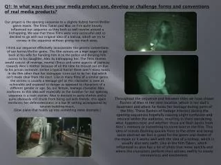
DPS Attractions • The Quotation • Within the double page spread, I do not think that there are many attractions as the page is based around text and the target audience (stereotypically) are not attracted by loads and loads of words. However, as the target audience is fairly young they may well be attracted to more inspirational pieces of text which is what the page presents with the words “Thinking is nothing. Doing is something.” especially since this is said by an iconic individual. This is attractive as young minds are open guidance an this quotation coming fro an iconic figure would attract them to reading more about the story
The Main Image • Another attraction that the DPS presents is the main image itself. This is the figure of an iconic figure that s related to the main story in every way. This is attractive especially since the story is about this figure and his return to the known media. This also attracts the audiences as the clothing of the figure is of the same as its intended target audience with the hoody. This would make people of the same fashion look and be inspired by the figure.
The Title • The last main attraction of the DPS is the title of the story. It says “BRAINZ HITTING BACK” implying that the return of the icon was a hard on as he was “hitting” back an not just coming back. This also has a double meaning as the article involves the new “HIT” that James Brain (AKA BrainZ) has produced. • The title is also attractive with the usage of its colour. This colour is the primary colour that is presented through all of the components of the magazine. This stands out fro the background therefore making this part of the magazine an eye catcher
Question 6: What have you learnt about technologies from the process of constructing this product?
I have learnt the basics of creating a magazine through the usage of the internet with researching other real time magazine products. I have learnt what sort of camera shots should be used for the effect of attracting the audience and also the font that are traditionally used within most magazines • The main technologies that I have learnt about are through the making stage of the magazine. I have learnt how to use Photoshop properly with being introduced to a lot more tool than I thought there was to begin with. Within Photoshop here are some things that I have learnt to use things like the cropping tool. the magic wand tool, magnetic lasso tool, brush tool, horizontal and vertical text tool, the list goes on.
I have also learnt how to use the software of InDesign. Before this task was set I had never heard of this software before but I now know how to use it as I have produced the contents page and the DPS. Through using both of these pieces of software I now know how to convert PSD and InDesign documents into jpegs. • I now also know how to use Word press as this is the very first time I had ever created and created post on my own blog. With now knowing how to use Word press I now know how to also upload and place images and documents (like word and PowerPoint presentations within the bog/posts.
I have learnt how to also use the software of preziwhich is where question 1 and 7 are formatted as. I have learnt how to import images and how to edit the prezi with the locations of the text within the layouts.