Download
1 / 15
150 likes | 157 Views
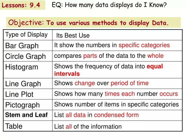
EQ: How many data displays do I Know?. Lessons: 9.4. Objective: To use various methods to display Data. Objective: Choose the Appropriate Display _____________ - Shows the number of items in specific categories. Bar Graph.

E N D
EQ: How many data displays do I Know? Lessons: 9.4 Objective:To use various methods to display Data.
Objective: Choose the Appropriate Display _____________ - Shows the number of items in specific categories. Bar Graph
______________ - Shows the frequency of data that has been organized into equal intervals. Histogram
______________ - Compares parts of the data to the whole. Circle Graph
______________ - Shows the number of items in specific categories. Pictograph
______________ - Shows change over a period of time. Line Graph
______________ - Shows how many times each number occurs in the data. Line Plot
___________________- Lists all individual numerical data in a condensed form. Stem-and-Leaf Plot
______________ -May list all the data individually or by group. Table
Choose an appropriate type of display for each situation. points scored by individual members of a basketball team compared to the team total CIRCLE GRAPH the profits of a company every year for the last ten years LINE GRAPH, TABLE the population of the states arranged by intervals HISTOGRAM
The number of students who wish to order each size of T-shirt TABLE OR BAR GRAPH OR PICTOGRAPH the amount of sales by different sales people compared to the total sales CIRCLE GRAPH average proficiency test score for five consecutive years LINE GRAPH amount of fat grams in intervals in various sandwiches HISTOGRAM
More on Circle Graphs 25% There are 360º in a circle. Multiply each percent by 360 to find the number of degrees for each section of the graph. EX: Find the number of degrees represented by a 25% section of a circle graph 90º .25 x 360 =
SCHOOL Which graph below could be used to show a greater difference in favorite classes? Which one is misleading? Why? Example 7-1b How many students are surveyed? Answer: Graph B distorts the data as a broken bar graph. English appears five times as large as math in graph B where the actual difference is not as large. Graph B because the interval does not start at 0.
Misleading video Weather and Music 1) After watching the video, be able to explain how changes to the scale affected the appearance of the graph.
Video: How outliers distort information 1) After watching the video, be able to determine what measures outliers have the greatest impact on .