Download
1 / 18
180 likes | 347 Views
Statistics. Collecting Describing Summarizing. What is Statistics?. Statistics is a set of data (information) that has been collected. The data can be categorical or numerical . Categorical Data – Information that can be sorted into groups/categories.

E N D
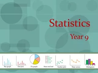
Statistics Collecting Describing Summarizing
What is Statistics? • Statistics is a set of data (information) that has been collected. The data can be categorical or numerical. • Categorical Data – Information that can be sorted into groups/categories. Ex: Favorite colors (Blue, Red, Purple, Green, etc.) • Numerical Data – Information that is in numbers. Ex: How many DVDs do you own? (5, 12, 316) How tall are your classmates? (60 in, 55 in)
Who Uses Statistics? Everyone uses statistics! Yes… YOU, even! Everyone is influenced by statistics! Yes… YOU, even! Everyone survives because of statistics! Yes… YOU, even! Not sure about that?
Step One: Collecting You have got to ask a statistical question, if you really want to get the info! What makes a question statistical? 1. A specific population . 2. Topic of interest . 3. MOST IMPORTANT: Variability in the responses .
Organize Your Data 1) Order the numerical data from least to greatest. 2) Put your data in a chart or table.
Step Two: Representing Type of Graph When To Use Example/Picture • Dot Plot Represents data on a number line using dots. • Box & Whiskers Plot Shows the distribution of data on a number line. • Histogram A special type of bar graph that shows the frequency of data in intervals!
Bar Graph vs Histogram • Check out this discussion between teacher and students as to the difference between bar graphs & histograms…. • http://www.shodor.org/interactivate/discussions/HistogramsVsBarGraph/
Tallest Men Alive Check out this random interesting article about tallest men in the world…. http://top10hm.com/top-10-tallest-man-alive/
Box & Whiskers Plot Is a good way to summarize and better interpret a lot of numerical data. Check out the video to learn more about Box & Whiskers Plots. There are practice questions, too! Box & Whiskers Plot Instructional Video
Step Three: Summarizing There are two ways to interpret data. 1) Measures of Center: One number that describes how the data is most typical. (Most alike) Ex: Mean; Median; Mode 2) Measures of Variability: One number that describes how the data spreads out (is different). Ex: Range; IQR; MAD
Mean, Median, MAD… Oh, IQR! The average 6th grade boy is: 11 ½ years old 4’ 7” 81 lbs The average 6th grade girl is: 11 ½ years old 4’ 8” 87 lbs Wait a minute! This doesn’t describe each of you… so how am I able to say this?
Measures of Central Tendency When a lot of data represents one specific population, there has to be a way to describe it easily. Looking around the classroom, we do not all look the same. We are all different. BUT… If we had to describe what we look like in ONE way, we would look for patterns and describe us that way.
Measures of Central Tendency Measure When to Use It How To Use It Mean when looking for the sum of all the numbers .typical or average amount of numbers added Median the data set has outliers the middle value when the data is in order from least to greatest
Measures of Variability Measure When to Use How To Use Range To find the spread of data; order the data from to check variation of data smallest to largest IQR To find the range of only upper quartile (inner quartile range) the majority of the data set – lower quartile to check how much the M.A.D. data deviates (differs) Click here to find out how from the central tendency