Download
1 / 3
30 likes | 42 Views
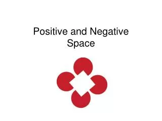
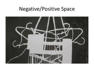
Negative space is the space between, within and surrounding an object in an image, often to form another image or symbol. The positive space is the focus of the image, the object itself, but the negative space is just as important. It shares edges with the positive space, defining the outline of the object and creating proportion.

E N D
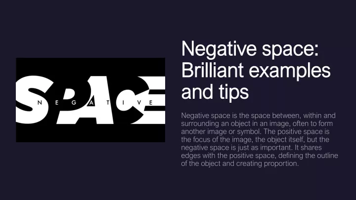
Negative space: Brilliant examples and tips Negative space is the space between, within and surrounding an object in an image, often to form another image or symbol. The positive space is the focus of the image, the object itself, but the negative space is just as important. It shares edges with the positive space, defining the outline of the object and creating proportion.
Artists often create positive spaces and shapes that, in turn, cleverly carve out shapes in negative space, interlocking just like a jigsaw puzzle. The results can be stunning. Here, we’ve found some brilliant examples, and click straight to page two to get some top tips from artist Timothy Von Rueden on how to harness negative space in your own work. Be literal This design used the number one to create a letter in the word one. They could have simply used only the word or only the number, but the combination of both adds a unique twist. The ’N’ isn’t incredibly apparent at first, but once you realize it’s there, it makes it all the more great. Free PSD Mockup Negative Space in Type Negative space isn’t just used for full composition; it can enhance type as well. If you know about typography, negative space between each line of text is called leading. Leading makes type much more legible. When reading two paragraphs of text, one with hardly any leading, and one without, it is easy to see why leading is so important.
Balance Use too much negative space, and it overwhelms and distracts from your positive space. Use too little, and the same thing happens — your focus isn’t clear, your audience is distracted, and your design is ineffective. Best PSD Mockup Some may view white space as wasted space, which could have been filled up with message-bearing information and graphics. But filling things up too much can stress us out; bombarding your viewer with information won’t allow them to process enough to retain what they’ve seen. Read More