Download
1 / 32
330 likes | 567 Views
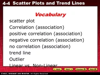
Vocabulary. scatter plot correlation positive correlation negative correlation no correlation trend line.

E N D
Vocabulary scatter plot correlation positive correlation negative correlation no correlation trend line
In this chapter, you have examined relationships between sets of ordered pairs or data. Displaying data visually can help you see relationships. A scatter plot is a graph with points plotted to show a possible relationship between two sets of data. A scatter plot is an effective way to some types of data.
Additional Example 1: Graphing a Scatter Plot from Given Data The table shows the number of cookies in a jar from the time since they were baked. Graph a scatter plot using the given data. Use the table to make ordered pairs for the scatter plot. The x-value represents the time since the cookies were baked and the y-value represents the number of cookies left in the jar.
Additional Example 1 Continued The table shows the number of cookies in a jar from the time since they were baked. Graph a scatter plot using the given data. Plot the ordered pairs.
Check It Out! Example 1 The table shows the number of points scored by a high school football team in the first four games of a season. Graph a scatter plot using the given data. Use the data in the table to make ordered pairs. The x-value represents the individual games and the y-value is the points scored in that game. Plot the ordered pairs to make scatter plot.
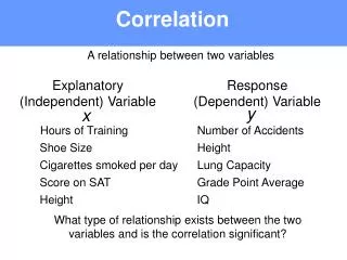
A correlation describes a relationship between two data sets. A graph may show the correlation between data. The correlation can help you analyze trends and make predictions. There are three types of correlations between data.
Additional Example 2: Describing Correlations from Scatter Plots Describe the correlation illustrated by the scatter plot. As the average daily temperature increased, the number of visitor increased. There is a positive correlation between the two data sets.
Check It Out! Example 2 Describe the correlation illustrated by the scatter plot. As the years passed, the number of participants in the snowboarding competition increased. There is a positive correlation between the two data sets.
Additional Example 3A: Identifying Correlations Identify the correlation you would expect between the pair of data sets. Explain. The average temperature in a city and the number of speeding tickets given in the city You would expect no correlation. The number of speeding tickets has nothing to do with the temperature. At least here in Pleasanton … Why might the answer be different in Salt Lake City or in Alaska?
Additional Example 3B: Identifying Correlations Identify the correlation you would expect between the pair of data sets. Explain. The number of people in an audience and ticket sales You would expect a positive correlation. As ticket sales increase, the number of people in the audience increases.
Additional Example 3C: Identifying Correlations Identify the correlation you would expect between the pair of data sets. Explain. Arunner’s time and the distance to the finish line You would expect a negative correlation. As a runner’s time increases, the distance to the finish line decreases.
Check It Out! Example 3a Identify the type of correlation you would expect between the pair of data sets. Explain. The temperature in Houston and the number of cars sold in Boston You would expect no correlation. The temperature in Houston has nothing to do with the number of cars sold in Boston.
Check It Out! Example 3b Identify the type of correlation you would expect between the pair of data sets. Explain. the number of members in a family and the size of the family’s grocery bill You would expect positive correlation. As the number of members in a family increases, more food is needed, so the grocery bill increases too.
Check It Out! Example 3c Identify the type of correlation you would expect between the pair of data sets. Explain. The number of times you sharpen your pencil and the length of your pencil You would expect negative correlation. As the number of times you sharpen your pencil increases, the length of your pencil decreases.
Additional Example 4: Matching Scatter Plots to Situations Choose the scatter plot that best represents the relationship between the age of a car and the amount of money spent each year on repairs. Explain. Graph B Graph A Graph C
Additional Example 4 Continued Choose the scatter plot that best represents the relationship between the age of a car and the amount of money spent each year on repairs. Explain. Graph A The age of the car cannot be negative.
Additional Example 4 Continued Choose the scatter plot that best represents the relationship between the age of a car and the amount of money spent each year on repairs. Explain. Graph B This graph shows all positive values and a positive correlation, so it could represent the data set.
Additional Example 4 Continued Choose the scatter plot that best represents the relationship between the age of a car and the amount of money spent each year on repairs. Explain. Graph C There will be a positive correlation between the amount spent on repairs and the age of the car. Graph C shows a negative correlation, so it is incorrect.
Additional Example 4 Continued Choose the scatter plot that best represents the relationship between the age of a car and the amount of money spent each year on repairs. Explain. Graph A shows negative values, so it is incorrect. Graph C shows negative correlation, so it is incorrect. Graph B is the correct scatter plot. Graph B Graph A Graph C
Check It Out! Example 4 Choose the scatter plot that best represents the relationship between the number of minutes since an oven was turned off and the temperature of the oven. Explain. Graph B Graph C Graph A
Check It Out! Example 4 Continued Choose the scatter plot that best represents the relationship between the number of minutes since an oven was turned off and the temperature of the oven. Explain. Graph A There will be a negative correlation between the time and the temperature because oven will get cooler as it is turned off.
Check It Out! Example 4 Continued Choose the scatter plot that best represents the relationship between the number of minutes since an oven was turned off and the temperature of the oven. Explain. Graph B Neither the temperature nor the time can be negative.
Check It Out! Example 4 Continued Choose the scatter plot that best represents the relationship between the number of minutes since an oven was turned off and the temperature of the oven. Explain. Graph C This graph shows the temperature of the oven increasing after the oven has been turned off.
Check It Out! Example 4 Continued Choose the scatter plot that best represents the relationship between the number of minutes since an oven was turned off and the temperature of the oven. Explain. Graph A Graph B shows negative time, so it is incorrect. Graph C shows the temperature of the oven increasing, so it is incorrect. Graph A is the correct answer. Graph B Graph C
It is often helpful to add a line to better describe a scatter plot. This line, called a trend line, helps show the correlation between data sets more clearly. It can also be helpful when making predictions based on the data.
Additional Example 5: Fund-Raising Application The scatter plot shows a relationship between the total amount of money collected at the concession stand and the total number of tickets sold at a movie theater. Based on this relationship, predict how much money will be collected at the concession stand when 150 tickets have been sold.
Additional Example 5 Continued Draw a trend line and use it to make a prediction. Draw a line that has about the same number of points above and below it. Your line may or may not go through data points. Find the point on the line whose x-value is 150. The corresponding y-value is 750. Based on the data, $750 is a reasonable prediction of how much money will be collected when 150 tickets have been sold.
Check It Out! Example 5 Based on the trend line, predict how many wrapping paper rolls need to be sold to raise $500. Find the point on the line whose y-value is 500. The corresponding x-value is about 75. Based on the data, about 75 wrapping paper rolls is a reasonable prediction of how many rolls need to be sold to raise $500.
Lesson Quiz: Part I For Items 1 and 2, identify the correlation you would expect to see between each pair of data sets. Explain. 1. The outside temperature in the summer and the cost of the electric bill Positive correlation; as the outside temperature increases, the electric bill increases because of the use of the air conditioner. 2. The price of a car and the number of passengers it seats No correlation; a very expensive car could seat only 2 passengers.
Lesson Quiz: Part II 3. The scatter plot shows the number of orders placed for flowers before Valentine’s Day at one shop. Based on this relationship, predict the number of flower orders placed on February 12. about 45
Homework Page 229: 15-20, 23, 25-26, 29-31 and 34-41