Download
1 / 28
280 likes | 439 Views
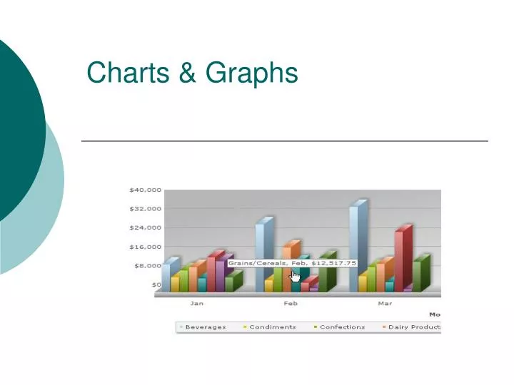
Charts & Graphs. Charts & Graphs. Stacked Bar Graph. Stacked Bar Graph Definition of Stacked Bar Graph Stacked bar graph is a graph that is used to compare the parts to the whole. The bars in a stacked bar graph are divided into categories. Each bar represents a total.

E N D
Stacked Bar Graph Stacked Bar Graph Definition of Stacked Bar Graph Stacked bar graph is a graph that is used to compare the parts to the whole. The bars in a stacked bar graph are divided into categories. Each bar represents a total. Examples of Stacked Bar Graph In the following example, each bar of the stacked bar graph is divided into two categories: girls and boys. Each of the three bars represents a whole. That is: about 38 students like Basket Ball, out of which 16 are girls.
Sliding Bar Graph Sliding Bar Graph Definition of Sliding Bar Graph Sliding bar graphs show two categories as bars graphed in opposite directions. They can be used to compare amounts or frequencies. Examples of Sliding Bar Graph The sliding bar graph shown below represents the favorite fruit of grade 8 for both boys and girls.
Line Graph • They are good at showing specific values of data, meaning that given one variable the other can easily be determined. • They show trends in data clearly, meaning that they visibly show how one variable is affected by the other as it increases or decreases. • They enable the viewer to make predictions about the results of data not yet recorded.
Frequency Table Definition of Frequency Table A frequency table is a table that lists items and uses tally marks to record and show the number of times they occur.
Line Plot One type of graph is a line plot. A line plot provides an easy way to organize data. They are usually used when there is one group of data, and fewer than 50 values. A line plot consists of a horizontal number line, on which each value of a set is denoted by an x over the corresponding value on the number line. Suppose thirty people live in an apartment building. These are the following ages: 58, 30, 37, 36, 34, 49, 35, 40, 47, 47, 39, 54, 47, 48, 54, 50, 35, 40, 38, 47, 48, 34, 40, 46, 49, 47, 35, 48, 47, 46 Your first step should be: placing the values in numerical order. 30, 34, 34, 35, 35, 35, 36, 37, 38, 39, 40, 40, 40, 46, 46, 47, 47, 47, 47, 47, 47, 48, 48, 48, 49, 49, 50, 54, 54, 58
Histogram A histogram is defined as a bar graph that shows frequency data. The first step in making a histogram is to collect data and sort it into categories. To continue, you must label the data as the independent set or the dependent set. The characteristic you grouped the data by would be the independent variable and the frequency of that set would be the dependent variable.
Pie Graph • A pie chart (or a circle graph) is a circular chart divided into sectors, illustrating relative magnitudes or frequencies or percents. Together, the sectors create a full disk. It is named for its resemblance to a pie which has been sliced.
Stem and Leaf Plot • Stem-and-leaf plots are a method for showing the frequency with which certain classes of values occur. You could make a frequency distribution table or a histogram for the values, or you can use a stem-and-leaf plot and let the numbers themselves to show pretty much the same information
Box and whisker plot • The first step in constructing a box-and-whisker plot is to first find the median, thelower quartile and the upper quartile of a given set of data. Example: The following set of numbers are the amount of marbles fifteen different boys own (they are arranged from least to greatest). • 18 27 34 52 54 59 61 68 78 82 85 87 91 93 100
Scatter Plot • Scatter plots are similar to line graphs in that they use horizontal and vertical axes to plot data points. However, they have a very specific purpose. Scatter plots show how much one variable is affected by another. The relationship between two variables is called their correlation . • Scatter plots usually consist of a large body of data. The closer the data points come when plotted to making a straight line, the higher the correlation between the two variables, or the stronger the relationship.
Charts & Graphs • Have different picture of all the charts the students will need to make. Show the different components in making a good chart or graph; i.e. labeling, title, coloring, etc.
Making Charts and Graphs • http://nces.ed.gov/nceskids/createagraph/default.aspx • www.census.gov