Download

1 / 25
720 likes | 1.67k Views
Dot Plots. A dot plot is a type of graphical display used to compare frequency counts within categories or groups. Dot Plots. Dot Plots - Symmetry. A symmetric distribution can be divided at the centre so that each half is a mirror image of the other. Dot Plots - Skewness.

E N D
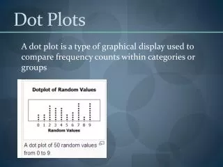
Dot Plots A dot plot is a type of graphical display used to compare frequency counts within categories or groups
Dot Plots - Symmetry A symmetric distribution can be divided at the centre so that each half is a mirror image of the other.
Dot Plots - Outliers A data point that diverges greatly from the overall pattern of data is called an outlier.
Dot Plots e.g. The dotplot below shows the number of televisions owned in each household in a city block
Calculating Statistics • Mean (average) – The mean can be affected by extreme values • Median – middle value data. Not affected by extreme values • Mode – the most common value/s
Calculating Statistics • Range – a measure of how spread out the data is. The difference between the highest and lowest values. • Lower Quartile (LQ) – halfway between the lowest value and the median • Upper Quartile (UQ) – halfway between the highest value and the median • Interquartile Range (IRQ) – the difference between the LQ and the UQ. This is a measure of the spread of the middle 50% of the data.
e.g. 1 1 2 2 3 3 4 4 4 5 6 7 18 LQ UQ The following data represents the number of flying geese sighted on each day of a 13-day tour of England 5 1 2 6 3 3 18 4 4 1 7 2 4 Find: a.) the min and max number of geese sighted b.) the median c.) the mean d.) the upper and lower quartiles e.) the IQR f.) extreme values Min – 1 Max - 18 Order the data - 4 Add all the numbers and divide by 13 – 4.62 (2 dp) UQ – 2 + 2 = 2 UQ – 5 + 6 = 5.5 2 2 5.5 – 2 = 3.5 18
UQ e.g. LQ UQ LQ A used car dealership owns 2 yards. They are forced to close one of them. The weekly sales for each dealership were recorded over a 10 week period * Leave out any extreme values 17 14 27 25 21 23 22.3 20.4 19.5 17.5 22.5 26
Note 2: Calculating Averages • In statistics, there are 3 types of averages: • mean • median • mode Mode Median Mean - x The middle value when all values are placed in order The most common value(s) Affected by extreme values Not Affected by extreme values These are all measures of central tendency
Note 3: Quartiles An indication of the spread of data. Lower Quartile – Q1 Upper Quartile – Q3 Median of bottom half Median of top half First identify the median to split the data into halves – do not include the median in either of these halves e.g. 40, 41, 42, 43, 44, 45, 49, 52, 52, 53 LQ median UQ Range – how spread out the data is. It is the difference between the maximum and minimum values Inter-quartile Range - the difference between the UQ & LQ – measures the spread of the middle 50% of data
Note 3: Quartiles e.g. Calculate the median, and lower and upper quartiles for this set of numbers 35 95 29 95 49 82 78 48 14 92 1 82 43 89 Arrange the numbers in order 1 14 29 35 43 48 49 78 82 82 89 92 95 95 LQ UQ median Median – halfway between 49 and 78, i.e. = 63.5 LQ – bottom half has a median of 35 UQ – top half has a median of 89
Note 4: Statistical Tables Tables are efficient in organising large amounts of data. If data is counted, you can enter directly into the table using tally marks e.g 33 students in 11JI were asked how many times they bought lunch at the canteen. Below is the tally of individual results. 0 4 0 3 5 0 5 5 0 2 1 0 5 2 3 0 0 5 5 1 2 5 5 3 0 0 1 5 0 5 1 3 0 The data can be summarised in a frequency table
Note 4: Statistical Tables Calculate the mean = = = = 2.3 Why is this mean misleading? Most students either do not buy their lunch at the canteen or buy it there every day. Total 33
47.In a javelin competition two competitiors were vying to represent their province in a national competition. On the basis of these results who would you select and why? Results in metres Peter: 42.4, 39.5, 43.2, 47.2, 31.6, 40.2, 41.4, 38.5, 29.5, 34.4 Quade: 37.8, 41.2, 40.8, 42.4, 41.2, 36.7, 42.3, 41.9, 34.2, 35.7 Quade is more consistent – Lower inter-quartile range & stnd dev. 38.8 39.4 29.5 34.2 Peterhas a higher UQ and longer maximum throw Which is more important ? 34.4 36.7 39.85 41.0 42.4 41.9 47.2 42.4 Choose: Peter 5.2 2.9 8.0 5.2 NuLake Q47. pg 229
Note 5: Data Display Box and Whisker Plot – comparing data Male Female x median minimum maximum Upper quartile extreme value Lower quartile IQR
Note 5: Data Display Line Graphs – identify patterns & trends over time Interpolation - Reading in between tabulated values Extrapolation - Estimating values outside of the range Looking at patterns and trends 0 1 2 3 4 5 6 7 8 9 10 11
Note 5: Data Display Pie Graph – show proportion Multiply each percentage of the pie by 360° 60% - 0.6 × 360° = 216° Scatter Graph – show relationship between 2 sets of data Plot a number of coordinates for the 2 variables Draw a line of best fit - trend Reveal possible outliers (extreme values)
Note 5: Data Display Histogram– display grouped continuous data – area represents the frequency frequency Bar Graphs– display discrete data Distance (cm) – counted data – draw bars (lines) with the same width – height is important factor
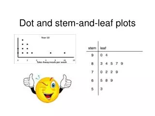
Note 5: Data Display Stem & Leaf – Similar to a bar graph but it has the individual numerical data values as part of the display – the data is ordered, this makes it easy to locate median, UQ, LQ 3 3 4 8 5 10 9 8 8 3 11 2 3 6 7 8 Back to Back Stem & Leaf – useful to compare spread & shape of two data sets 4 2 0 12 1 9 9 3 3 13 0 2 2 14 5 Key: 10 3 means 10.3
Note 6: Cumulative Frequency When dealing with large data sets or grouped data, a cumulative frequency can be used to find medians and quartiles. Cumulative frequency is calculated by ‘accumulating’ the frequencies as we move down the table.
Example: The table shows the number of customers in a small cinema The shaded figure shows that on 25 occasions there were fewer than 40 customers
Lower Quartile = 40 Median = 48 Upper Quartile = 57 What percentage of the time was there 65 or more customers in the cinema? 100 – 86 = 14%