Download
1 / 14
140 likes | 285 Views
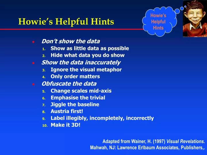
Howie’s Helpful Hints. Don’t show the data Show as little data as possible Hide what data you do show Show the data inaccurately Ignore the visual metaphor Only order matters Obfuscate the data Change scales mid-axis Emphasise the trivial Jiggle the baseline Austria first!

E N D
Howie’s Helpful Hints • Don’t show the data • Show as little data as possible • Hide what data you do show • Show the data inaccurately • Ignore the visual metaphor • Only order matters • Obfuscate the data • Change scales mid-axis • Emphasise the trivial • Jiggle the baseline • Austria first! • Label illegibly, incompletely, incorrectly • Make it 3D! Adapted from Wainer, H. (1997) Visual Revelations. Mahwah, NJ: Lawrence Erlbaum Associates, Publishers,.
2. Hide what data you do show Source: PhD thesis, Monash University
Greeks in Greece Anglo-Celts in Australia Japanese in Japan Swedes in Sweden Greeks in Australia 0.10 0.25 0.50 0.75 1.00 Relative mortality rate (all causes) Clearer version: Drawn using S-plus
0.10 0.25 0.50 0.75 1.00 Relative mortality rate (all causes) What’s the difference? Greeks in Greece Anglo-Celts in Australia Japanese in Japan Swedes in Sweden Greeks in Australia • Rotated by 90o – labels fit & can be read • Logarithmic scale – correct for ratio measure • Removed grid lines, background, legend • Ordered categories by response variable • Monochrome emphasises data, not decoration
3. Ignore the visual metaphor Source: Tufte E. (2001) The Visual Display of Quantitative Information. 2nd Ed. Cheshire: Graphics Press
Source: Pravda, 24 May 1982. Source: Los Angeles Times, 5 August 1979. 4. Only order matters
5. Change scales mid-axis Drawn using MS Excel A common error, often attributable to use of categoricalx-axis, rather than quantitative.More of this later … Source: Andreasson S et al. Cannabis and schizophrenia. A longitudinal study of Swedish conscripts. Lancet. 1987 Dec 26;2(8574):1483-6.
6. Emphasise the trivial Source: US Bureau of Census. Social Indicators IIIcited: Wainer H. Visual Revelations (op cit)
7. Jiggle the baseline Source: Results of 1984 New York Democratic primary election;cited in: Cleveland WS. The Elements of Graphing Data. Monterey: Wadsworth, 1985.
8. Austria first! Drawn using Excel only Note the “hatched” axis, ignoring the clear loss of proportionality for bar-lengths Source: US Bureau of Census. Social Indicators IIIcited: Wainer H. Visual Revelations (op cit)
9. Label illegibly, incompletely, incorrectly Source: Ithaca Times, 7 December 2000cited: http://www.math.yorku.ca/SCS/Gallery/, 21 Nov 2002
Source: Marmot M. From Black to Acheson: two decades of concern with inequalities in health.Int J Epidemiol 2001; 30: 1165-1171 10. Make it 3D! Proportion of the Total Number of Published Papers By Region in All Fields, 1981 - 1996 Source: The Scientist 11[14]:8, Jul. 07, 1997cited: http://www.math.yorku.ca/SCS/Gallery/, 21 Nov 2002
Good 3D & Bad 3D The population of Sweden from 1750-1875 by age groups by Luigi Perozzo, from the Annali di Statistica, 1880,