Download
1 / 10
100 likes | 246 Views
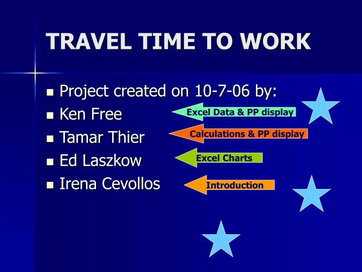
TRAVEL TIME TO WORK. Project created on 10-7-06 by: Ken Free Tamar Thier Ed Laszkow Irena Cevollos. Excel Data & PP display. Calculations & PP display. Excel Charts. Introduction. So… It’s time to head to work. How long does it take someone to get to work anyway?. We. surveyed. 100.

E N D
TRAVEL TIME TO WORK • Project created on 10-7-06 by: • Ken Free • Tamar Thier • Ed Laszkow • Irena Cevollos Excel Data & PP display Calculations& PP display ExcelCharts Introduction
So… It’s time to head to work... How long does it take someone to get to work anyway?
We surveyed 100 random employees : "How many minutes does it take you to get to work?"
Each group member surveyed individuals around their homes and places of work to ensure that the sample was selected over the widest demographic possible. Due to the impersonal nature of our question, it was not difficult to get answers, as people are more willing to share basic information.
Histogram Skewed – Right Distribution -Chart shows the data visually and most frequent time traveled.
Polygon 37 people avg 27 min drive time * Chart shows how frequent each time was traveled.** Midpoint of each frequency is on the X Axis
Ogive Cumulative -Chart shows a cumulative frequency polygon. Ogive holds a running total of frequencies.
Conclusion of Survey • Over 11 days a YEAR are spent on travel to work one way • That works out to 3 weeks spent traveling both to and from work total • The sample taken did not result in a bell shaped curve due to the fact that there wasn’t an opportunity for normal distribution. On average, people tend to work close to home, because of this, the median and mode are a lower number than the mean. However if this survey was done over a larger demographic, a bell shaped curve would have been produced. • The Distribution is Skewed – Right Distribution