Download
1 / 17
170 likes | 250 Views
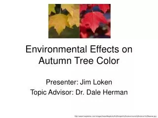
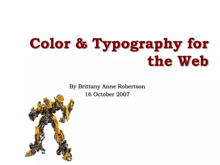
Color & Typography for the Web. By Brittany Anne Robertson 16 October 2007. Why are color & typography important to IA?. Both serve as visual and verbal communication of a site. F-shaped pattern for reading web content. What is typography?.

E N D
Color & Typography for the Web By Brittany Anne Robertson 16 October 2007
Why are color & typography important to IA? • Both serve as visual and verbal communication of a site. • F-shaped pattern for reading web content
What is typography? • The study, design, and usage of fonts and typefaces. !
What is color? • The way our brain interprets the electromagnetic radiation of a wavelength • Different wavelengths are seen as different colors
Typography for the Web • Web page type vs. Print type • Web = 85 dpi or less • Print = 1200 dpi or more • Less useable area on a computer screen than on a page • Page is rebuilt each time it is loaded
Good Typography . . . • Establishes a visual hierarchy . . . by providing visual punctuation and graphic accents that help readers understand relations between prose and pictures, headlines, and subordinate blocks of text
How to Make Good Typography • Typefaces • Serif vs. Sans Serif • Serif = More legible on paper • Sans serif = More legible on screen • x-height; size of typeface • Adaptable typeface = Times New Roman • Some designed for screen: Verdana, Georgia etc. • Great on screen, clunky on paper • Convention: serif for text, sans serif for headlines
More How to Make Good Typography • Type size, 12pt or > • 3 ways:“em” unit, point size, pixel units • Different screens display points differently • User settings may interfere • Case: downstyle • Emphasis: italics, bold, underlined, colored text, CAPITAL LETTERS
Last of How to Make Good Typography • Space & Indentation • Alignment • Left-justified – main text and headlines • Line length • White Space • Leading = 2+point size of type • Paragraphs • To indent: or transparent single-pixel .GIF • Line space: <br />+.GIF or <p>
Color RGB Primary Colors CMYK Secondary Colors Tertiary Colors
Value Hue Color Wheel Tint & Shade Saturation
Using Colors on the Web • Each color = group of 3 dots (R+G+B) • Possible value of each dot from 0 to 255 • 256 x 256 x 256 = 16,777,216 colors! • Hexadecimal system; base of 16 • Value of each dot = two digits • Ex: FF+FF+00 = • Websafe colors – dated • Mathematically calculated: combo of 0%,20%, 40%, 60%, 80% and 100% of primary colors • < 1% users have 256 color screens
Rule o’ Thumb: Use 3 Colors Primary color: sets tone of design Secondary color: “back up” primary color Highlight color: emphasis Using Colors on Your Page Analog Colors Harmonious Complementary Highlight Triad Colorful & Balanced Split Complementary Contrast & Harmony
More Using Colors on Your Page Contrast Colors & Text Value Contrast Hue Contrast Simultaneous Contrast Saturation Contrast
Tools You Can Use • Color Help • http://cssjuice.com/25-popular-color-scheme-and-palette-generators/ • http://cssjuice.com/ • http://www.colorblender.com/ • Color & Text • http://www.ideo.com/visualizer.html • http://typetester.maratz.com/ • Color Accessibility • http://wellstyled.com/tools/colorscheme2/index-en.html
What Did We Learn? Hopefully, what not to do
Resources • Web Style Guide, 2nd edition • http://www.webstyleguide.com/type/index.html • Colors on the Web • http://www.colorsontheweb.com/default.asp • Design: Talkboard glossary • http://www.designtalkboard.com/glossary/ • Bad Typography Page • http://www.jaydax.co.uk/tutorials/webdesign/badpageguide/badpgguide.html • F-shaped Pattern for Reading Web Content • http://www.useit.com/alertbox/reading_pattern.html • Fred Frap’s Page • http://www.fredfrap.com/Booking%20information.htm • Usability.gov • http://www.usability.gov/pdfs/guidelines.html • Pink and Orange Sunburst Picture • http://www.hgu.mrc.ac.uk/Bad/sometext.gif