Download
1 / 19
250 likes | 412 Views
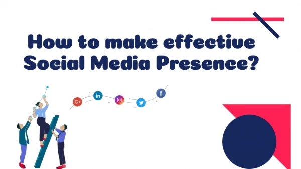
How to Design an Effective Web Presence. -Mykalynn Rowland-. Why design your website?. Your website reflects… you, or business that you are presenting The world revolves around the internet these days important to give good impressions. Why design your website?.

E N D
How to Design an Effective Web Presence -Mykalynn Rowland-
Why design your website? • Your website reflects… • you, or • business that you are presenting • The world revolves around the internet these days • important to give good impressions
Why design your website? • It markets yourself well as a developer/service provider • Makes you look organized/well rounded • Have information about yourself at the click of a mouse; e.g. • resume • portfolios • contact information • drop box • links to anything that describes your type of work etc.
Why is this “bad”? • Bad design can include many things. • Colors • type size • the layout • graphics, etc. • easy it is to use. Is the content well-organized and is the navigation intuitive?
Bad… • http://www.usplastics.com • TOO much going on • WAY too wordy • WHAT is this site about? Contact, order etc… • http://www.rzent.co.nr/ • AWEFUL!
Why is this bad? • Color usage • No bright colors. • Hard on the eyes • Attention on the wrong items. • Its annoying and distracting • Just because you like the colors, does not mean that they are the right ones to use.
Why is this bad? • Navigation • Cluttered • Too many lists, it can get monotonous and annoying to try to sift through • The navigation bar is the same as all the others • Navigation should be the first thing you see. People are there for a REASON
Why is this bad? • Keep it SIMPLE • Hard to read • Confusing • Where do you go first? • The simpler it is, the easier it is, plus the “cleaner” it looks.
Good… • http://webdesignerwall.com/trends/best-of-design-2010 • Design choices • Choose a layout you like and enjoy • Placement of items is crucial • Make something your own! Do not copy! There’s a difference!
Why are these good? • Simplicity! • Easy navigation • Easy reading • No cluttered mess • No irritating of the browser
Tangent… • In art…. • Space and color play BIG roles in design. • Color and space move your eye… • GRID STRUCTURE….it’s kind of a big deal!
Why are these good? • Color choice and typeface choice • Monochromatic color schemes, especially for background use http://colorschemedesigner.com/ • 3 colors is enough, try not to use more • ONLY use 2 typefaces, then use the families of that typefacehttp://unitinteractive.com/blog/2008/06/26/better-css-font-stacks/ • No huge type unless it’s the first thing you want someone to see
Why are these good? • Over all feel & photo usage • You can tell what most sites are about just by looking right at the page or the navigation bar. • The layout is consistent and eye catching • All colors match and present the eye with a cooling canvas to look at. • Photos are strategically placed within the layout
How to achieve GOOD • Don’t annoy your visitors • Grid structure • let the eye flow • look at it all • but easy to navigate • Follow the rules • Keep it simple When in doubt, take it out!
Resources for beginners • http://www.kuler.adobe.com • Taking a photo and creating a color scheme based on the photo • http://colourlovers.com • Every color scheme that is described as “workable” in the art world.
Design Methodology • Research…for a layout, a feel, and colors • What do you want the website to do? • What is your target audience? • Navigation…Stationaryor moving / top or side • Title and typefaces based on audience • Photos and final touches
SAnToS Lab • http://www.santoslab.org What I thought of when I designed this…