Download
1 / 74
740 likes | 863 Views
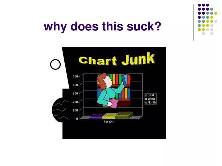
why does this suck?. Information Visualization. Jeffrey Heer UC Berkeley | PARC, Inc. CS160 – 2004.11.22. (includes numerous slides from Marti Hearst, Ed Chi, Stuart Card, and Peter Pirolli). Basic Problem. We live in a new ecology. Scientific Journals.

E N D
Information Visualization Jeffrey Heer UC Berkeley | PARC, Inc. CS160 – 2004.11.22 (includes numerous slides from Marti Hearst, Ed Chi, Stuart Card, and Peter Pirolli)
Basic Problem We live in a new ecology.
Scientific Journals Journals/person increases 10X every 50 years 1000000 100000 Journals 10000 1000 Journals/People x106 100 10 1 0.1 Darwin V. Bush You 0.01 1750 1800 1850 1900 1950 2000 Year
Web Ecologies 1 new server every 2 seconds7.5 new pages per second
Human Capacity 1000000 100000 10000 1000 100 10 1 0.1 Darwin V. Bush You 0.01 1750 1800 1850 1900 1950 2000
Attentional Processes “What information consumes is rather obvious: it consumes the attention of its recipients. Hence a wealth of information creates a poverty of attention, and a need to allocate that attention efficiently among the overabundance of information sources that might consume it.” ~Herb Simon as quoted by Hal Varian Scientific American September 1995
Human-Information Interaction • The real design problem is not increased access to information, but greater efficiency in finding useful information. • Increasing the rate at which people can find and use relevant information improves human intelligence.
Information Visualization • Leverage highly-developed human visual system to achieve rapid understanding of abstract information. 1.2 b/s (Reading) 2.3 b/s (Pictures)
Information Visualization • “Transformation of the symbolic into the geometric” (McCormick et al., 1987) • “... finding the artificial memory that best supports our natural means of perception.'‘ (Bertin, 1983) • The depiction of information using spatial or graphical representations, to facilitate comparison, pattern recognition, change detection, and other cognitive skills by making use of the visual system. (Hearst, 2003)
Why Visualization? • Use the eye for pattern recognition; people good at • scanning • recognizing • remembering images • Graphical elements facilitate comparisons via • length • shape • orientation • texture • Animation shows changes across time • Color helps make distinctions • Aesthetics make the process appealing
Visualization Success Story Mystery: what is causing a cholera epidemic in London in 1854?
Visualization Success Story Illustration of John Snow’s deduction that a cholera epidemic was caused by a bad water pump, circa 1854. Horizontal lines indicate location of deaths. From Visual Explanations by Edward Tufte, Graphics Press, 1997
Visualization Success Story Illustration of John Snow’s deduction that a cholera epidemic was caused by a bad water pump, circa 1854. Horizontal lines indicate location of deaths. From Visual Explanations by Edward Tufte, Graphics Press, 1997
A Visualization Expedition (a tour through past and present)
Starfield Displays Slide adapted from Chris North
Indented Hierarchy Layout Places all items along vertically spaced rows Uses indentation to show parent child relationships Breadth and depth end up fighting for space resources
Reingold-Tilford Layout Top-down layout Uses separate dimensions for breadth and depth tidier drawing of trees - reingold, tilford
TreeMaps Space-filling technique that divides space recursively Segments space according to ‘size’ of children nodes map of the market – smartmoney.com
Cone Trees Tree layout in three dimensions Shadows provide 2D structure Can also make “Balloon Trees” – 2D version of ConeTree cone tree – robertson, mackinlay, and card
Network visualization Often uses physics models (e.g., edges as springs) to perform layout. Can be animated and interacted with.
Network Visualization Skitter, www.caida.org
Data Mountain Supports document organization in a 2.5 dimensional environment.
Designing Visualizations (some tricks of the trade)
Graphical Excellence [Tufte] • the well-designed presentation of interesting data – a matter of substance, of statistics, and of design • consists of complex ideas communicated with clarity, precision and efficiency • is that which gives to the viewer the greatest number of ideas in the shortest time with the least ink in the smallest space • requires telling the truth about the data.
Interactive Tasks [Shneiderman] • Overview: Get an overview of the collection • Zoom: Zoom in on items of interest • Filter: Remove uninteresting items • Details on demand: Select items and get details • Relate: View relationships between items • History: Keep a history of actions for undo, replay, refinement • Extract: Make subcollections
Proposed Data Types • 1D: timelines,… • 2D: maps,… • 3D: volumes,… • Multi-dimensional: databases,… • Hierarchies/Trees: directories,… • Networks/Graphs: web,… • Document collections: digital libraries,… This is useful, but what’s wrong here?
Basic Types of Data • Nominal (qualitative) • (no inherent order) • city names, types of diseases, ... • Ordinal (qualitative) • (ordered, but not at measurable intervals) • first, second, third, … • cold, warm, hot • Mon, Tue, Wed, Thu … • Interval (quantitative) • integers or reals
Ranking of Applicability of Properties for Different Data Types(Mackinlay 88, Not Empirically Verified) QUANT ORDINAL NOMINAL Position Position Position Length Density Color Hue Angle Color Saturation Texture Slope Color Hue Connection Area Texture Containment Volume Connection Density Density Containment Color Saturation Color Saturation Length Shape Color Hue Angle Length
Visualization Design Patterns • Pre-Attentive Patterns • Leverage things that automatically “pop-out” to human attention • Stark contrast in color, shape, size, orientation • Gestalt Properties • Use psychological theories of visual grouping • proximity, similarity, continuity, connectedness, closure, symmetry, common fate, figure/ground separation • High Data Density • Maximize number of items/area of graphic • This is controversial! Whitespace may contribute to good visual design… so balance appropriately. • Small Multiples • Show varying visualizations/patterns adjacent to one another • Enable Comparisons
Visualization Design Patterns • Focus+Context • Highlight regions of current interest, while de-emphasizing but keeping visible surrounding context. • Can visually distort space, or use degree-of-interest function to control what is and isn’t visualized. • Dynamic Queries • Allow rapid refinement of visualization criteria • Range sliders, Query sliders • Panning and Zooming • Navigate large spaces using a camera metaphor • Semantic Zooming • Change content presentation based on zooming level • Hide/reveal additional data in accordance with available space
Software Architectures • The Information Visualization Reference Model [Chi, Card, Mackinlay, Shneiderman]
Evaluating Visualizations • Visualizations are user interfaces, too…established methodologies can be used. • Questions to ask • What tasks do you expect people to perform with the visualization? • What interfaces currently exist for this task? • In what ways do you expect different visualizations to help or hurt aspects of these tasks? • Metrics: task time, success rate, information gained (e.g., test the user, or exploit priming effects), eye tracking.
Evaluating Hyperbolic Trees • The Great CHI’97 Browse-Off: Individual browsers race against the clock to perform various retrieval and comparison tasks. • Hyperbolic Tree won against M$ File Explorer and others. • Can we conclude that it is the better browser? vs.
Evaluating Hyperbolic Trees • No! • Different people operating each browser. • Tasks were not ecologically valid. • Can’t say what is better for what. • PARC researchers did extensive eye-tracking studies uncovering very nuanced visual psychology. • Found Hyperbolic Tree is better when underlying information design (e.g., tree structure and labeling) is better. • In case of CHI Browse Off, the Hyperbolic Tree had a quicker human user “behind the wheel”. • Moral: Exercise judicious study design, but also don’t feel let down if task times are not being radically improved… subtleties abound.
Questions? Jeffrey Heer jheer@cs.berkeley.edu prefuse http://prefuse.sourceforge.net
Accuracy Ranking of Quantitative Perceptual TasksEstimated; only pairwise comparisons have been validated(Mackinlay 88 from Cleveland & McGill)
Interpretations of Visual Properties Some properties can be discriminated more accurately but don’t have intrinsic meaning • Density (Greyscale) Darker -> More • Size / Length / Area Larger -> More • Position Leftmost -> first, Topmost -> first • Hue ??? no intrinsic meaning • Slope ??? no intrinsic meaning