Download
1 / 10
100 likes | 115 Views
The geography of health inequalities Danny Dorling – University of Sheffield. Peter Townsend Memorial Conference , Conway Hall, London, 20-11-2009. Take a long perspective. Peter was born in Middlesbrough 6/4/1928.

E N D
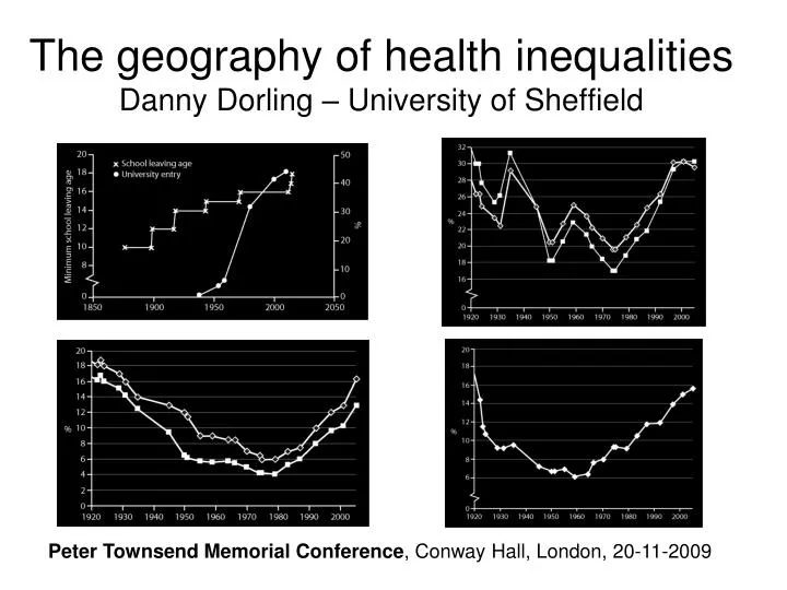
The geography of health inequalitiesDanny Dorling – University of Sheffield Peter Townsend Memorial Conference, Conway Hall, London, 20-11-2009
Take a long perspective Peter was born in Middlesbrough 6/4/1928 his overall verdict on the last decade is unforgiving: "disappointment writ large Peter Townsend 2/4/2008 birth CPAG university
Inequality in mortality: Britain - area Squares: under age 65 mortality rate of the best-off 10% by area is as compared to the average (how much lower). Diamonds: excess mortality the worst-off 30% is than the average. Source Thomas & Dorling, 2009
Income in Britain: richest 1% share Squares: post tax share of all income in Britain received by the best off 1%. Sources: Atkinson (2003, figures 2 and 3), Brewer et al (2008, p. 11). It is likely that the final bonuses brought the 2007/8 level back to 1929…
Voting in Britain: Tory Segregation Proportion of Conservative voters who would have to move constituency for each to have an equal share (1974 average shown: 8.01% in the February election and 10.74% in the October election of that year…) Source Dorling 2010
Inequalities in health – latest figures by area (district gap) Gap in years between the average life expectancy in the worse-off district of Britain and the best-off, al, women, men, Source: ONS various years When the latest figures were released on 21 October 2009 at 9:30 am, for the First time in many years the BBC chose not to report the rise. Instead it lead with “Swine flu vaccination under way” and then “Big variation in life expectancy ”. The ONS press release was titled “Life expectancy continues to rise”.
We need to recognise where we are now – in a kind of denial Consider the predictions of the IMF for public sector deficits and fiscal stimulus plans in 2007-2010. Then consider the geography of the rise in unemployment in the United States from 2004 onwards. There is no inevitability that inequality will rise or fall from now-on. It would be in the direct interests of at least 95% of people for it to fall, but that is no guarantee. Cartoon Credit Matt Buck Hack Cartoons http://www.mattbuckhackcartoons.com One great change 1928-2009 is how much more dependent the UK now is on the USA so it is worth ending by looking at the US.
Map Credit TIP Strategies, Inc. http://tipstrategies.com/archive/geography-of-jobs/
Credits Thanks to Matt Buck Hack Cartoons (http://www.mattbuckhackcartoons.com) and TIP Strategies (http://tipstrategies.com/) for their visual contributions. The slideshow also featured a screenshot from the BBC News website (http://news.bbc.co.uk/) A script for this lecture is available at http://sheffield.ac.uk/geography/staff/dorling_danny/lectures.html SaSI research group http://sasi.group.shef.ac.uk/ SaSI slideshow repository http://www.slideshare.net/geosasi