Download
1 / 36
430 likes | 632 Views
The History of Typography Unit 1B-Year 2.

E N D
The History of Typography Unit 1B-Year 2
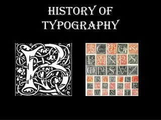
The word typography means “writing with pictures,” as the design of written communications has always depended on visual images. Typography is the selection and arrangement of typeset letters on a printed page. This presentation describes type’s journey from purely visual images to the electronic text we use today. Aa Bb Cc Dd Ee Ff Gg Hh Ii Jj Kk Ll Mm Nn Oo Pp Qq Rr Ss Tt Uu Vv Ww Xx Yy Zz
The earliest known cave paintings were found in Lascaux, France, and are believed to date from 15,000 to 10,000 B.C. Early humans communicated simply, and their written symbols communicated simple concepts as well. These images are called pictographs, symbols that resemble what they signify, in this case, bulls and horses.
Cuneiform consisted of wedge-shaped marks on clay tablets. The Sumerians invented this early writing system around3000 B.C. Originally pictograms expressing literal objects, the symbols became increasingly abstract over the millennia. What do you see in these symbols?
The Egyptians c. 2575 B.C. wrote hieroglyphs (which means “sacred writing”) onto papyrus. These images are ideographs, graphic symbols that represent more abstract ideas. The symbols resemble birds, snakes, insects and other recognizable objects, but depending on their context can mean different things. A duck, for example, might mean, “to keep watch.”
Ancient China gave us inks c. 1200 B.C., used to write on flattened bamboo sticks or silk. The first true paper, made from wood pulp, was invented China in 105 A.D. The Chinese also invented relief printing 1000 years before Gutenberg. But written Chinese, consisting of more than 7,000 ideograph characters was too complex for printing to catch on.
The Phoenicians, c. 1500 B.C. were the first civilization to use symbols that expressed the sounds made by speaking. The Greek alphabet, and hence, all Western alphabets, derive themselves from the Phoenician alphabet. Do you notice anything familiar?
Thats because early Arabic is based on Phoenician! Since the Phoenicians were business traders sailing the Mediterranean, the alphabet influenced all the Mediterranean nations. The location of the middle-east being in the center of the ancient world (between the east and the west) also played a part in the spreading of the alphabet. So that is why the Phoenician alphabet is the mother of the Latin as well as the Arabic script.
How did Arabic develop as a written language? In 1300 BC, the early Phoenician alphabet (consisting of 22 consonants without capitals written from right to left) was born in the city of Byblos on the coastal side of Lebanon. In 1000 BC, the Aramaic alphabet originated from the Phoenician in Aram (Syria and Mesopotamia) which represented the language of the Arameans. In 100 BC, the Nabatean script was born in the city of Petra north of the Red Sea (present day Jordan) and spread all over the middle-east. In 100 AD, the Syriac alphabet (22 letters) was created in Mesopotamia developing also from the Aramaic. Mid of the first century, the early Arabic alphabet was created in Kufa (Iraq). The old kufi (Archaic Kufi) contisted of around 17 lettersforms without diacritic dots or accents. Afterwards the diacritic dots and accents were added in order to help pronunciation and the set of Arabic letters rose to 29 (including the Hamza).
Calligraphic styles: Several Arabic calligraphic styles developed from different Arabian cities, different writing techniques and different writing tools. The most known Arabic calligraphic styles are: 1-Kufi (Old Kufi & Ornamented geometric Kufi), 2-Thuluth, 3-Diwani & Diwani Djeli, 4-Naskh, 5-Persian, 6-Ruqaa and 7-Maghrébi.
With the birth of Islam, the Quran became the reason to reform all the Arabic scripts found in Arabia. One unified well structured Arabic script with 29 letters was developed for the writing of the holy scripts of the Quran in the 7th century AD. Primarily the Quran was written with the Quranic kufi script and later it was written with the Quranic Naskh style. From its creation in the Arabian Peninsula, the Arabic alphabet spread to all of the middle-east, northern Africa and even reached Spain due to Islamic conquests. Since Arabic was the language of the Quran hence of God, all the occupied nations were forced to use the Arabic language.
The Greeks added more letters to the alphabet, notably vowels. The Romans developed the Greek alphabet into the world’s most widely used writing system today. Roman stonecutters created serifs, short finishing strokes at the ends of the main strokes of the letters, following the brush-drawn letterforms painted on the stone before carving.
An example of early Roman inscription still exists on the Column of Trajan, erected in 113 A.D. in Rome. The letters are straight lines, rounded curves, thick and thin strokes and sharp serifs.
During the 3rd century A.D., medieval scribes wrote important books by hand. During this time Roman emperor Constantine ordered 50 copies of the Bible sent to all the churches of Asia Minor.
Emperor Charlemagne called for a standard writing style to help spread the small literate class in medieval France. The minuscule script letters were clear and legible. Carolingian scribes developed the ampersand (&) and question mark (?).
Blackletter, a heavy and highly ornate script, became popular in Europe from 1150 until the Renaissance. As opposed to Carolingian script, Blackletter script could be written more quickly and required less space. You might also know Blackletter as “Gothic” script.
Johann Gutenberg invented handset movable type in Mainz, Germany in 1450 toward the beginning of the Renaissance. For the first time in history, books could be produced quickly and inexpensively. This great invention contributed to expanding literacy and growing knowledge throughout the world. Almost anyone, not just royalty, could own a book and learn to read.
Gutenberg’s first book was the 42-line Gutenberg Bible. His first typeface imitated the hand-drawn Blackletter script popular in Germany at that time.
In handset type, the individual type pieces are selected from a type case and put into a composing stick. The type compositor places the letters upside down and fills the line from left to right. When finished, he adds a strip of lead and starts the next line above the first line.
When the column of text is completed, it is locked up in a metal frame called a chase, inked and run on a letterpress. After the job is run the type is cleaned and redistributed into the type case. Setting up a single page took time, but once the page was set, hundreds and thousands of copies could be printed quickly.
The “Golden Age” of typeface design began. In 1480, Claude Garamond designed a beautiful Old Style typeface based on the handwriting style of Italian scribes. This beautiful, classic typeface can be found in electronic form today.
William Caslon designed a very legible Old Style typeface in 1720. It became so popular the phrase, “when in doubt, set it in Caslon,” became common.
In 1750 John Baskerville designed a typeface with vertical stress, and sharper serifs. This style became known as Transitional.
Giambattista Bodoni further refined stresses and serifs on his typeface to create a style known as Modern in 1791.
Alois Senefelder invented lithography in 1796, a printing technique whereby the image and non-image areas are on the same surface. Based on the principle that grease and water don't mix, an artist writes on a perfectly smooth stone with a greasy pencil, and then covers the stone with water, which is repelled from the pencil but attracted to the porous stone.
Ink is applied to the stone and is repelled by the water, but sticks to the pencil marks. Paper is then applied, and the ink transfers to the paper, forming an image.
In 1815, Vincent Figgins designed the first Slab Serif typeface. Because Napoleon had made several expeditions to Egypt around that time, and he used Slab Serif on signs to communicate with his generals many miles away, this style of typeface became known as Egyptian, and came into vogue in Europe upon his return.
William Caslon IV designed the first Sans Serif typeface in 1816. Sans Serif is French for "without serifs."
Slab serif Sans serif
In 1886, Ottmar Mergenthaler invented the Linotype, the first machine for setting type using a keyboard. The keyboard operator strikes a key, dropping a matrix with a recessed letterform from the overhead magazine.
The matrices are collected to form a line of type. Then molten lead is shot into the recesses to form a slug. When they solidify, the slugs are collected into a chase, inked and run on a letterpress. The matrices are redistributed back into the magazine automatically, and the slugs are melted down and used again for future projects.
In 1897, two printing technologies existed side-by-side: letterpress and lithography. The letterpress technology forced the designer to work within a rigid grid because the individual blocks needed strong pressure from all four sides in order to be held together in a chase. On the other hand, lithography freed artists to experiment with asymmetrical compositions, curving baselines and distorted type.
In the sixties, phototypesetting became popular due to the development of computers by IBM. The Internet was born as a military research project. Eventually, it was opened to universities, government agencies and hobbyists, who sent email and joined discussion groups.
Apple introduced the Macintosh in 1984. With built-in graphics and networking, it became the first graphics computer and launched the desktop publishing revolution along with Aldus PageMaker and Adobe PostScript. QuarkXPress, Adobe Illustrator, and Adobe Photoshop became the standard software applications for desktop publishing.
1985—Small specialized foundries such as FontBureau, Emigre, T-26 and FontShop emerged and introduced innovative and cutting-edge type designs.