Download
1 / 1
10 likes | 105 Views
Abstract. Results. Conclusions. Methods. Emphasize points with italics or in boldface . Underlining is less attractive and can be distracting . Less is often more. Make effective use of negative space. Figures can be produced directly in PowerPoint or imported from other programs.

E N D
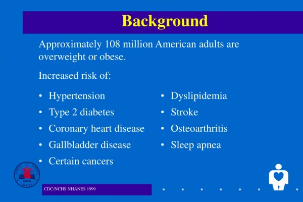
Abstract Results Conclusions Methods • Emphasize points with italics or in boldface. • Underlining is less attractive and can be distracting. • Less is often more. Make effective use of negative space. • Figures can be produced directly in PowerPoint or imported from other programs. • Background. This poster template will scale up to 42 inches by 66 inches. 42 inches is the widest we can print. (Longer formats are possible, but the template needs adjustment.) • Objectives. To use this template, simply replace the text in these sections. Check LDI website first for updates to template or to process: www.upenn.edu/ldi. • Methods. Download template and insert your content. • Results. Send to Jennifer O’Donohue-Sye (odonohu2@wharton.upenn.edu), who will work with you to produce the final poster. This often takes some back and forth discussion. Let Jennifer know name and date of event and if we can post your poster on LDI’s web site. • Conclusions. Contact us a few weeks in advance or we may not be able to help you. Don’t assume we can meet a deadline unless you have communicated with us about it first. • When writing for a poster, simplify everything and avoid over-writing. • The best posters are designed with empathy: Put yourself in the position of the audience and think about what they will want to know. • Do not start from the perspective of what you want to tell people. That perspective leads people to make posters that are too busy and have too much information. • Note that we suggest that the Abstract, Methods, Results, and Conclusion sections line up at the heads of the four columns. • Although potentially constraining, this design introduces some organizational discipline that may be useful to viewers. Policy Implications • A few take-aways or next steps can help position your presentation or make your points more enduring. • Depending upon your goals, you might come with a stack of business cards, copies of your abstract, or even copies of a completed manuscript to give away to interested parties. Attach them to your poster in the bottom right or make them available in other ways. • If you have suggestions for improving this template or this process, please let us know. Background • This template contains some style and format suggestions. LDI can work with you to help you achieve your goals. • We recommend the white background for clarity and simplicity, but a blue background is also available. Objectives Note that for small text, a serifed font is easier to read. It is possible to delete this section by selecting the text box and hitting the delete key. Study title written out in sentence case, which means that only the first letter of the first word is capitalized. This make the title more readable. (Never use all capitals.) Author Names Author Names Author Names Author Names Author Names Author Names Author Names Author Names Author Affiliations Author Affiliations Author Affiliations Author Affiliations Author Affiliations Author Affiliations Author Affiliations Figure 1 Table 1: Sample Table • Imported figures and photographs often work well if saved in jpeg format. A grey border can soften a photograph’s visual impression in the poster. • Follow principles of Edward Tufte and avoid “chart junk” and unnecessary ink in creating charts. • For example, avoid three dimensional bar graphs or pie charts when presenting two dimensional data. • Avoid harsh contrasting colors that create visual vibration. • Avoid images from the web. They are low resolution and become “pixilated” on enlargement. • Figures can be produced directly in PowerPoint or imported from other programs, like Excel.. • Graphs produced in scientific graphic programs should be saved in jpeg or tiff format before inserting. Additional logo here, if desired