Download
1 / 12
120 likes | 124 Views
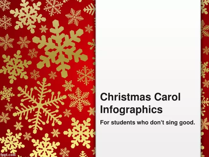
Christmas Carol Infographics. For students who don ’ t sing good. So you think you have the X Factor? You ’ re a Pop Idol in waiting? You ’ re the next… erm … Wham!. Christmas Carols. I ’ d ask you to prove it, but ‘ tis the season for Christmas Carols.

E N D
Christmas CarolInfographics For students who don’t sing good.
So you think you have the X Factor? • You’re a Pop Idol in waiting? • You’re the next… erm … Wham!
Christmas Carols • I’d ask you to prove it, but ‘tis the season for Christmas Carols. • And Christmas Carols can be HARD to sing…
Just how difficult are they? • Well, let’s find out. • Analyse your Christmas Carol. • Create an infographic that shows me the frequency of each note • Then I’ll know if it’s in my range…
How to make a cool infographic… • First, create a tally chart including the frequency of each note in your carol like so…
But I’ve got Sharps and Flats! • Ignore those unless you want to be EXTRA clever. Here’s a break down of what each note looks like if you aren’t sure…
So by the end of this bit… • You’ll have something like this: • Add the third and fourth columns.
Now the cool bit… • You’re going to need a compass. • Draw and cut out a circle with radius 10cm • This is equivalent to your “100%” • Draw and cut out a second circle (in a different colour) with a radius equivalent to your second largest cumulative percentage. (e.g if it’s 70%, radius = 7cm) etc • You are creating an infographic made of concentric circles
Mount your circles on top of each other… • This is called making your circles concentric (they all have the same centre point) • Label each circle with the note it represents • Write the name of yourcarol on the back.
Alternatives… • You can do this all on one piece of paper, then colour in each concentric circle if you like. • You could make your own version of this infographic, using squares or triangles instead of circles… be creative!