Download
1 / 6
60 likes | 178 Views
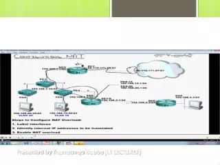
Show Me: Automatic Presentation for Visual Analysis. Jock Mackinlay, Pat Hanrahan, Chris Stolte to be presented at InfoVis 2007. Summary. Visual analysis process in Tableau: Analyst specifies each field via “Add to Sheet”.

E N D
Show Me: Automatic Presentation for Visual Analysis Jock Mackinlay, Pat Hanrahan, Chris Stolte to be presented at InfoVis 2007
Summary • Visual analysis process in Tableau: • Analyst specifies each field via “Add to Sheet”. • Automatic Marks chooses a good/best viz based on characteristics of those fields • Show Me & Show Me Alternatives: • Developed to streamline the analysis process, focus on the user experience • Analyst selects many fields at once • Sees many valid visualizations • Analyst chooses the preferred
Summary • Goal: Focus on the user experience to support the flow of visual analysis • Evaluation: • Informal– from customer feedback, employees • Semi-formal– used UI logs from beta testers and “active users” • Three conclusions: • Automatic Marks is mostly correct, 6.8% error rate • Skilled users are not using “Add to Sheet” • Show Me/Show Me Alternatives is modestly used • “We aren’t getting negative feedback about “Show Me”. If “Show Me” is being used by skilled users, then it must be at least kinda good.”
Good Things • The software is described in good detail • The UI follows good principles • Quantity user data have been collected
Room for Improvement • The paper required a lot of software description and definitions • The chart types really provided too much detail and could have been condensed • Who is the target audience– felt more like a user manual or white paper rather than a research paper • The evaluation
Discussion Topics • How to define the criteria for “Skilled Users” • How does this software support both novice and skilled users? • What kind of data could be captured that could support evaluating Show Me/SMA? • How can users be involved in improving the software? (Interviews vs. logging)