Download
1 / 24
240 likes | 315 Views
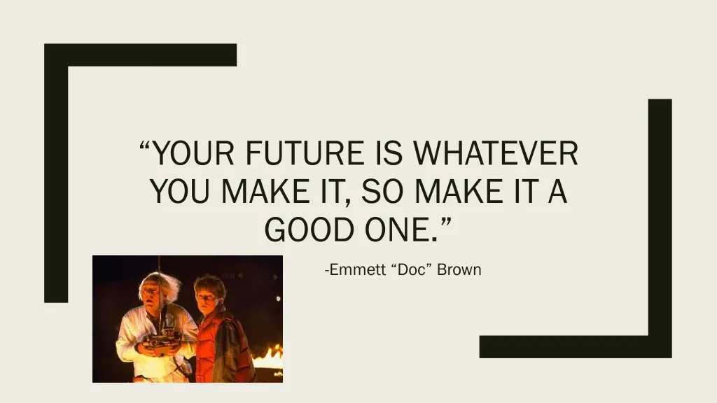
“Your Future is Whatever You Make it, so make it a good one.”. -Emmett “Doc” Brown. Today. Brochure Discussion Graphic Concepts and Examples. Friday and the Weekend. Poster and Website Analysis Work on a mock up/rough draft of your poster or brochure to class on Monday for group activity

E N D
“Your Future is Whatever You Make it, so make it a good one.” -Emmett “Doc” Brown
Today • Brochure Discussion • Graphic Concepts and Examples
Friday and the Weekend • Poster and Website Analysis • Work on a mock up/rough draft of your poster or brochure to class on Monday for group activity • Email me which medium you will be using and which paper you will be using
Presentation Dates • Monday: • Brandon • Wilfredo • Eric • Alexis • Aaron • Dylan • Kyle • Richa • Wednesday: • Hannah McGuinness • Marco • Mohammad • Lucas • Hunter • Madison • Colton • Mireille • Friday: • Kortni • Xuewen • Galaxy • Hannah Madsen • Julianna • Sheng Be advised that missing your presentation will result in an F for that portion of the assignment, there are no make-up days. Missing due to flights leaving for home is not an excused absence and you will be counted absent from class.
Questions for Thought • How does your brochure utilize the terms we discussed? • Are there things that are missing? • How do the colors used reflect the meaning of the brochure? • Who do you think the intended audience is for this? • Do you fall into the intended audience? • Do you think that this brochure is successfully reaching its target audience? Why or why not? • How do you feel when looking at the brochure? • What about it interests you? Why did you choose this brochure?
Brochures: • Six panels of design space • Requires planning for stand-alone sections such as the cover flap, as well as planning for how the flaps will look when viewed together • The brochures are better for large amounts of text-based information • Important: do not just copy and paste from your paper
Posters: • They have only one large design space on which to create your presentation • Allow for flexibility with photos and graphics • Relies more on visual elements than text
Quiz Time!What genre, poster or brochure, would be the better choice based on each statement below? • You want to showcase a student organization and explain the group’s purpose, recent activities, and how to join. • You plan to profile the Gold Star Hall in Memorial Union and have a lot of detailed photos to work with. • You have equal amounts of visual and textual elements about Reiman Gardens and their projects to work with.
Vocabulary of the Form • Composition: The arrangement of elements on a page. • Design element: One aspect of a design (a photo, a text block, a label or caption, etc.) • Visual hierarchy: the order in which the content in a visual design should be viewed • Chunking: dividing information in small, manageable pieces • Positive space: Any area of a design that appears to have a form or object in it. • Negative space: All remaining space (the background or unused space).
Visual Hierarchy • What information is most important in the design? • Differentiate the most important element from the others in the design by relative size, prominent placement, and/or color • To use color: choose one hue and use several saturation levels to designate importance • Titles, captions, bullet points
Using Gridlines • Turn on the gridlines in either PowerPoint or Word (or other design software) • Use these liens to help you properly spaced and aligned in the way that you want • These can also help you determine where the middle of the page or graphic is
Chunking • Chunks make it easier for your audience to process and remember the visual • The ideal number of chunks of information is no more than nine • Lines, borders, colors, and shading can be used as a divider between pieces of information can help break your piece into chunks
Positive or Negative Space • Negative space contributes as much to composition as positive spaces • A lack of negative space can make a design appear “busy” and confusing
Photo Considerations • Consider how large a photo will be in the finished product before using it. • Small photos may not be the best choice for a standard size brochure but maybe more effective in a poster • Choose clear and focused photos • Use cropping to create a more effective photo for your visual • The same photo can make different impressions based on how loosely or tightly it is cropped
Vocabulary • Typeface: The style of a particular group of letters. (Times New Roman) • Font: All of the characteristics about a typeface in a given design. (Times New Roman 22pt bold) • Serif : The small lines on the edges of letters in typefaces such as Times New Roman and Baskerville. • Sans serif: Typefaces that do not have serifs such as Arial or Geneva. • Legibility: the degree to which something is easy to read
Vocabulary • Primary colors: these colors are used to make all other colors, they cannot be made by mixing other colors (red, blue, and yellow) • Secondary colors: colors made by mixing two primary colors (orange, green, and violet) • Tertiary colors: colors made by mixing one primary color and one secondary color, such as yellow-green • Hue: the generic name of a color (red) • Tone: how light or dark a color is, adding white is a tint, adding black is a shade
Vocabulary Continued • Analogous colors: colors next to each other on the color wheel (blue and violet) • Complementary colors: colors opposite each other on the color wheel (yellow and violet)
Quiz Time! • Which of these colors would make the best choice for a background color? • Using that choice as your background color, which of these colors would create the most color contrast if used for the text • What is the suggested number of hues in a color scheme to tie the elements of your design together?