Download
1 / 24
260 likes | 479 Views
13.7 Interpret Stem-and-Leaf Plots and Histograms. Essential Question: How do you make stem-and-leaf plots and histograms?. 1. The data gives the ages of people in an art class. Find the mean, median, and mode of the data. 38, 15, 13, 32, 13, 17, 29, 43. 2.

E N D
13.7 Interpret Stem-and-Leaf Plots and Histograms Essential Question: How do you make stem-and-leaf plots and histograms?
1. The data gives the ages of people in an art class. Find the mean, median, and mode of the data. 38, 15, 13, 32, 13, 17, 29, 43 2. Find the range and the mean absolute deviation of the data. 8, 3, 3, 8, 9, 2, 3 6, about 2.41 mean: 25, median: 23, mode: 13 ANSWER ANSWER Lesson 13.7, For use with pages 881-886 Warm-up Exercises
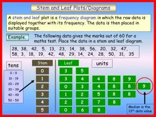
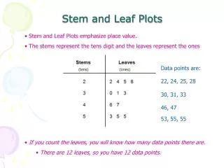
Stem-and-Leaf Plots • What do you see here? • Data display that organizes data based on their digits • Key • Stem = Leading digit(s) on the left • Leaf = Last single digit on the right
Frequency Tables • What do you see here? • Counts of different categories of data that are all ranges of data
What do you see here? • Visual comparison of different categories of data showing each with a bar whose length is related to its frequency • No gaps between bars Histograms
EXAMPLE 1 Make a stem-and-leaf plot Baseball The number of home runs hit by the 20 baseball players with the best single-season batting averages in Major League Baseball since 1900 are listed below. Make a stem-and-leaf plot of the data. 14, 25, 8, 8, 7, 7, 19, 37, 39, 18, 42, 23, 4, 32, 14, 21, 3, 12, 19, 41
EXAMPLE 1 Make a stem-and-leaf plot SOLUTION Separate the data into stems and leaves. STEP1: Home Runs
EXAMPLE 1 Make a stem-and-leaf plot Write the leaves in increasing order STEP2: Home Runs
1. U.S. History for Example 1 GUIDED PRACTICE The years in which each of the first 20 states were admitted to the Union are listed below. Make a stem-and-leaf plot of the years. 1788, 1787, 1788, 1816, 1792, 1812, 1788, 1788, 1817, 1788, 1787, 1788, 1789, 1803, 1787, 1790, 1788, 1796, 1791, 1788
Stem Leaves 178 8 7 8 8 8 7 8 7 8 8 9 179 2 0 6 1 180 3 181 6 2 7 Key: 178 | 8 = Year 1788 for Example 1 GUIDED PRACTICE SOLUTION Separate the data into stems and leaves. STEP1: Years
Stem Leaves 178 7 7 7 8 8 8 8 8 8 8 9 179 0 1 2 6 180 3 181 2 6 7 Key: 178 | 8 = Year 1788 for Example 1 GUIDED PRACTICE Write the leaves in increasing order STEP2: Years
2. Reasoning ANSWER The data are clustered from 3–19. Over half of the values are from 3–19. for Example 1 GUIDED PRACTICE In Example 1, describe the distribution of the data on the intervals represented by the stems. Are the data clustered together in a noticeable way? Explain.
Gymnastics EXAMPLE 2 Interpret a stem-and-leaf plot The back-to-back stem-and-leaf plot shows the ages of members of the U.S men’s and women’s 2004 Olympic gymnastics teams. Compare the ages of the gymnasts on the two teams.
EXAMPLE 2 Interpret a stem-and-leaf plot SOLUTION Consider the distribution of the data. The interval for 10–19 years old contains more than half of the female gymnasts. The interval for 20–29 years old contains more than half of the male gymnasts. The clustering of the data shows that the men’s team was generally older than the women’s team.
Choose intervals of equal size that cover all of the data values. Organize the data using a frequency table. EXAMPLE 3 Make a histogram Sandwich Prices The prices (in dollars) of sandwiches at a restaurant are listed below. Make a histogram of the data. 4.00, 4.00, 4.25, 4.50, 4.75, 4.25, 5.95, 5.50, 5.50, 5.75 SOLUTION STEP 1:
Draw the bars of the histogram using the intervals from the frequency table. EXAMPLE 3 Make a histogram STEP 2:
Television 3. The back-to-back stem-and-leaf plot shows the percents of students in 24 countries who report watching television for 4 or more hours each day. Compare the data for female and male students. for Examples 2 and 3 GUIDED PRACTICE
ANSWER Most of the data for the females is between 10% and 30%. While most of the data for males is between 20% and 40%. There is considerable overlap, but in general the male students watch more television then do the female students. for Examples 2 and 3 GUIDED PRACTICE
Precipitation 4. for Examples 2 and 3 GUIDED PRACTICE The average number of days each month with precipitation of 0.01 inch or more in Buffalo, New York, are 20, 17, 16, 14, 13, 11, 10, 10, 11, 12, 16, and 19. Make a histogram of the data. SOLUTION Stem Leaves 1 7 6 4 3 1 0 0 1 2 6 9 0 2 Key: 1 | 7 = 17 days
How do you make stem-and-leaf plots and histograms? Essential Question:
Benchmark Skills: • Finding Probabilities of Unordered Events Using Combinations • Finding Probabilities of Compound Events Quiz – Lessons 13.3 to 13.4
Textbook p. 883-885 Independent Practice