Download
1 / 13
190 likes | 591 Views
Defined in the AWT. Defined in Swing. Layout Managers. A layout manager is an object that determines the way that components are arranged in a container There are several predefined layout managers defined in the Java standard class library:. Flow Layout Border Layout Card Layout

E N D
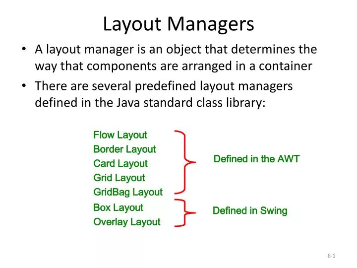
Defined in the AWT Defined in Swing Layout Managers • A layout manager is an object that determines the way that components are arranged in a container • There are several predefined layout managers defined in the Java standard class library: Flow Layout Border Layout Card Layout Grid Layout GridBag Layout Box Layout Overlay Layout
Layout Managers • Every container has a default layout manager, but we can explicitly set the layout manager as well • Each layout manager has its own particular rules governing how the components will be arranged • Some layout managers pay attention to a component's preferred size or alignment, while others do not • A layout manager attempts to adjust the layout as components are added and as containers are resized
Layout Managers • We can use the setLayout method of a container to change its layout manager JPanel panel = new JPanel(); panel.setLayout(new BorderLayout()); • The following example uses a tabbed pane, a container which permits one of several panes to be selected • See LayoutDemo.java • See IntroPanel.java
Flow Layout • Flow layout puts as many components as possible on a row, then moves to the next row • Rows are created as needed to accommodate all of the components • Components are displayed in the order they are added to the container • Each row of components is centered horizontally in the window by default, but could also be aligned left or right • Also, the horizontal and vertical gaps between the components can be explicitly set • See FlowPanel.java
North West Center East South Border Layout • A border layout defines five areas into which components can be added
Border Layout • Each area displays one component (which could be a container such as a JPanel) • Each of the four outer areas enlarges as needed to accommodate the component added to it • If nothing is added to the outer areas, they take up no space and other areas expand to fill the void • The center area expands to fill space as needed • See BorderPanel.java
Grid Layout • A grid layout presents a container’s components in a rectangular grid of rows and columns • One component is placed in each cell of the grid, and all cells have the same size • As components are added to the container, they fill the grid from left-to-right and top-to-bottom (by default) • The size of each cell is determined by the overall size of the container • See GridPanel.java
Box Layout • A box layout organizes components horizontally (in one row) or vertically (in one column) • Components are placed top-to-bottom or left-to-right in the order in which they are added to the container • By combining multiple containers using box layout, many different configurations can be created • Multiple containers with box layouts are often preferred to one container that uses the more complicated gridbag layout manager
Box Layout • Invisible components can be added to a box layout container to take up space between components • Rigid areas have a fixed size • Glue specifies where excess space should go • A rigid area is created using the createRigidArea method of the Box class • Glue is created using the createHorizontalGlue or createVerticalGlue methods • See BoxPanel.java
Borders • A border can be put around any Swing component to define how the edges of the component should be drawn • Borders can be used effectively to group components visually • The BorderFactory class contains several static methods for creating border objects • A border is applied to a component using the setBorder method
Borders • An empty border • buffers the space around the edge of a component • otherwise has no visual effect • A line border • surrounds the component with a simple line • the line's color and thickness can be specified • An etched border • creates the effect of an etched groove around a component • uses colors for the highlight and shadow
Borders • A bevel border • can be raised or lowered • uses colors for the outer and inner highlights and shadows • A titled border • places a title on or around the border • the title can be oriented in many ways • A matte border • specifies the sizes of the top, left, bottom, and right edges of the border separately • uses either a solid color or an image
Borders • A compound border • is a combination of two borders • one or both of the borders can be a compound border • See BorderDemo.java