Download
1 / 22
220 likes | 314 Views
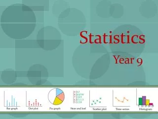
Statistics. Types. Descriptive statistics -graphs and averages. 2. Inferential statistics. -populations and samples. Variables. 1. Qualitative. 2. Quantitative. a. Discrete. b. Continuous. 4 Levels of Measurement. 1. Nominal level. - data is sorted into classes.

E N D
Statistics Types • Descriptive statistics -graphs and averages 2. Inferential statistics -populations and samples
Variables 1. Qualitative 2. Quantitative a. Discrete b. Continuous
4 Levels of Measurement 1. Nominal level - data is sorted into classes 2. Ordinal level - data is ranked 3. Interval level - difference between values is a constant size. 4. Ratio level - a meaningful zero point - the ratio of two values is meaningful
Identify the Measurement Scale: 11. classification of computer makes 12. the temperature readings in Washington, DC 13. college major 14. number of traffic fatalities 15. military rank. 16. time required to complete a crossword puzzle 17. order of finish in the 2001 Indianapolis 500 18. number of people at a board of directors meeting 19. years in which Huntington Bank stock split 20. the color of the students’ hair in this class
Statistics Types • Descriptive statistics -graphs and averages 2. Inferential statistics -populations and samples organizing and grouping into meaningful form: Frequency Distribution
Frequency Distribution Vocabulary • Frequency distribution – organizing and grouping into meaningful form • Classes – divisions in the data • Class interval- The size or width of the class • Class frequency- The number of observations in each class • Class midpoint – halfway between the upper and lower limits • Relative class frequency-Shows what percent each class is of the total number of observations
Constructing Frequency Distributions 1. The class intervals should be equal 2. i = H-L/k 3. General rule 5 – 15 classes 4. 2k rule for number of classes 5. Lower limit of 1st class should be a multiple of the interval 6. Avoid overlapping class limits 7. Avoid open-ended classes
Frequency Distribution 1. Number of classes or class interval size of the class H-L k i > 2. Put observations in correct class 3. Count the number in each class
Example 1. Number of tries it took members of the last Statistics class to pass i H L k
Statistics 1. Class frequency -observations per class 2. Class midpoint -halfway between upper and lower class limit 3. Relative Class frequency – what percent each class is of the total number
Relative Class Frequency Divide each class frequency by total frequency
Histogram frequencies marked by heights of the bars years 6 5 4 3 2 1 1 0 7 3 5 9 11 Length of Service
Frequency Polygon line segments connect points at midpoints years 6 5 4 3 2 1 1 0 7 3 5 9 11 13 Length of Service
Cumulative Frequency Distribution line segments connect points at midpoints years 100% 15 10 5 1 0 7 3 5 9 11 Length of Service
Dr. Tillman is Dean of the School of Business Socastee University. He wishes prepare to a report showing the number of hours per week students spend studying. He selects a random sample of 30 students and determines the number of hours each student studied last week. 15.0, 23.7, 19.7, 15.4, 18.3, 23.0, 14.2, 20.8, 13.5, 20.7, 17.4, 18.6, 12.9, 20.3, 13.7, 21.4, 18.3, 29.8, 17.1, 18.9, 10.3, 26.1, 15.7, 14.0, 17.8, 33.8, 23.2, 12.9, 27.1, 16.6. Organize the data into a frequency distribution.
15.0, 23.7, 19.7, 15.4, 18.3, 23.0, 14.2, 20.8, 13.5, 20.7, 17.4, 18.6, 12.9, 20.3, 13.7, 21.4, 18.3, 29.8, 17.1, 18.9, 10.3, 26.1, 15.7, 14.0, 17.8, 33.8, 23.2, 12.9, 27.1, 16.6. H L n k i
Line graphs are typically used to show the change or trend in a variable over time.
A Bar Chart can be used to depict any of the levels of measurement (nominal, ordinal, interval, or ratio). • Construct a bar chart for the number of unemployed per 100,000 population for selected cities during 2001
A Pie Chart is useful for displaying a relative frequency distribution. A circle is divided proportionally to the relative frequency and portions of the circle are allocated for the different groups. A sample of 200 runners were asked to indicate their favorite type of running shoe. Draw a pie chart based on the following information.