Download
1 / 12
120 likes | 226 Views
The adversiment. FOOOD ADVERSITING. Raquel Lorenzo Vidal Alberto Sueiro Fernandez Marta García Suárez Marta Otero Fernández Antón Torres Rosal. I am loving it! (Mc Donalds ).

E N D
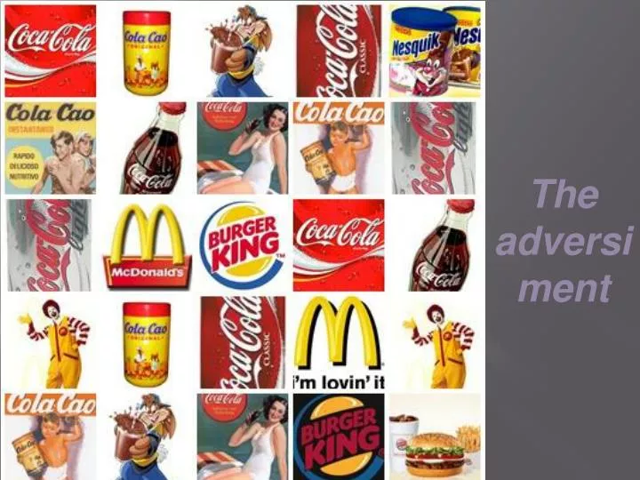
The adversiment
FOOOD ADVERSITING. • Raquel Lorenzo Vidal • Alberto SueiroFernandez • Marta García Suárez • Marta Otero Fernández • Antón Torres Rosal
I am lovingit!(Mc Donalds) • There have been many McDonald's advertising campaigns and slogans over the years. The company is one of the most prevalent fast food advertisers. The purpose of the image has always been "portraying warmth and a real slice of every day life." Its TV ads, showing various people engaging in popular activities, usually reflect the season and time period. Finally, they have never in their advertising history used negative or comparison ads pertaining to any of their competitors; the ads have always focused only on McDonalds alone.
Mc Donalds(Before and now) Before Mc Donalds logo wasnotmuchshowyand notmuchacquaintance. Now Mc Donalds logo isshowy and more acquaintance
Haveityourway.(Burguer King) • Logos: To establish a brand identity for its children's products, Burger King created a separate logo for its children's products with the introduction of its Burger King Kid's Club in 1990. The original logo, an inverted triangle with a blue "sign", was part of the new kid's program and was used in television and print advertising; signage; and toy and meal packaging. Through the life of the program they changed the logo several times and introduced several local versions in its international market. In 1996, the company replaced the original logo with one that resembled its corporate logo, the "bun halves" logo. The new logo featured the original Burger King text logo on a single line with the kids' club text under it on two lines.
BUGER KING (Before and now) Beforeburgerking logo waswhite and andblackand notmuchloud. Nowburgerking logo iscolour and more loud.
LAYS. • Lay's is the brand name for a number of potato chip varieties as well as the name of the company that founded the chip brand in 1938. Lay's chips are marketed as a division of Frito-Lay, a company owned by PepsiCo Inc. since 1965. Other brands in the Frito-Lay group include Fritos, Doritos, Ruffles, Cheetos and Rold Gold pretzels.
LAYS(Before and now). BeforeLays logo wasalmost similar at new.Thecoloursweredull. Nowlays logo isalmost similar at old.Thecolours are loud.
Cola-Cao’ssong. http://video.google.es/videosearch?gbv=2&hl=es&q=colacao&ndsp=18&ie=UTF-8&sa=N&tab=iv#
Cola-Cao(Before and now) Before Cola-Cao box was a nuisance. Now Cola-Cao box is a plastic
Glosary: • Alone: solo/solamente. • Purpase: propósito. • Engaging: atractivo/simpàtico. • Showy: