Download
1 / 11
260 likes | 943 Views
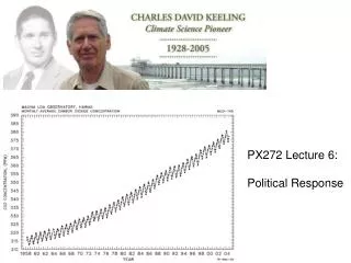
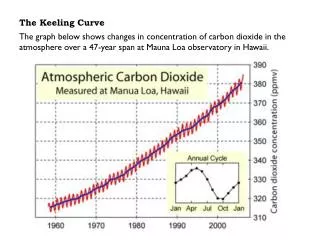
The Keeling Curve. The graph below shows changes in concentration of carbon dioxide in the atmosphere over a 47-year span at Mauna Loa observatory in Hawaii. Question 1.

E N D
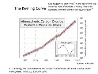
The Keeling Curve The graph below shows changes in concentration of carbon dioxide in the atmosphere over a 47-year span at Mauna Loa observatory in Hawaii.
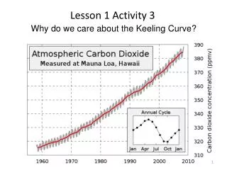
Question 1 Why do you think this graph shows atmospheric carbon dioxide levels decreasing in the summer and fall and carbon dioxide levels increasing in the winter and spring? Earth is closer or further from the Sun at these times of the year There is more plant activity in the summer and fall Humans produce more CO2 in the winter months
Question 2 Why do you think the levels of carbon dioxide in the atmosphere have increased from 1960 to present? Increasing volcanic activity and natural cycling of carbon Decreasing number of plants to absorb CO2 from the atmosphere Increasing amounts of fossil fuels burned
Question 3 What would graph look like if these measurements were taken at the North or South pole? The graph would be about the same There would be a greater increase between 1960 and 2000 The annual fluctuation would be smaller The annual fluctuation would be larger
Question 1 Why do you think this graph shows atmospheric carbon dioxide levels decreasing in the summer and fall and carbon dioxide levels increasing in the winter and spring? Earth is closer or further from the Sun at these times of the year There is more plant activity in the summer and fall Humans produce more CO2 in the winter months
Question 1 Why do you think this graph shows atmospheric carbon dioxide levels decreasing in the summer and fall and carbon dioxide levels increasing in the winter and spring? Earth is closer or further from the Sun at these times of the year There is more plant activity in the summer and fall Humans produce more CO2 in the winter months
Question 2 Why do you think the levels of carbon dioxide in the atmosphere have increased from 1960 to present? Increasing volcanic activity and natural cycling of carbon Decreasing number of plants to absorb CO2 from the atmosphere Increasing amounts of fossil fuels burned
Question 2 Why do you think the levels of carbon dioxide in the atmosphere have increased from 1960 to present? Increasing volcanic activity and natural cycling of carbon Decreasing number of plants to absorb CO2 from the atmosphere Increasing amounts of fossil fuels burned
Question 3 What would graph look like if these measurements were taken at the North or South pole? The graph would be about the same There would be a greater increase between 1960 and 2000 The annual fluctuation would be smaller The annual fluctuation would be larger
Question 3 What would graph look like if these measurements were taken at the North or South pole? The graph would be about the same There would be a greater increase between 1960 and 2000 The annual fluctuation would be smaller The annual fluctuation would be larger