Download
1 / 23
230 likes | 332 Views
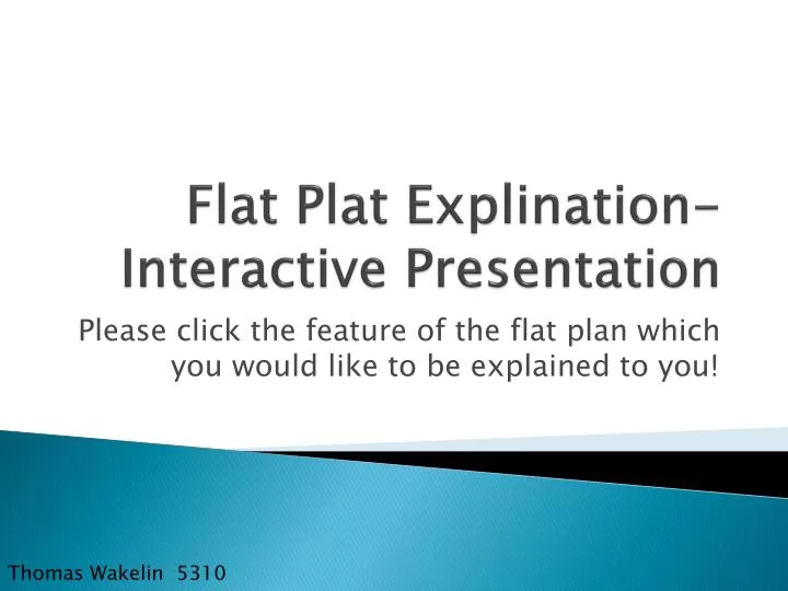
Flat Plat Explination - Interactive Presentation. Please click the feature of the flat plan which you would like to be explained to you!. Thomas Wakelin 5310. Please select a Flat-Plan Design. Below are my three “Flat-Plan Designs”.

E N D
Flat Plat Explination- Interactive Presentation Please click the feature of the flat plan which you would like to be explained to you! Thomas Wakelin 5310
Please select a Flat-Plan Design Below are my three “Flat-Plan Designs”. After selecting a chosen Flat-Plan you will be linked to the corresponding Flat-Plan Page. Front Cover Contents Page Double Page Spread If you ever want to return to this page then please click the home button at any time on any page!
Flat Plan- Cover Please click the section of the flat-plan which you would like to be explained to you. Touchable sections include: . “Class” logo . “Free CD” . “Fall Edition” . “Royal Albert Hall” . “Man on Piano” . “Banner at bottom”.
Flat Plan- Contents Please click the section of the flat-plan which you would like to be explained to you. Touchable sections include: . “”In your issue . “Image Collage” . “Features & Regulars” . “Cover Story box” . “Bottom information”
“Class Logo” The logo at the top of the magazine. I wanted my magazine to be immediately appeal to my target audience. The lexis choice of “Class” implies that the magazine is in a class of it’s own (good quality) and is also a part of “Classical” (the genre of music which the magazine covers). You can see that the “C” in “Class” is in a different font style than the remainder of the text, this was decided after taking into consideration my research which I completed. Classical FM magazine did a similar style choice with the “F” in their logo and I believe having the “C” in a different style would attract people to looking at my magazine. The “C” would obviously be in a different colour, red perhaps (signifying urgency, important) to draw this attention to my magazine. The rest of the word “Class” however is in a font style which some may argue is quite posh for a magazine. I decided that this font should be included as it met my target audience extremely well. I’m not designing a magazine for readers my age for example; so certain font style would not be very appropriate. However I believe the posh and ‘mature’ font style which I have written my logo in fits my adult audience extremely well and would draw the attention of adults searching for a classical music magazine. Click me to go back!
“Free CD” Upper right corner of the magazine cover All of the classical music magazines I looked at whilst doing my research were offering a “Free CD” to customers who purchased their magazine. I enquired if this was just the genre of music magazine I was researching but even ‘Rock’ magazines were offering free CD’s through purchasing the magazine. It is obvious to me then, that music magazines should include a free CD involving the genre of music the magazine is based around. This alert would be in red; drawing attention to the upper-right corner of the cover to ensure that the reader realises there are extra benefits to purchasing my magazine over another competitor. Inside the magazine would be articles written regarding what the CD includes and steps of how to get it to work for my older section of my target audience. Click me to go back!
“Fall Edition” After the logo of the magazine. After deep consideration I came to the conclusion that I should release a magazine every quarter of the year. Research informs me that the publishing industry is currently experiencing difficulties and releasing a new magazine in an area which is as crowded as the “Music Genre” could cause issues if I am thinking from a business prospective. Through writing “Fall Edition” however, I believe that my magazine immediately gains a reputation for being quite posh and professional. I kept in mind my target audience and I believe that they would prefer a more unique approach instead of following what everyone else was doing in my sector of the market and emphasising what issue number they are on. Adults don’t want the same magazine as what their teenaged son is buying every week, they want an experience of a well written, professional and intelligent approach to their favourite genre of music. That is why they are buying my magazine. Click me to go back!
“Headlines & Subheadings” The first heading on the left hand side of the page. I tried to follow the font style of the “Class” Logo here and I believe this would be beneficial for the entire magazine. A magazine that follows the same colour scheme, font style and layout appears to be more professional and smart; I believe that my target audience would appreciate this and would agree that it contributes positively to the overall appearance of the front cover. The first letter of the “Headline” is in a different style and is much larger than the rest of the text which follows, this is to draw the readers attention to the very beginning of the headline so that they know exactly what is included inside the magazine. The subheading works as an ‘incentive’ to support the headline and (at times) question the reader. The only way the reader will know the answer in this particular example is to buy my magazine! Click me to go back!
“Cover Image” The main (and only) image covering the entire cover. My main image needs to entice consumers into picking up my magazine and purchasing it. So therefore my cover image must be appropriate and be relatable to the genre of music which I am covering. Through using my “Actor”, “Costume”, “Prop” and “Location” research, this image will be both appealing and astonishing to look at. My cover image must therefore be interesting to my target audience and stand out when the magazine is placed on the shelf. It may be worth considering using photograph manipulation programmes such as “Adobe Photoshop” to edit my photographs to ensure they are the best quality which they can be. Click me to go back!
“Bottom Banner” Banner at the bottom of the cover page This banner is something which I have added myself after researching magazines from a completely different genre than “Music”. I believe this is a very effective technique as it looks professional and smart whilst informing consumers about four other sections of the magazine without taking up too much space. Through choosing general topics, I have been able to immediately appeal to a consumer who may want to see the latest concerts for example. This single lexis choice (“Concerts”) could be the selling point of the entire magazine for this individual consumer so I believe this banner is very important. Click me to go back!
“In your issue” Main heading at the top of the contents page I wanted my magazine to be more ‘unique’ when being compared to existing music magazines currently available on store shelves. Instead of simply putting “Contents Page” to label an obvious page and insult my readers intelligence, I decided to change the wording to “In your issue!” This makes the magazine feel a lot more personal to the person reading it and they will feel more valued when reading it. The “I” follows the same rule as the “C” in the “Class” logo to stand out and emphasise that this particular banner is actually the title of the page; the remaining text follows the professional font style which other text did on the cover also. Click me to go back!
“Image Collage” The selection of many images on the contents page Instead of simply listing a lot of page numbers and page headings, I will select a small amount of important articles in a particular issue of the magazine and illustrate them here. Each image has the page number next to it so (for example) the image to the far left would be related to an article on page 18. I believe that this is a more visual way to navigate your way around a magazine as a lot of people “look with their eyes” and if they spot something which interests them they want to get to the right page straight away instead of searching through a long list of different pages. Click me to go back!
“Features & Regulars” The headings and listings to either side of the centre box. Unfortunately there is not enough room on my contents page to have an image of every article which would be published in my magazine. And sometimes words are the only way to describe what a particular article may be able. The headings; “Features” and “Regulars” are clearly visible at the top of each column to avoid confusion whilst the article and a small synopsis follows the page number which the article is on. To make this more appealing to my target audience, I could change the font colour slightly each time to add a more professional approach. Click me to go back!
“Cover Story Box” The centre box. Instead of allowing the cover story to take up both the cover and contents page I have decided to emphasise the cover story in a (still easily noticeable) box which would be an eye-catching colour; Red, Yellow, Green or Orange for example. The image on the cover will be included here before a small synopsis about the cover story follows afterward. The page number would also be included at the bottom of the box to ensure that the reader can easily identify what page they would have to go to to read the cover story. Click me to go back!
“Bottom Information” Information at the bottom left and right of the contents page. This bottom information is not only at the bottom left/right of the contents page but at the bottom left/right of every page in my magazine. On the left is “Class” Magazine’s website which will be emphasised to the reader as they read through the magazine. This could lead to them visiting the website where the company are funded with business’ paying advertisement costs or through possible subscriptions. To the right is the name of the magazine and the page number; to act as a marker so that the reader can return to this page at a later time/date or remember where they have read up to for example. Click me to go back!
Flat Plan-Double Page Spread Please click the section of the flat-plan which you would like to be explained to you. Touchable sections include: . “Welcome Back” . “Capital W” . “Face-Shot Photograph” . “Breakout Quote” . “Thee Columns” . “Her Hits Column” . “Time Line”
“Welcome Back” Title of double-page spread article. This is the title of my double page spread. This will be the title of a returning star from the classical music scene who left to study their GCSE examination results. Though “Welcome Back” is the title for the double page spread it also contains pragmatics which could be stretched to be “Welcoming the reader back to the magazine” also. This would obviously please the reader as they feel valued by the magazine editorial team. As a title however it shares the similarities of the “C” in the logo for the magazine (being a different font style, bold and a different colour) whilst the remainder of the text is quite formal. This would most likely be white text on a black background to emphasise the title of the page and add formality to my double page spread. Click me to go back!
“Capital ‘W’” The capital letter which features at the start of the first paragraph of the feature. The “Capital ‘W’” clearly indicates to the reader where the first paragraph of the double page spread is and where it begins. The ‘W’ would be in the same font style as the “C” in the logo for the magazine. Following the visual trend of the cover page all the way through the magazine is very important to me as I believe that it is very professional to continue the same layout and style whenever possible. Hopefully the readers of the magazine will feel the same way when considering the professional style of my magazine and they will agree with me? Click me to go back!
“Face-Shot Photograph” The main photograph of the double-spread article. My double page spread is about a particular artist and thus his/her image needs to be featured at least once in my double page spread. Instead of having many small images of the celebrity which my double page spread is about, I have decided to have a “Face/Mug-Shot” of the celebrity in question and to enlarge it to cover the majority of the left (first) page of my double page feature. If the reader is not aware that the double page spread is about this celebrity and is ‘flicking’ through the magazine and notices this image, they may consider stopping and reading as they recognise the celebrity and want to find out what is being reported about him/her. Click me to go back!
“Break Out Quotes” Break Out quotes which feature text of the article. Break out quotations are very important and should be used to illustrate shocking/important information which has been written about in the double page feature. These breakout quotes are supposed to draw the attention of the reader and encourage them to read the entire article. These will be large and bold whilst being an eye-catching colour to ensure that the reader notices them. Click me to go back!
“Three Columns” How the text is laid out on the second page. There is a lot of different sections of my double page feature on the second page so to ensure that the reader does not get frustrated and lost when reading the main article, I have decided to separate it into three columns with a break out quotation in the centre. This makes for easy reading and ensures that my desired ‘professional and smart’ approach is still kept even though there is less space for the article to be written in. Click me to go back!
“Her Hits Column” A list of hits by the artist covered in the double page spread. This is an extra part of the double page spread where all of the successful records/concerts which my classical music artist has achieved in their current life time are listed. Interesting facts/figures will also be included here regarding how many tickets/CD’s were sold for example. This could be interesting for the reader and teach them something which they are unaware of about this particular artist. Click me to go back!
“Time-Line” A time-line of the artist featured in the double page spread. Another part of the double page spread is a time line of the classical musician’s life. This will contain interesting information which the reader may not be aware of and will enjoy reading about. Whilst there is a small amount of text it is mainly focussed around a graphology choice of a time line which is explained through dates and images alongside a very small amount of text. Click me to go back!