Download
1 / 25
250 likes | 275 Views
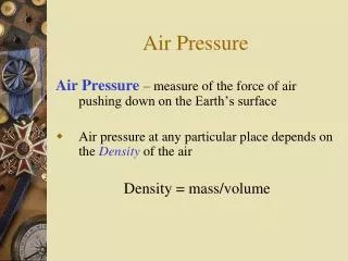
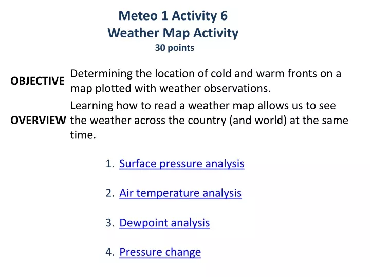
Meteo 1 Activity 6 Weather Map Activity 30 points. Surface pressure analysis Air temperature analysis Dewpoint analysis Pressure change. Learning Lesson: Drawing Conclusions - Surface Air Pressure Map.

E N D
Meteo 1 Activity 6 Weather Map Activity 30 points Surface pressure analysis Air temperatureanalysis Dewpointanalysis Pressure change
Learning Lesson: Drawing Conclusions - Surface Air Pressure Map This map shows the sea level pressures for various locations over the contiguous U.S. The values are in whole millibars. Objective Using a black colored pencil, lightly draw lines connecting identical values of sea level pressure. Remember, these lines, called isobars, do not cross each other. Isobars are usually drawn for every four millibars, using 1000 millibars as the starting point. Therefore, these lines will have values of 1000, 1004, 1008, 1012, 1016, 1020, 1024, etc., or 996, 992, 988, 984, 980, etc.
Learning Lesson: Drawing Conclusions - Surface Air Pressure Map Procedure Begin drawing from the 1024 millibars station pressure over Salt Lake City, Utah (highlighted in blue). Draw a line to the next 1024 value located to the northeast (upper right). Without lifting your pencil draw a line to the next 1024 value located to the south and then to the one located southwest, finally returning to the Salt Lake City value. Remember, isobars are smooth lines with few, if any, kinks. The result is an elongated circle, centered approximately over Eastern Utah. The line that was drawn represents the 1024 millibars line and you can expect the pressure to be 1024 millibars everywhere along that line. Repeat the procedure with the next isobar value. Remember, the value between isobars is 4 millibars. Since there are no 1028 millibars values on the map, then your next line will follow the 1020 millibars reports. Then continue with the remaining values until you have all the reports connected with an isobar. Label each isobar with the appropriate value. Traditionally, only the last two digits are used for labels. For example, the label on the 1024 mb isobar would be 24. A 1008 mb isobar would be labeled 08. A 992 mb isobar will be labeled 92. These labels can be placed anywhere along the isobar but are typically placed around edges of the map at the end of each line. For closed isobars (lines that connect) a gap is placed in the isobar with the value inserted in the gap. Your map should look like this.
Learning Lesson: Drawing Conclusions - Surface Air Pressure Map Analysis Isobars can be used to identify "Highs" and "Lows". The pressure in a high is greater than the surrounding air. The pressure in a low is lower than the surrounding air. Label the center of the high pressure area with a large blue "H". Label the center of the high pressure area with a large red "L". High pressure regions are usually associated with dry weather because as the air sinks it warms and the moisture evaporates. Low pressure regions usually bring precipitation because when the air rises it cools and the water vapor condenses. Shade, in green, the state(s) would you expect to see rain or snow. Shade, in yellow, the state(s) would you expect to see clear skies. In the northern hemisphere the wind blows clockwise around centers of high pressure. The wind blows counterclockwise around lows. Draw arrows around the "H" on your map to indicate the wind direction. Draw arrows around the "L" on your map to indicate the wind direction.
Learning Lesson: Drawing Conclusions - Surface Pressure Map Solutions Solution 1
Learning Lesson: Drawing Conclusions - Surface Pressure Map Solutions Solution 2
Learning Lesson: Drawing Conclusions - Surface Pressure Map Solutions Solution 3
Learning Lesson: Drawing Conclusions - Surface Pressure Map Solutions Solution 4
Learning Lesson: Drawing Conclusions - Surface Temperature Map This map shows the air temperature for various locations over the conterminous U.S. The values are in °F. Objective Using a bluecolored pencil, lightly draw lines connecting equal values of temperatures, every 10°F. Remember, like isobars, these lines (called isotherms) are smooth and do not cross each other. Procedure You will draw lines connecting the temperatures, much like you did with the sea-level pressure map. However, you will also need to interpolate between values. Interpolation involves estimating values between stations which will enable you to properly analyze a map.
We will begin drawing from the 40°F temperature in Seattle, Washington (top left value). Since we want to connect all the 40°F temperatures together, the nearest 40°F value is located in Reno, Nevada, (southeast of Seattle). However, in order to get there you must draw a line between a 50°F temperature along the Oregon coast and a 30°F temperature in Idaho. Since 40°F is halfway between the two locations, your line from Seattle should pass halfway between the 50°F and 30°F temperatures. Place a light dot halfway between the 50°F and 30°F temperatures. This is your interpolated 40°F location. Next connect the Seattle 40°F temperature with the Reno 40°F temperature ensuring your line moves through your interpolated 40°F temperature. Continue connecting the 40°F temperatures until you get to Texas. Now your line will pass between two values, 60°F and 30°F. Like the last time, you should make a mark between the 60°F and 30°F but this time a 50°F is also to be interpolated in addition to the 40°F. Between the 60°F and 30°F temperatures, place a small dot about 1/3 the distance from the 30°F and another small dot about 2/3 the distance from the 30°F. These dots become your interpolated 40°F and 50°F temperatures. Finish drawing your 40°F isotherm passing through your interpolated 40°F value. Repeat the above procedures with the other isotherms drawn at 10°F intervals. Label your isotherms. Analysis Isotherms are used to identify warm and cold air masses. Shade, in blue, the region with the lowest temperatures. Shade, in red, the region with the warmest air. Your map should look like this.
Learning Lesson: Drawing Conclusions - Surface Temperature Map Solutions Solution 1
Learning Lesson: Drawing Conclusions - Surface Temperature Map Solutions Solution 2
Learning Lesson: Drawing Conclusions - Surface Temperature Map Solutions Solution 3
Learning Lesson: Drawing Conclusions - Surface Temperature Map Solutions Solution 4
Learning Lesson: Drawing Conclusions - Dewpoint Temperature Map This map shows the dewpoint temperature for various locations over the conterminous U.S. The values are in °F. Recall, dewpoint is the temperature to which, if the air cooled to this value, then the air would be completely saturated. Objective Using a greencolored pencil, lightly draw lines connecting equal values of dewpoint temperatures, every 10°F. Remember, like isobars, these lines (called isodrosotherms) are smooth and do not cross each other.
Procedure You will draw lines connecting the dewpoint temperatures, much like you did with the air temperature map. However, you will also need to interpolate between values. Interpolation involves estimating values between stations which will enable you to properly analyze a map. Label the values. Analysis Isodrosotherms are used to identify surface moisture. The closer the temperature and dewpoint are together, the greater the moisture in the atmosphere. As the moisture increases so does the chance of rain. Also, since moist air is lighter than dry air, the greater the moisture, the easier for the moist air to lift into the atmosphere resulting in a better chance for thunderstorms. Typically, dewpoint70°F or greater have the potential energy needed to produce severe weather. Shade in greenthe region where dewpoint temperatures are 70°F or greater.
Learning Lesson: Drawing Conclusions - Dewpoint Temperature Map Solutions Solution 1
Learning Lesson: Drawing Conclusions - Dewpoint Temperature Map Solutions Solution 2
Learning Lesson: Drawing Conclusions - Surface Air Pressure Map This map shows change in surface pressure (in whole millibars) during the past three hours at various locations. Objective Using colored pencils, you will draw a lines connecting equal values of pressure change for every two millibars. These lines are drawn for the -8, -6, -4, -2, 0, +2, +4, +6, +8, etc. values. Remember, like isobars, these lines (called isallobars) are smooth and do not cross each other.
Procedure Using a bluecolored pencil, beginning at any +2 value, lightly draw lines connecting equal values of the +2 millibars pressure change. Remember, you will need to interpolate between values to draw your lines correctly. Draw the remaining "positive" pressure change value(s) at two millibars intervals. Using redcolored pencils lightly draw a line connecting equal pressure change values of less than zero (0). Finally, using black, draw a line connecting the zero (0) line. Analysis Cold fronts are often located in areas where the pressure change is the greatest. The front represents the boundary of different air masses. Cold air is more dense than warm air so when a cold front pass your location, the pressure increases. We analyze for pressure change to look for these boundaries. We can also tell where high pressure and low pressure systems are moving by looking where the greatest change is occurring. Shade, in red, the region where the surface pressure change is -2 millibars or less. Shade, in blue, the region where the surface pressure change is +2 millibars or more.
Learning Lesson: Drawing Conclusions - Surface Pressure Change Map Solutions Solution 1
Learning Lesson: Drawing Conclusions - Surface Pressure Change Map Solutions Solution 2
Learning Lesson: Drawing Conclusions - Surface Pressure Change Map Solutions Solution 3
Learning Lesson: Drawing Conclusions - Surface Pressure Change Map Solutions Solution 4