Download
1 / 28
290 likes | 409 Views
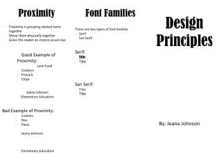
Proximity and Hierarchy. Principle of Design. Hierarchy. Pecking order. Visual Hierarchy. Visual hierarchy is the ranking of important of the elements in a composition. The most important element is at the top of the list. This is your focal point, or center of interest.

E N D
Proximity and Hierarchy Principle of Design
Hierarchy Pecking order.
Visual Hierarchy • Visual hierarchy is the ranking of important of the elements in a composition. • The most important element is at the top of the list. This is your focal point, or center of interest. • From the focal point, the eye goes down the list of importance, around to each element. • Your job is to establish this list and make sure the viewer travels the correct pathway around the elements.
Be Decisive. No wishy-washy visual hierarchy paths. The visual hierarchy should be OBVIOUS.
Control the ranking • Use principles of design to control the path the viewer travels… • Size • Color • Contrast • Value • Proximity (grouping)
Size • Bigger/biggest can draw the eye as well as • Smaller/smallest.
Color • Variations in color can draw the eye. • Maybe a red focal point, where the rest of the composition is shades of gray?
Contrast • Contrast is using difference to create emphasis. • For instance: • black and white • pattern and plain • complementary colors • color and no color • jagged or soft • etc.
Value • Value refers to a ranking of light to dark. • A difference in value can draw the eye, much like contrast (light on dark or vice versa).
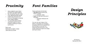
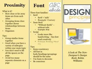
Proximity • Proximity we learned a little about last semester, and earlier this week. • It refers to how you group elements and/or information.
Proximity The state of being near.
Text Size and Weight BORING and not very effective. When does the club meet? How many readings are there?
Getting Better Items that are intellectually connected should be visually connected.
Ahh Much better… Look how much you know just at a glance! Compare it to the first composition. How many readings are there? When are they? You know right away!
Mess. The goal was probably to make this seem interesting, energetic and fun. Instead it looks like a giant mess and you can’t find any information about it!
Better. Clear communication is always better than amateur design. While this might not be all that interesting, at least the viewer knows what is going on.
Not bad…could be better. Spacing is off. You can’t tell at a glance that some of these headline looking things are actually part of the following paragraphs. Lots and lots of broken up white space.
Better. Organization is clearer. Less puzzle piece white space. More breathing room.
Menus Menus are an excellent example of when proximity and grouping is essential.
Menu…better. What changed? Is it better? Why?
Menu…even better! Now, what has changed? Is it better? How so?
Menu…yep another one. What is different? Is it better? Why?
Website Everything here is ranked the same. What is important?
Website…better. You already know how to do this in your brain! Now you just need to apply it to visual organization.
Summary • When several items are in close proximity to each other, they become one visual unit rather than several separate units. Items relating to each other should be grouped together. Be conscious of where your eye is going: • Where do you start looking? • What path do you follow? • Where do you end up? • After you've read it, where does your eye go next? • You should be able to follow a logical progression through the piece, from a definite beginning to a definite end.
Purpose • The basic purpose of proximity is to organize. • Other principles come into play as well, but simply grouping related elements together into closer proximity automatically creates organization. If the information is organized, it is more likely to be read and more likely to be remembered. • As a by-product of organizing the communication, you also create more appealing (more organized) white space (designers' favorite thing).
How To • Squint your eyes slightly and count the number of visual elements on the page by counting the number of times your eye stops. • If there are more than three to five items on the page (of course it depends on the piece), see which of the separate elements can be grouped together into closer proximity to become one visual unit.
Common Errors • Don't stick things in the corners or in the middle just because the space is empty. • Avoid too many separate elements on a page. • Avoid leaving equal amounts of white space between elements unless each group is part of a subset. • Avoid even a split second of confusion over whether a headline, subhead, caption, graphic, etc., belongs with its related material. Create a relationshipamong elements with close proximity. • Don't create relationships with elements that don't belong together! If they are not related, move them apart from each other.