Download
1 / 2

E N D
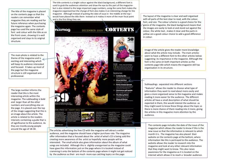
The title contents is a bright colour against the black background, a different font is used to grab the audiences attention and draw the eye to this part of the magazine- but is also related to the large important page numbers, using the same font makes the magazine organised but the change of font also makes it an interesting change for the magazine. Although instead of putting the date of issue in the middle at the top I would have placed the title there instead so it makes it more of the main focal point and is the first thing they see. The title of the magazine is placed on the contents page so that the readers can remember what magazine they are reading and for future reference when purchasing the magazine again. The contents page has used the same style of font and colour with the title as on the front cover, showing it is well organised and stays to its original structure. The layout of the magazine is clear and well organised with all parts of the text clear to read, with the colour, font, and size. The colour scheme is a good choice for the genre of the magazine, the black background means that the images are easily to look at and stand out against the colour, the white text , makes it clear and the parts in yellow are a good colour choice to add a good difference in colour. Image of the article gives the reader more knowledge about what the article may include. The main articles seem to have a different font to the other articles below suggesting its importance in the magazine. Although the font is the same on both important articles as the contents page title which means the magazine still has organisation in its structure. The main photo is related to the theme of the magazine and is exciting and interesting which will keep its audience interested and focused. It takes up most of the page but the magazine structure is still organised and professional. Subheadingsseparated into different sections “features” allows the reader to choose what type of information they want to read about more easily and gives a more organised sense to the magazine and makes reading it more easier for the audience. The different articles all have a small description of what should be expected in them, this would interest the audience as they might want to know these things about the topic so there is more chance of them reading into it more, giving the articles in this magazine more attention by the audience. The large number informs the reader that this is the most interesting article within the magazine. The subheading is bold and larger than all the other numbers and everything else on the page. It is placed over the top of the image suggesting that this is an image about the article. The article is related to the readers interests containing a guide that is of significance to the audience. As they are mostly young people around the age of 18-30. The contents page includes the date of the issue of the magazine which allows the reader to know if this is the new issue so that the information is relevant to which month it is . The magazine has also placed their website on the contents page at the bottom, where information like this is portrayed to the audience. The website allows the reader to research into the magazine and look at any other relevant information that they might want to know. This also raises awareness for the magazine as it is located on the internet which allows it to reach a broader audience. The articles advertising the free CD with the magazine will attract a wider audience, and the magazine should have a higher purchase rate. The magazine offer information that is focused about the artist of what's CD is being sold this creating more awareness of the artist so hopefully more people will be interested. The small article also gives information about the album of what songs are included. Although this is slightly unorganised as the magazine could have gave this information just on the page where it is located instead of cramming it onto the bottom of the contents page where it might not get noticed by the audience as their are much more eye catching topics on the page.
Contents title uses a simple font that matches the rest of the page, a simple design to a magazine that could have been livened up with different fonts . The title isn't bold but it is a different colour from the rest of the magazine with a black box placed behind it to back it visible to the audience. The only other way they have made it different from the rest of the layout is by putting in in capital letters which makes it more evident to the audience. The colour scheme is quite plain compared to the genre of the magazine a more exciting variety of text and colours would have made this issue more attractive and interesting for the reader . The images placed down one side take up most of the contents pages layout placed upon a white background make the images stand out, although a black background would have brought out the images more and made the colour scheme to be more interesting. The layout could have been enhanced by an incorporation pictures and text together instead of using a two sided layout for the magazine, as the information is squeezed down one side and the images taking priority. This image would interest the audience with the age group being around the same age as this women pictured, although one of a party could have been placed in to liven up the feel of the magazine. A picture of the next issue of the magazine is placed on the contents page to make it recognisable to the audience next time they purchase it to attract a improved amount of readers to the magazines next issue. The subheadings in bold represent the articles in which are included in the magazine, and each one has a description with it to inform the reader about what to expect in each section. The page numbers are larger than the text so that the reader can read them more easily and the bold font makes it clear to turn to what page they want to read and stays with the colour theme of the magazine. The image in bottom corner could have had some photo editing as it is a little unclear compared to the photo above it of the women . The lighting could have been enhanced making it more visible to the audience instead of it being so dark so that the struggle to see it. A border to the images could have also been included to break up the layout of the page . Subheadings organised into sections to break up the layout of the magazine. The “regulars” means the same sections that are included every week in the magazine which is placed at the bottom of the page as an addition to the magazine. It stays with the colour scheme of the magazines addition which makes the structure organised and professional. At the bottom of the magazine the date of the issue and a website for the readers to follow makes this magazine more interactive as readers can get involved further with this brand. Although they are not very visible to the audience so a bold box around them could make the magazines information clearer and make sure that no information is missed on the page