Download
1 / 70
700 likes | 862 Views
Small multiples, or the science and art of combining graphs. Nicholas J. Cox Department of Geography Durham University, UK. 1. Small multiples. Good graphics often exploit one simple design that is repeated for different parts of the data.

E N D
Small multiples, or the science and art of combining graphs Nicholas J. Cox Department of Geography Durham University, UK 1
Small multiples Good graphics often exploit one simple design that is repeated for different parts of the data. Edward Tufte called this the use of small multiples. Well-designed small multiples are inevitably comparative, deftly multivariate, shrunken, high-density graphics…. Edward Rolf Tufte (1942–)
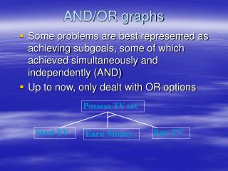
…in Stata In Stata, small multiples are supported for different subsets of the data with by() or over()options of many graph commands. Users can emulate this in their own programs by writing wrapper programs that call twoway or graph bar and its siblings. Otherwise, specific machinery offers repetition of a design for different variables, such as the graph matrix command.
Users can always put together their own composite graphs by saving individual graphs and then combining them using graph combine. This presentation offers further modest automation of the same design repeated for different data.
Original programs discussed sparkline crossplot combineplot designplot and with cameo roles aaplot sepscatter All may be installed from SSC. 5
What’s in a name? roseplot by any other name… A minor theme here is that definite names are needed for programs, even if kinds of graphs do not have distinct agreed names. As in advertising, a good name attracts and keeps users. As in politics, a bad name can be fatal.
sparkline The purpose of visualization is insight, not pictures Ben Shneiderman (1947–)
Sparklines The name “sparkline”was suggested by Edward Tufte for intense text-like graphics. Sparklines are typically simple in design, sparing of space and rich in data, but they include several quite different kinds of graph otherwise. The most common kind shows several time series stacked vertically. sparkline is a Stata implementation. 8
Sparklines have long been standard in several fields, including physics and chemistry (spectroscopy), seismology, climatology, ecology, archaeology and physiology (notably encephalography and cardiography). Tufte provided an memorable and evocative new name and an excellent provocative discussion. The Grunfeld data (webuse grunfeld) are a classic dataset in panel-based economics. Ten companies were monitored for 1935–54. They give us a simple sandpit.
What are we doing here? The problem of time series graphics Comparisons of time series are a rich and challenging area of statistical graphics. The widespread term spaghetti plot hints immediately at the difficulties. As always, we want to combine a grasp of general patterns with access to individual details. With this in mind, we look at some sparklines of the Grunfeld dataset. 10
Vertical and horizontal By default sparkline stacks small graphs vertically. If several graphs are combined, it is typical to cut down on axis labels and rely on differences in shape to convey information. Horizontal stacking is also supported, which can be useful for archaeological or environmental problems focused on variations with depth or height. Here is an archaeological dataset as example. 14
Nightingale’s data Florence Nightingale (1820–1910) is well remembered for her nursing in the Crimean war and (within statistical science) for use of quantitative arguments. Her most celebrated dataset is often reproduced using her polar diagram, but is easier to think about as time series. Zymotic (loosely, infectious) disease mortality dominates other kinds, so much so that a square root scale helps comparison. (A logarithmic scale over-transforms here.) 16
Source of image: http://understandinguncertainty.org/coxcombs
Would sparkline help? A sparkline display is useful to show relative shape, such as times of peaks. We see that seasonality is only part of what is being seen. The harsh winter of 1854–5 coincided with some of the hardest battles of the war, but 1855–6 was quite different. But, as often happens, no one graph dominates others here. 21
crossplot The scatter plot is the workhorse of statistical graphics. John McKinley Chambers (1941– )
crossplot crossplot is designed as a quick-and-easy way to combine scatter plots. The basic syntax is crossplot (yvarlist) (xvarlist) and the idea is to plot every y in yvarlist against every x in xvarlist. The use of two varlists gives greater flexibility than does graph matrix, which produces every possible scatter plot for a single varlist.
Scatter plot matrices Scatter plot matrices are great, but they can be excessive. Their main feature is also a limitation. p variables mean p2 plots all at once, so 10 means 100, and so forth. (The half option just controls which plots you see. )
crossplot design crossplot was developed in teaching, especially of regression, with the aim of encouraging focused comparisons. Originally (1999) crossplot was called cpyxplot, cp meaning Cartesian product, but the name was ugly, cryptic and easily forgotten. The syntax had to be as simple as possible.
crossplot examples Versions of a response variable versus a key predictor. A response variable versus versions of a key predictor. Each output versus each input. Principal components versus original variables. First, let us look at four versions of mpg versus weight in the auto dataset.
Next we look at an audiometric dataset used as a multivariate example in the Stata manuals. There are 8 response variables, 4 for left ears and 4 for right ears. Here we just focus on the 16 plots pairing left and right. Another graph could be the 4 plots comparing left and right ears at the same frequency, the diagonal here.
crossplot syntax for examples crossplot (mpg rt_mpg ln_mpg rec_mpg) weight, combine(imargin(small)) crossplot (lft*) (rght*), jitter(1)
crossplotsyntax extras By default, crossplot is just calling twoway scatter followed by graph combine. It follows that recast() is available to recast to twoway line or twoway connected. crossplot has an extra sequence() option to label graphs to ease preparation of graphics for papers e.g. sequence(a b c d)
combineplot The greatest value of a picture is when it forces us to notice what we never expected to see. John Wilder Tukey (1915–2000)
combineplot combineplot is a generalisation of crossplot, more flexible and inevitably more complicated in syntax. The general problem of combining plots of similar kind reduces to a loop producing individual plots and a call to graph combine. That is bound to be a challenge to beginning users. The idea is to avoid that by encapsulating the predictable syntax within one command.
combineplot examples We will look at a series of univariate examples followed by a series of bivariate examples. A great variety is possible, as we can loop over user-written graphics commands as well as official commands.
A digression on sepscatter The last example usedsepscatter, a program automating separation of data points on a scatter plot by a categorical variable. The repetition of the legend needs some kind of fix. In this and similar examples, the legend could be deleted and explaining symbols left as a task for the text caption.
sepscatter and scatter plot matrices combineplot with sepscatter meets a felt need, scatter plot matrices with categorisation of data points. Here is an example with “size” variables from the auto dataset. The diagonal scatter plots have meaning, yet are not conventional. But not every graph need be immediately publishable.
A digression on aaplot The last example used aaplot. aaplot customises automatic annotation of scatter plots with fitted regressions with text for key results. Originally, it was written following a request by my Ph.D. student Alona Armstrong.
Back tocombineplot Some examples of its syntax will make clearer how it works. First look at a univariate example: combineplot mpg price weight headroom: graph box @y, over(rep78) Here we have one varlist and the syntax @y is a placeholder for the variable name.
Next look at a bivariate example: combineplot price (mpg weight length displacement): sepscatter @y @x, ytitle("Price (USD)") sep(foreign) Here we have two varlistsand the syntax elements @y and @x are placeholders for the variable names.
The two varlists may each contain a single variable and they may be identical. When both are presented, the combination is the Cartesian product of the varlists. Naturally, you can reach through to control the options of graph combine as well as those of the particular graph command used.
Quirk or quick? The quirky syntax of combineplot might cause some queasiness. Some might recall the obsolete for command. Confident users would (should) be happy to write their own loops, topped by graph combine, and that is fine too. The justification for combineplot is just convenience: it can be quicker than writing your own script.
designplot Real life is both complicated and short, and we make no mockery of honest adhockery. Irving John Good (1916–2009)