Download
1 / 11
130 likes | 273 Views
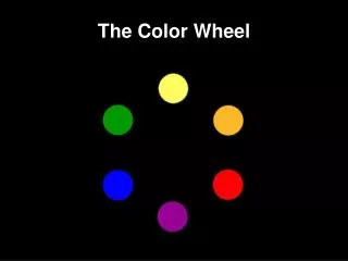
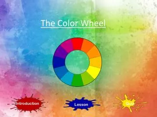
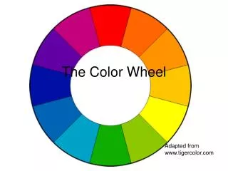
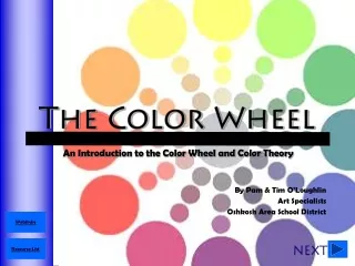
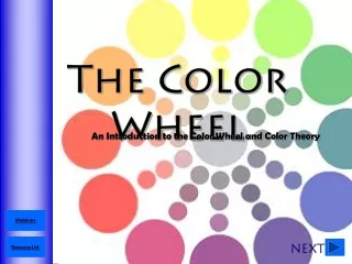
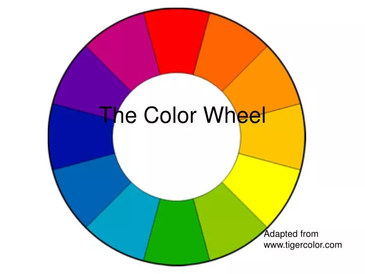
The Color Wheel. Adapted from www.tigercolor.com. The color wheel or color circle is the basic tool for combining colors. The first circular color diagram was designed by Sir Isaac Newton in 1666. Designed so that virtually any colors you pick from it will look good together.

E N D
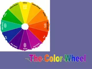
The Color Wheel Adapted from www.tigercolor.com
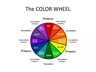
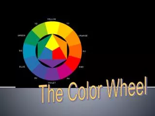
The color wheel or color circle is the basic tool for combining colors. • The first circular color diagram was designed by Sir Isaac Newton in 1666. • Designed so that virtually any colors you pick from it will look good together. • The most common version is a wheel of 12 colors based on the RYB (or artistic) color model.
there are a number of color combinations that are considered especially pleasing. These are called color harmonies or color chords
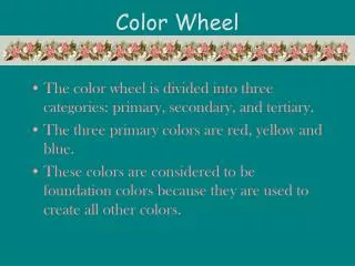
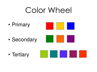
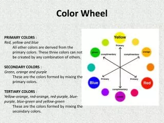
Primary, Secondary and Tertiary Colors • In the RYB (or subtractive) color model, the primary colors are red, yellow and blue. • The three secondary colors (green, orange and purple) are created by mixing two primary colors. • Another six tertiary colors are created by mixing primary and secondary colors.
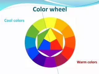
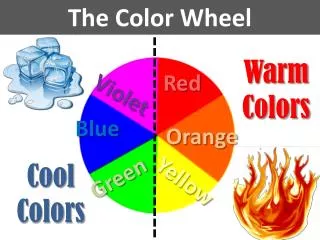
Warm and cool colors • Warm colors are vivid and energetic. • Cool colors give an impression of calm, and create a soothing impression. • White, black and gray are considered to be neutral. www.blogs.glnd.k12.va.us
Complementary color scheme • Colors that are opposite each other on the color wheel are considered to be complementary colors (example: red and green). • The high contrast of complementary colors creates a vibrant look • bad for text
Analogous Color Scheme • Analogous color schemes use colors that are next to each other on the color wheel. They usually match well and create serene and comfortable designs.
Triadic Color Scheme • A triadic color scheme uses colors that are evenly spaced around the color wheel. • quite vibrant
Split-Complementary Color Scheme • is a variation of the complementary color scheme. • In addition to the base color, it uses the two colors adjacent to its complement.
Conclusion • Colors affect us in numerous ways, both mentally and physically. A strong red color has been shown to raise the blood pressure, while a blue color has a calming effect. • Being able to use colors consciously and harmoniously can help you create spectacular results.