Download
1 / 9
90 likes | 94 Views
This presentation will educate you about data visualisation and why it is important, popular techniques and benefits of data visualisation.<br><br> <br><br>For more topics stay tuned with Learnbay

E N D
Data visualisation Swipe
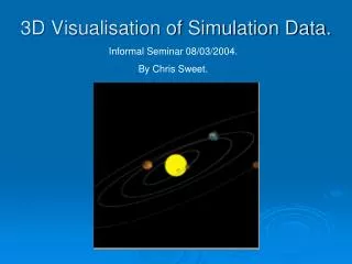
Data visualisation Data visualisation is the process of converting information into a visual representation, such as a map or graph, in order to make data easier to comprehend and extract insights from. Information graphics, information visualisation, and statistical graphics are all terms that are frequently used interchangeably.
Data visualisation Data visualisation is one of the processes in the data science process, according to which data must be visualised after it has been collected, processed, and modelled in order to draw conclusions.
Why is data visualisation important? Data visualisation provides a quick and effective way to communicate information in a universal manner using visual information. The practice can also help businesses identify which factors affect customer behavior; pinpoint areas that need to be improved or need more attention; make data more memorable for stakeholders; understand when and where to place specific products; and predict sales volumes.
Benefits of data visualisation The ability to absorb information quickly, improve insights and make faster decisions. An increased understanding of the next steps that must be taken to improve the organization. An improved ability to maintain the audience's interest with information they can understand.
An easy distribution of information that increases the opportunity to share insights with everyone involved. Eliminate the need for data scientists since data is more accessible and understandable. An increased ability to act on findings quickly and, therefore, achieve success with greater speed and less mistakes.
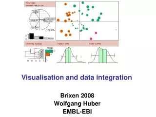
Examples of data visualisation In the early days of visualization, the most common visualization technique was using a Microsoft Excel spreadsheet to transform the information into a table, bar graph or pie chart. While these visualization methods are still commonly used, more intricate techniques are now available, including the following infographics bubble clouds bullet graphs heat maps fever charts time series charts
Some other popular techniques are as follows. Line charts. Area charts. Scatter plots. Treemaps. Population pyramids.
Topics for next Post Classification and regression trees (CART) Neural Networks Big data Stay Tuned with