Download
1 / 21
240 likes | 409 Views
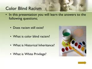
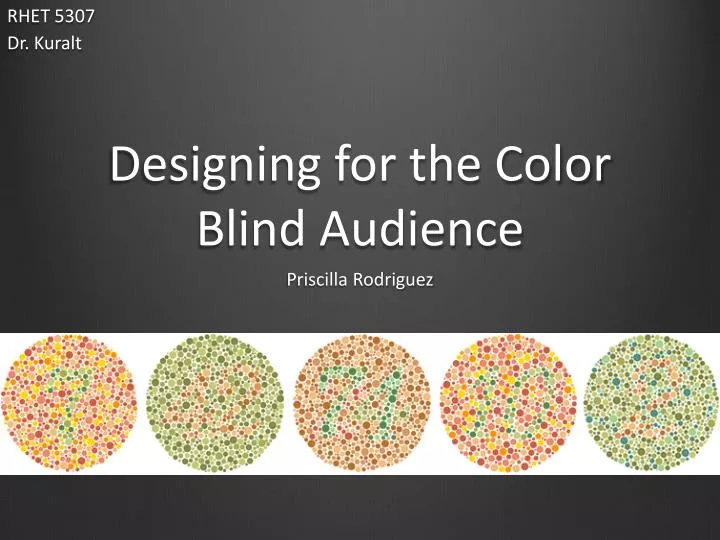
RHET 5307 Dr. Kuralt. Designing for the Color Blind Audience . Priscilla Rodriguez. Color blindness is a visual defect that results in the inability to differentiate between colors . It affects: 8% of Males 0.5% of Females. Understanding Color Blindness. Understanding

E N D
RHET 5307 Dr. Kuralt Designing for the Color Blind Audience Priscilla Rodriguez
Color blindness is a visual defect that results in the inability to differentiate between colors. It affects: • 8% of Males • 0.5% of Females
Understanding Color Blindness Understanding Color’s Components More accessibility for users, increasing the document’s usability By understanding what color blindness is and understanding the components of color, Technical Communicators can produce a document that increases its usability amongst the audience.
Deuteronopia/ Deuteronomaly • Red/green deficiency There are three types of color blindness that are most common. Normal Vision Color Blind Vision • Protonopia/ Protanomaly • Red/green deficiency Color Blind Vision Normal Vision • Tritanopia/ Tritanopia • Blue/yellow deficiency Normal Vision Color Blind Vision
Consider the way images look to the color blind user. People with normal color vision should see this image. The way userswith color blindness would view the image.
For the color blind, the ability to discriminate colors on the color model of Hue- Saturation- Value is reduced. HUE- perceptual attribute associated with elementary color names Strip of color with a range of hues. Ex: “red” or “blue” SATURATION- refers to the amount of white light mixed with the hue. Strip of color with range of saturation from low to high. VALUE- refers to the intensity of light present (Value is also referred to as lightness) Strip of color with range of value from low to high. HSV color space as a conical object Hue ranges from 0-360. Saturation and Value range from 0-100. The lower the saturation of a color, the more "grayness” present and the more faded the color will appear.
Maximize the contrast between foreground and background colors • Choose colors that contrast in hue • Avoid using colors of similar lightness adjacent to one another Choosing color effectively to increase usability To maximize contrast, always use dark types on light or white backgrounds, exaggerate lightness differences between foreground and background colors.
Choosing color effectively to increase usability • Choose dark colors with hues from the bottom half of the hue circle. • For most people with color deficiencies, the lightness of colors in the bottom half of the hue circle tends to be reduced.
Choosing color effectively to increase usability • Avoid contrasting hues form adjacent parts of the hue circle • Color deficiencies make it difficult to tell the difference between colors of similar contrast.
For the color blind audience, meaning should be independent from color • All information using color as a distinction should be evident without it • Accessibility is not just a legal requirement but also about doing the right thing. U.S. Rehabilitation Act states: Designing for the Color Impaired “Color coding shall not be used as the only means of conveying information, indicating an action, prompting a response, or distinguishing a visual element.” 1194.25(g).
Relying only on color affects the usability of documentation. Effective illustrations clarify relationships. This Pie Chart lacks other visual cues to assist the color impaired audience to view the information presented.
Deuteroanopia: inability to see the color green or to distinguish green and purplish-red Consider the view of the color impaired. Protanopia: inability to see the color red or to distinguish red or bluish-green Tritanopia: inability to discern blue and yellow
For the color blind audience, Technical Communicators can design manual tabs, pie charts, and other document elements, that make meaning independent of color. This Pie Chart adds textual cues to assist the color impaired audience. This creates better usability and accessibility of the information presented.
Using evaluation tools can help the technical writer better understand the difficulties the color blind audience faces. These websites allow Technical Communicators to simulate their designs as a color impaired user: • http://aspnetresources.com/tools/colorBlindness • http://www.vischeck.com/ • http://www.colblindor.com/coblis-color-blindness-simulator/ • http://colororacle.cartography.ch/
This chart is has been corrected by using diagonal lines. Using Evaluation Tools People with normal color vision should see this image. By using the vischeck simulator, there is no problem interpreting this chart. The way userswith color blindness would view the image. Notice how the addition of diagonal lines creates better usability.
Usability and accessibility is a common goal to improve user experience. Choose color schemes that can be easily identified by people with all types of color vision, in consideration with the actual lighting conditions and usage environment. Use a combination of different shapes, positions, line types and coloring patterns, to ensure that information is conveyed to all users including those who cannot distinguish differences in color. Clearly state color names where users are expected to use color names in communication.
Still, Brian. “What’s Accessible for Some Is Better for All.” Intercom January 2011: 28-29. Print. Roberts, Linda. “Don’t Turn a (Color) Blind Eye.” Intercom January 2011: 30. Print. Smith, Kel. “Universal Design for Digital Media.” Intercom January 2011: 6-8. Print. Mackiewicz, Jo. “Color: The Newest Tool for Technical Communicators- Redux.” Technical Communication Volume 56.1 (2009): 33-13. Print. Arditi, Aries. “Effective Color Contrast/ Designing for People with Partial Sight and Color Deficiencies" Lighthouse International, 2005. Web. 10 Feb. 2011. <http://www.lighthouse.org/accessibility/design/ accessible-print-design/effective-color-contrast>.