Download
1 / 18
190 likes | 324 Views
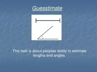
Guesstimate. This task is about peoples ability to estimate lengths and angles. Guesstimate. Sarah asked 200 people to estimate the length of a short line and a longer line, they were also asked to estimate the size of a small angle and a larger angle. Guesstimate.

E N D
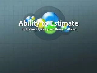
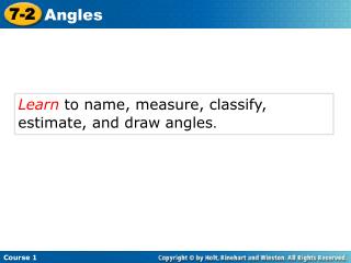
Guesstimate This task is about peoples ability to estimate lengths and angles.
Guesstimate Sarah asked 200 people to estimate the length of a short line and a longer line, they were also asked to estimate the size of a small angle and a larger angle.
Guesstimate Put away all rulers and protractors. Before we look at that data you are going to be given a sheet with two lines and two angles drawn on it. Write down in the back of your books how long you think each line is to the nearest mm (e.g. 17.3cm) and how large each angle is to the nearest degree (e.g. 520)
Guesstimate The actual lengths were: Small line = 6.2cm Long line = 21.3cm Small angle = 480 Large angle = 1240
Guesstimate Complete this table and your teacher will collect in your gender and 4 error results for later.
Hypothesis • Boys are better at estimating lengths than girls. • It is easier to estimate lengths than angles • Adults are better at estimating than young people. • 15 year old pupils are better than 11 years olds at estimating angles. • Smaller angles are easier to estimate than larger ones
Males are better at estimating lengths than females. • I believe this because boys are seen as being more practical than girls. • I will test this by using the estimates given for the shorter lengths • I will take a quota sample of 40 males and 40 females • I have decided on 40 as it is sufficient to give an accurate result but not so many as to make the task tedious and time consuming.
Key Questions. • Sample Size – How large and how will you choose randomly? • Statistical Calculations – Which ones do we know and which ones could we use? • Graphs – What graphs can we draw and which ones are best? • Comment on all your graphs and calculations. Always ask does this support my hypothesis.
Data Calculations • To find the mean value of a set of data you add up all the data • values then divide by how many there are. • To find the median you put the data in order and find the • middle value. • The mode is the most common value • The range is a measure of spread and is the largest data value – • the smallest data value. • 25% of the results lie between each of the quartile values • The interquartile range is the upper quartile value – the • lower quartile value. This is the spread of the middle 50% of the • data and excludes any extreme values
Comparative Bar Charts The number of older people dying has increased each year, whereas the number of young people dying has reduced. The number of deaths in the 45-74 age group has gone up and then down but still remains high.
Comparative Bar Charts This comparative bar chart shows the same information but it enables me to compare the total number of deaths each year.
Pie Charts I can see from this pie chart that in 1901 that about 25% of the deaths were babies under 1 year old and about a 1/3 were aged 45-74 years old.
Scatter Graphs The older the car the more miles it has done, although it is not a big difference, petrol cars have a lower mileage than diesel ones, this might be because many company cars run on diesel.
Line Graphs This graph enables me to see how in 1902 many people died young whereas in 1999 deaths were low until they reached about 50 when it starts to increase noticeably.
Box Plots The age at death has increased dramatically since the 1902 figure as can be seen by the box plot being skewed to the right. In 1902 50% of the population would be dead by the age of 35, this age rose to 68 in 1950 and 80 in 1999.
Frequency Polygons The shape of both frequency polygons is similar although the Championship polygon is wider indicating that the median and mean are similar for both but the spread is larger for the championship.
Cumulative Frequency Graph I have drawn this cumulative frequency curve as I had a lot of data and it will enable me to draw a boxplot to compare the two sets of results for Set 1 and Set 2.