Download
1 / 45
450 likes | 549 Views
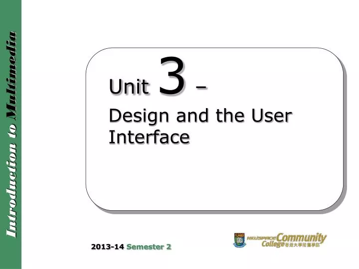
Unit 3 – Design and the User Interface. 2013-14 Semester 2. Unit Outline. In this unit, we will learn Design Guidelines: Appearance Balanced Layout Movement White Space Unified Piece Metaphor Consistency Template Color Scheme. Unit Outline. Design Guidelines: Interactivity

E N D
Unit 3 – Design and the User Interface 2013-14 Semester 2
Unit Outline • In this unit, we will learn • Design Guidelines: Appearance • Balanced Layout • Movement • White Space • Unified Piece • Metaphor • Consistency • Template • Color Scheme
Unit Outline • Design Guidelines: Interactivity • Optimize User Access and Control • Load Media Elements Quickly • Link Effectively • Provide Sense of Context • Provide Choices and Escapes • Provide Opportunity for Feedback • Web Accessibility 3
Introduction • Design of multimedia product: • Use basic standards of design • Focus on what user wants and needs • Design strategy should be solid;simple, easily understood, easy to use • Users should know where they are and where they can go • Design guidelines fall into two broad categories: • appearance • interactivity
Design Guidelines: Appearance • Superb visual design and high editorial standards inspire confidence in users. • The following issues regarding the appearance of multimedia product will be discussed: • Balanced layout • Movement • White space • Unified piece • Metaphor • Consistency • Template • Color scheme
Balanced Layout • Balance in screen design refers to the distribution of optical weight in the layout. • Optical weight is the ability of an element to attract the user’s eye. • Each element has optical weight as determined by its nature and size. • Nature of an element refers to its shape, color, brightness and type.
Balanced Layout • Balance is determined by the weights of the elements and their positions on the screen. • Three types of balance: • symmetrical balance • asymmetrical balance • no balance
Balanced Layout A balanced layout using symmetrical design
Balanced Layout A balanced layout using asymmetrical design 9
Balanced Layout • Symmetrical balance • Elements are arranged as mirrored images on both sides of a center line • Symmetrical design is static • Suggests order and formality • Appropriate to highlight corporate image of conservative organizations
Balanced Layout • Asymmetrical balance • Non-identical elements are arranged on both sides of a center line • Asymmetrical design is dynamic • Suggests diversity and informality • Might be appropriate for entertainment products for a feeling of movement and discovery • No balance • Elements are arranged without regard to the weight on both sides of the center line
Movement • Movement relates to how the user’s eye moves through the elements on the page. • When a multimedia application / web page appears on the monitor, the user’s eye is drawn to a particular location. This point might be the optical center. • Optical center is a point somewhat above the physical center of the page.
Movement • To ensure that users view content in a more structured way: • Control where user starts on page • Use lines or objects that point the user in a certain direction • Use color gradients that go from light shade to dark shade • Have people or animals look in the direction the user should look
Movement • Emphasize an element • make it a different shape or color • surround it with white space • use a different font or type style • create borders • use different backgrounds for selected objects 14
Movement Self-Study Slide Optical center and physical center (geometric center). 15
White Space • White space is the blank areas on a page where text and other media elements are not found. • White space does not have to be white. The designers of the Colgate web site used white space between media elements. The white space in this example includes the blue area around the products. 16
Unified Piece • A multimedia application / web site should be presented as a unified piece. • Two types of unity • Intra-page unity • Inter-page unity • Intra-page unity • deals with how various elements on a page relate
Unified Piece • Inter-page unity • deals with the design that users encounter as they navigate from one page to another • provides consistency throughout the entire multimedia application / web site. • Can be achieved by maintaining consistency in shapes, colors, text styles and themes • In general, users appreciate common metaphor, color scheme and navigation method from page to page. • In games or entertainment applications, however, unified design may be too dull. 18
Metaphor • A metaphor is a figurative representation that links the content of the multimedia application / web site to an established mental model. • Example: E-commerce’s metaphor is an electronic shopping cart • Metaphors must be concrete and obvious, and consistent with the content. 19
Metaphor • If the metaphor is not appropriate, it can mislead and confuse the users. • The metaphor should reinforce the message, and appeal to the target audience without detracting from any of the content. • Why metaphors are used? • A strong metaphor can guide a visitor. • A strong metaphor can glue a multimedia application / web site together. 20
Consistency • Consistency is an essential component of multimedia application / web site design, which applies to both appearance and navigation schemes. • Having the navigation bar remain consistent from one page to the next is vital to the success of the site. 21
Consistency Maintaining a consistent look from one page / screen to another is an important design consideration. 22
Template • A template is a precise layout indicating where various elements will appear on a page / screen. • The template dictates positions of various elements, including the Graphics, Heading, Menu, Text, and Navigation bar. A design template can be used to maintain consistency. 23
Template • Template aids the design process in several ways: • Provides consistency • Shortens development time • Prevents “object shift” • An object that moves even one pixel as the user navigates through the web site causes a noticeable and disconcerting jump. Templates that utilize grids can specify the exact layout, down to a pixel in each element, which prevents objects from shifting. 24
Color Scheme • Color is a powerful communication tool. • Wrong colors may communicate wrong messages. • Color evokes emotion and associations. • Color schemes increase visual appeal and improve readability. • Color signals changes in context. • Don’t go too wild with color. Fewer colors create a cleaner, more tasteful look. 25
Color Scheme • Multimedia applications / web sites created with a monochromatic color scheme (different shades of one color) can also be incredibly appealing. A monochromatic color scheme is designed with various shades of a single color. 26
Design Guidelines: Interactivity • User interface must be user-centered. It should give users direct control over the product. Examples: • If sound is played, user should be able to adjust volume. • User can decide to play a video directly or download the file. • Navigational structure should be transparent to user.
Design Guidelines: Interactivity The Disney web site is visually appealing, functional, and user-centered. 28
Design Guidelines: Interactivity Many web sites use tabs or a button bar as part of the user interface. 29
Design Guidelines: Interactivity • To improve the interactivity of multimedia product, we can: • optimize user access and control • load media elements quickly • link effectively • provide sense of context • provide choices and escapes • provide opportunity for feedback 30
Optimize User Access and Control • Users must know where they are within the overall structure of the product. • Users want quick and easy access to the content of the product. • It should be easy to return to the home page or other major pages.
Load Media Elements Quickly • Users will not tolerate delay. Therefore, it is important to load the media elements quickly. • To reduce download time, graphics should be optimized and thumbnails could be used. A status message can be provided if a multimedia element will take time to load. 32
Link Effectively • We should provide users with the information that they want: • in least number of steps • in shortest amount of time • using least amount of screen real estate • External links may be opened in separate browser windows so that the original window remains open. 33
Provide Sense of Context • Just as readers use context to help them assess their place in a printed document, users of multimedia applications rely on context to help them determine where they are within the hierarchy of information. • Contextual clues for users include: • familiar and intuitive icons • common color scheme • consistent layout • consistent method of navigation • graphic similarity
Provide Choices and Escapes • Avoid long introductions of automatically scrolling text, narration, music and credits • Provide a way to skip or escape introductory elements • Provide ways for users to control the playing of animations, sound and video Video controls allow the user control when viewing a video element.
Provide Opportunity for Feedback • We may want to give users an opportunity to establish an ongoing relationship with the company or organization. • Users need to be able to communicate with company or organization online and be able to have an opportunity for feedback. 36
Web Accessibility • Web sites should be designed for everyone, no matter who they are or how they access the Internet. • Web accessibility specifically addresses the needs of persons with disabilities, and ensures acceptable ease of use for all levels of ability. 37
Web Accessibility Self-Study Slide • Guidelines • Content on a web site should be able to be represented in text so that it can be read by screen readers. • A screen reader is a software application that identifies and interprets what is being displayed on the screen, and then the interpretation is re-presented to the user with text-to-speech, sound icons, or a Braille output device. • Screen readers are a form of assistive technology potentially useful to people who are blind, visually impaired, illiterate, or learning disabled. • Alternatives (to audio or video clips) which present essentially the same information should be provided to people who cannot access the original pieces. 38
Web Accessibility Self-Study Slide • Guidelines • Captions should be provided for audio tracks so that they are accessible by persons with hearing impairments. • When a video with audio is uploaded into a web site, a visually impaired person will be able to hear the audio but will not be able to see the picture. Web sites should either provide additional audio that explains what is happening in the picture or provide a text transcript that explains both the audio and what is taking place in the picture. • Functions should be provided within a web site that allow users to enlarge the font size. 39
Web Accessibility Self-Study Slide • Guidelines • Do not rely solely on sound, shape, size or visual location to provide instructions for understanding content. • For example, if instructions say “to submit, click the button to the right”, a visually impaired person will not know where that button is. 40
Web Accessibility Self-Study Slide • Guidelines • Do not rely solely on colors to convey information. It is impossible to be sure that everybody perceives colors in the same way (for example the visually impaired or those who are color blind). 41
Web Accessibility Self-Study Slide • Guidelines • Ensure the primary language of a web page is defined within the HTML code. The correct speaking language will be loaded by screen readers to read the words in the web page. 42
Web Accessibility Self-Study Slide • Guidelines • PDF documents should be produced from text-based source documents so that they are readable by Braille devices used by persons with visual impairments. • Image-based documents, such as files produced by scanning, should be converted into text-based documents with Optical Character Recognition (OCR) software prior to producing the PDF documents. 43
Web Accessibility Self-Study Slide This figure illustrates a common problem with PDF documents that have been scanned by scanners without OCR processing. Although they appear as text to a non-disabled person, they are not text that assistive technology can use. 44
Reference • Part of this slide set is prepared or/and extracted from the following references: • Multimedia For The Web Revealed, Calleen Coorough & Jim Shuman, Thomson Learning, 2006, ISBN:1-4188-3953-1 • Web Accessibility Handbook, The Office of the Government Chief Information Officer, The Government of the Hong Kong Special Administrative Region • This set of slides is for teaching purpose only. • Self-study slide(s) is / are within the scope of the final examination.