Download
1 / 10
100 likes | 187 Views
My Digipack. How effective is the combination of your main product and ancillary texts?.

E N D
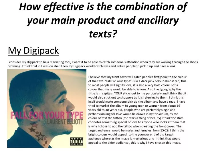
My Digipack How effective is the combination of your main product and ancillary texts? I consider my Digipack to be a marketing tool, I want it to be able to catch someone's attention when they are walking through the shops browsing. I think that if it was on shelf then my Digipack would catch eyes and entice people to pick it up and have a look. I believe that my front cover will catch peoples firstly due to the colour of the text. “Fall For Your Type” is in a dark pink colour almost red, this to most people will signify love, it is also a very bold colour not a colour that many would be able to ignore. Also the typography the tittle is in capitals, YOUR sticks out to me particularly and I think that it would also stick out to shoppers as it is referring to them, I think this itself would make someone pick up the album and have a read. I have tried to market the album to young men or women from about 16 years old to 30 years old, people who are preferably single and perhaps looking for love would be drawn in by this album, by the colour of text the tattoo (the stars a thing of beauty) I think the stars connotes something special or love to anyone who looks at them that is why I chose to add the tattoo when creating the front cover. The target audience would be males and females from 15-29, I think the bright colours would appeal to the younger end of the target audience where as the image is mysterious and I think that would appeal to the older audience , this is why I have chosen this image.
My Digipack I think my back cover could have been better in terms of typography, upon reflection I could have made the writing a bit bigger to then draw in attention and make everything stand out a bit more. Although I do think the CD cover would be affective as a marketing tool as the artist takes up most of the cover which is eye catching particularly if you don’t know who this person is, you may want to learn more about them. The artist is wearing a nice suit and looks like a real celebrity, in society many are fascinated by celebrities therefore the better he looks in the pictures the more likely a member of the public are to pick up the CD to try and find out who this man is. I think the colour of the writing is ok it matches the artists suit and is easily visible against the background, the song names are pretty good if you are a person perhaps looking for love or already in a relationship as most of the songs are related to love in some way. I chose this image as it is bold and the artist looks like a real star, the image takes up most of the frame and the suit looks particularly good, i think the image is bold and eye catching and it would be fitting to use it for the back cover.
My magazine advertisement I was happy with my magazine advertisement as I thought it really stood out the tittles were bold and eye catching if I personally saw that in a magazine I wouldn’t just flick past it. The artists name stands out and there is a variation of colour. Also for the first time the artist is looking directly at you, this was intentional as although I’m going for a mysterious theme when it comes to the CD front cover I liked the idea of having the artist looking directly at you for the advertisement as it creates a sense of tension you wouldn’t want to turn the page because even though it’s only a picture it’s still looking directly at you this was the main reason as to why I picked this photograph, just because it is looking directly at you and I feel there is a lot of emotion and an enticing look on the artists face. The expression on the artists face almost looks as if he is daring you to read the advert or even buy the album. I have tried to take up as much space on the page as possible so when someone flicks over the page they are straight away drawn to the advertisement. I think the advertisement would be an affective marketing tool as it is bold and bright in some places I think the colours and images used would make the consumer want to read and the advert and eventually buy the album.
My Digipack This is one of two inserts that I have created to go inside the CD case. I chose the image as the pose being struck is stereotypical of and upset or even depressed person, the artist has his head In his hand and is facing downwards. This sort of image is keeping in line with the theme of the music video which is a downbeat song. I believe this insert would work as an effective marketing tool due to mainly the picture it is an interesting image, I have put some of the lyrics from the music video over the picture as if someone is looking at the insert and the image they could be wondering why the man is upset and they’ll will find out from the lyrics. The main reason I chose the image is due to the pose it was fitting with the music video.
My Digipack This the second insert that will go inside the CD case. I chose a different kind of image for this insert mainly because this insert isn’t advertising my music video. I felt I should go with a more soulful and up beat image for this insert as many of the images I have used have been saddening poses. This image to me looks a lot more meaningful, I have highlighted the words “be mine” in red as I think they really stand out on the page compared to the black and white image and background. The colour red is usually associated with love and this in keeps with my music videos theme which is about love and relationships. I think the image is interesting and eye catching, the words highlighted in red are bold and the eye is drawn to them straight away therefore I think this insert would be a successful marketing tool, I also think that this insert would be particularly aimed at the younger females of my target audience due to the words “be mine” as it is stereotypically a relatively childish thing to say and you see those words in movies when two young people are in love they’d carve the words “be mine” into a tree or desk etc.
Brand Identity I believe that I have constructed a brand identity for my artist, the identity although not in all ways the identity of a common R&B artist. In these four CD covers with well known R&B artists Trey Songzand Usher, they have both used close up shots, as have I, however the artist is making eye contact with the consumer. I purposely chose this image as the artist was not looking directly at the at that camera. I think this helps create my artist his own identity as mysterious it also it sets him apart from other big R&B stars such as usher. I have done this again with one of my inserts purposely making the artist look down would eventually constructed and identity, when a consumer buys an R&B album of a male artist and see that they would probably recognise it was that artist as it is a theme the artist uses. Therefore the images are in some ways conforming to the usual images of R&B but also going against the conventions of looking directly at the camera.
Brand identity We first had to establish what label would represent the message our artist was trying to get across one of love. We researched and came to the decision to choose Sony. We chose Sony as they have signed many artists similar to mine such as T-pain, Omarianand Usher who both sing about similar things such as love, relationships and women, take for example Ushers song “I care for you” a song about love. Sony has many R&B artists under contract and we thought it was fitting to use Sony as what many of their artists promote is similar to what ours is promoting. We also looked at another record label which was Just Jam the record label of SBTV, However we didn’t go with Just Jam as they are a subsidiary of SBTV who promote more Rap/Grime artists such as K koke, Giggs and Maxsta. These artist are all promoting a tough life and mainly talk about how they started from the bottom worked hard and were then shot to stardom. These ideologies do not represent my artist as he isn’t speaking of how tough his life was simply of a relationship between him and his former partner. As you can see from this picture of K koke he is taking stance which is pretty stand-offish. Which is something you do not see in R&B, also the clothes he wears are not brands worn by many R&B artists.
Are my products linked? Clothing I have also tried to link my products through clothing and location. In my music video the artist is dressed smartly for most scenes as you can see below in the scenes below he is wearing a suit and also a smart sweater. Although this is not unheard of in R&B it is not all that common. Many male artists prefer to wear branded jeans and smart casual branded shirts rather than a full suit. As you can see below my artist is wearing a smart suit in the video and on the back cover, front cover, magazine advert and booklet inserts. The suit he is wearing on the back cover is different in colour rather than being black this suit is a navy blue, however it is still smart. I felt I should just have more colour for the front and back cover of the CD. Therefore my products are linked when it comes to costume.
Are my products linked? Colour and typography? I think my products are linked highly through colour and typography. As you can see below I have used the black and white effect many times as it features in my video a lot. Therefore I thought it was a good idea to use it for my CD inserts. I have also used the bright colours such as red and in pink on my front cover and CD inserts. The black and white effect as it is used so much during my music video would be associated with it………………..