Download
1 / 73
740 likes | 1.05k Views
Chapter 3 Linear Regression and Correlation. Descriptive Analysis & Presentation of Two Quantitative Data. Chapter Objectives. To be able to present two-variables data in tabular and graphic form Display the relationship between two quantitative variables graphically using a scatter diagram .

E N D
Chapter 3Linear Regression and Correlation Descriptive Analysis &Presentation of Two Quantitative Data
Chapter Objectives • To be able to present two-variables data in tabular and graphic form • Display the relationship between two quantitative variables graphically using a scatter diagram. • Calculate and interpret the linear correlation coefficient. • Discuss basic idea of fitting the scatter diagram with a best-fitted line called a linear regression line. • Create and interpret the linear regression line.
Terminology • Data for a single variable is univariate data • Many or most real world models have more than one variable … multivariate data • In this chapter we will study the relations between two variables … bivariate data
Bivariate Data • In many studies, we measure more than one variable for each individual • Some examples are • Rainfall amounts and plant growth • Exercise and cholesterol levels for a group of people • Height and weight for a group of people
Types of Relations When we have two variables, they could be related in one of several different ways • They could be unrelated • One variable (the input or explanatory or predictor variable) could be used to explain the other (the output or response or dependent variable) • One variable could be thought of as causing the other variable to change Note: When two variables are related to each other, one variable may not cause the change of the other variable. Relation does not always mean causation.
Lurking Variable • Sometimes it is not clear which variable is the explanatory variable and which is the response variable • Sometimes the two variables are related without either one being an explanatory variable • Sometimes the two variables are both affected by a third variable, a lurkingvariable, that had not been included in the study
Example 1 • An example of a lurking variable • A researcher studies a group of elementary school children • Y = the student’s height • X = the student’s shoe size • It is not reasonable to claim that shoe size causes height to change • The lurking variable of age affects both of these two variables
More Examples • Some other examples • Rainfall amounts and plant growth • Explanatory variable – rainfall • Response variable – plant growth • Possible lurking variable – amount of sunlight • Exercise and cholesterol levels • Explanatory variable – amount of exercise • Response variable – cholesterol level • Possible lurking variable – diet
Types of Bivariate Data Three combinations of variable types: 1. Both variables are qualitative (attribute) 2. One variable is qualitative (attribute) and the other is quantitative (numerical) 3. Both variables are quantitative (both numerical)
Two Qualitative Variables • When bivariate data results from two qualitative (attribute or categorical) variables, the data is often arranged on a cross-tabulation or contingency table • Example: A survey was conducted to investigate the relationship between preferences for television, radio, or newspaper for national news, and gender. The results are given in the table below:
TV Radio NP Row Totals Male 280 175 305 760 Female 115 275 170 560 Col. Totals 395 450 475 1320 Marginal Totals • This table, may be extended to display the marginal totals (or marginals). The total of the marginal totals is the grand total: Note: Contingency tables often show percentages (relative frequencies). These percentages are based on the entire sample or on the subsample (row or column) classifications.
æ 175 ö ´ = ç ÷ 100 13 . 3 è ø 1320 TV Radio NP Row Totals Male 21.2 13.3 23.1 57.6 Female 8.7 20.8 12.9 42.4 Col. Totals 29.9 34.1 36.0 100.0 Percentages Based on the Grand Total(Entire Sample) • The previous contingency table may be converted to percentages of the grand total by dividing each frequency by the grand total and multiplying by 100 • For example, 175 becomes 13.3%
Percentages Based on Grand Total 25 20 Male 15 Percent Female 10 5 0 TV Radio NP Media Illustration • These same statistics (numerical values describing sample results) can be shown in a (side-by-side) bar graph:
Percentages Based on Row (Column) Totals • The entries in a contingency table may also be expressed as percentages of the row (column) totals by dividing each row (column) entry by that row’s (column’s) total and multiplying by 100. The entries in the contingency table below are expressed as percentages of the column totals: Note: These statistics may also be displayed in a side-by-side bar graph
One Qualitative & One Quantitative Variable 1. When bivariate data results from one qualitative and one quantitative variable, the quantitative values are viewed as separate samples 2. Each set is identified by levels of the qualitative variable 3. Each sample is described using summary statistics, and the results are displayed for side-by-side comparison 4. Statistics for comparison: measures of central tendency, measures of variation, 5-number summary 5. Graphs for comparison: side-by-side stemplot and boxplot
Example • Example: A random sample of households from three different parts of the country was obtained and their electric bill for June was recorded. The data is given in the table below: • The part of the country is a qualitative variable with three levels of response. The electric bill is a quantitative variable. The electric bills may be compared with numerical and graphical techniques.
The Monthly Electric Bill 7 0 6 0 5 0 Electric Bill 4 0 3 0 2 0 N o r t h e a s t M i d w e s t W e s t Comparison Using Box-and-Whisker Plots The electric bills in the Northeast tend to be more spread out than those in the Midwest. The bills in the West tend to be higher than both those in the Northeast and Midwest.
Descriptive Statistics for Two Quantitative Variables Scatter Diagrams and correlation coefficient
Two Quantitative Variables • The most useful graph to show the relationship between two quantitative variables is the scatterdiagram • Each individual is represented by a point in the diagram • The explanatory (X) variable is plotted on the horizontal scale • The response (Y) variable is plotted on the vertical scale
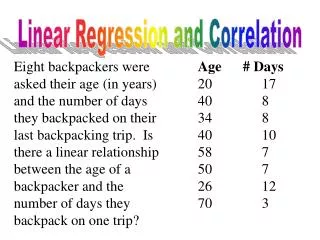
Example • Example: In a study involving children’s fear related to being hospitalized, the age and the score each child made on the Child Medical Fear Scale (CMFS) are given in the table below: Construct a scatter diagram for this data
Child Medical Fear Scale 5 0 4 0 CMFS 3 0 2 0 1 0 6 7 8 9 1 0 1 1 1 2 1 3 1 4 1 5 Age Solution • age = input variable, CMFS = output variable
Another Example • An example of a scatter diagram Note: the vertical scale is truncated to illustrate the detail relation!
Types of Relations • There are several different types of relations between two variables • A relationship is linear when, plotted on a scatter diagram, the points follow the general pattern of a line • A relationship is nonlinear when, plotted on a scatter diagram, the points follow a general pattern, but it is not a line • A relationship has no correlation when, plotted on a scatter diagram, the points do not show any pattern
Linear Correlations • Linear relations or linear correlations have points that cluster around a line • Linear relations can be either positive (the points slants upwards to the right) or negative(the points slant downwards to the right)
Positive Correlations • For positive (linear) correlation • Above average values of one variable are associated with above average values of the other (above/above, the points trend right and upwards) • Below average values of one variable are associated with below average values of the other (below/below, the points trend left and downwards)
6 0 5 0 Output 4 0 3 0 2 0 1 0 1 5 2 0 2 5 3 0 3 5 4 0 4 5 5 0 5 5 Input Example: Positive Correlation • As x increases, y also increases:
Negative Correlations • For negative (linear) correlation • Above average values of one variable are associated with below average values of the other (above/below, the points trend right and downwards) • Below average values of one variable are associated with above average values of the other (below/above, the points trend left and upwards)
9 5 8 5 Output 7 5 6 5 5 5 1 0 1 5 2 0 2 5 3 0 3 5 4 0 4 5 5 0 5 5 Input Example: Negative Correlation • As x increases, y decreases:
Nonlinear Correlations • Nonlinear relations have points that have a trend, but not around a line • The trend has some bend in it
No Correlations • When two variables are not related • There is no linear trend • There is no nonlinear trend • Changes in values for one variable do not seem to have any relation with changes in the other
5 5 Output 4 5 3 5 1 0 2 0 3 0 Input Example: No Correlation • As x increases, there is no definite shift in y:
Distinction between Nonlinear & No Correlation Nonlinear relations and no relations are very different • Nonlinear relations are definitely patterns … just not patterns that look like lines • No relations are when no patterns appear at all
Example • Examples of nonlinear relations • “Age” and “Height” for people (including both children and adults) • “Temperature” and “Comfort level” for people • Examples of no relations • “Temperature” and “Closing price of the Dow Jones Industrials Index” (probably) • “Age” and “Last digit of telephone number” for adults
Please Note • Perfect positive correlation: all the points lie along a line with positive slope • Perfect negative correlation: all the points lie along a line with negative slope • If the points lie along a horizontal or vertical line: no correlation • If the points exhibit some other nonlinear pattern: nonlinear relationship • Need some way to measure the strength of correlation
Measure of Linear Correlation • The linearcorrelationcoefficient is a measure of the strength of linear relation between two quantitative variables • The sample correlation coefficient “r” is Note: are the sample means and sample variances of the two variables X and Y.
Properties of Linear Correlation Coefficients Some properties of the linear correlation coefficient • r is a unitless measure (so that r would be the same for a data set whether x and y are measured in feet, inches, meters etc.) • r is always between –1 and +1. • r = -1 : perfect negative correlation • r = +1: perfect positive correlation • Positive values of r correspond to positive relations • Negative values of r correspond to negative relations
Various Expressions for r There are other equivalent expressions for the linear correlation r as shown below: However, it is much easier to compute rusing the short-cut formula shown on the next slide.
( ) å 2 x å = SS ( x ) “sum of squ ares for x” 2 = - x n ( ) å 2 y å = SS ( y ) “sum of squ ares for y” 2 = - y n å å x y å = SS ( xy ) “sum of squ ares for xy” = - xy n Short-Cut Formula for r
Example • Example: The table below presents the weight (in thousands of pounds) x and the gasoline mileage (miles per gallon) y for ten different automobiles. Find the linear correlation coefficient:
- SS ( xy ) 42 . 79 = = = - r 0. 47 SS ( x ) SS ( y ) ( 7 . 449 )( 1116 . 9 ) Completing the Calculation for r
Please Note • r is usually rounded to the nearest hundredth • r close to 0: little or no linear correlation • As the magnitude of r increases, towards -1 or +1, there is an increasingly stronger linear correlation between the two variables • We’ll also learn to obtain the linear correlation coefficient from the graphing calculator.
Strong Positive r = .8 Moderate Positive r = .5 Very Weak r = .1 Positive Correlation Coefficients • Examples of positive correlation • In general, if the correlation is visible to the eye, then it is likely to be strong
Strong Negative r = –.8 Moderate Negative r = –.5 Very Weak r = –.1 Negative Correlation Coefficients • Examples of negative correlation • In general, if the correlation is visible to the eye, then it is likely to be strong
Nonlinear Relation No Relation Nonlinear versus No Correlation • Nonlinear correlation and no correlation • Both sets of variables have r = 0.1, but the difference is that the nonlinear relation shows a clear pattern
Interpret the Linear Correlation Coefficients • Correlation is not causation! • Just because two variables are correlated does not mean that one causes the other to change • There is a strong correlation between shoe sizes and vocabulary sizes for grade school children • Clearly larger shoe sizes do not cause larger vocabularies • Clearly larger vocabularies do not cause larger shoe sizes • Often lurking variables result in confounding
How to Determine a Linear Correlation? • How large does the correlation coefficient have to be before we can say that there is a relation? • We’re not quite ready to answer that question
Summary • Correlation between two variables can be described with both visual and numeric methods • Visual methods • Scatter diagrams • Analogous to histograms for single variables • Numeric methods • Linear correlation coefficient • Analogous to mean and variance for single variables • Care should be taken in the interpretation of linear correlation (nonlinearity and causation)
Learning Objectives • Find the regression line to fit the data and use the line to make predictions • Interpret the slope and the y-intercept of the regression line • Compute the sum of squared residuals