Download
1 / 4
40 likes | 125 Views
In what way does my m edia product, use develop or challenge forms and conventions of real media products?.

E N D
In what way does my media product, use develop or challenge forms and conventions of real media products?
Just like the other two posters next to my own poster, posters take the typical form of simplicity. The image is the main attraction and the texts you will find in a poster is kept to a limit. During research I have acknowledged that the background to Romantic comedy posters are usually blue or white so therefore I decided to imitate this type of convention. In order to keep in time with contemporary media, I decided to converge with Facebook and Twitter, also presenting my username at the bottom of my page so the audience will be even more aware of my trailer. However, after researching posters I did not see a lot which included their Facebook and Twitter account so therefore in order to differentiate my posters from the rest I thought it would be a great idea to do this.
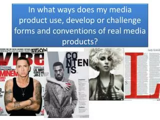
As you can see my magazine considers the typical conventions you will find in a magazine: masthead, headline, main image, and subheadings, barcode and price. Without these conventions my magazine will not look realistic. As these were typical conventions it was very easy for me to pick these conventions and use them for my own magazine. However one minor challenge that I came across was applying these conventions in an effective manner in order for it to portray a romantic comedy genre. To overcome this I searched up comedy magazines online and as a result I was able to acknowledge how this was done. One main obvious feature of a magazine reflecting a comedic genre (which I also reflected on in my piece) is the fact that it includes a lot of bright colours. Notice that my magazine has a similar colour pattern to Entertainment magazine, this is because the genre of the film they are promoting is a comedy film which takes half the form of my chosen genre. Although my main image does not reveal humorous connotations compared to the one from Entertainment magazine, my main image does include certain gestures you will expect to find in a romantic comedy. Romantic films do not mainly concentrate on perfect love, there is always some kind of row, differences or challenges between the partners, and this is what I decided to present in my main image. Most magazines reflecting a romantic genre that I have researched on all include images where it is looks as if the partners are in unity so therefore in order to be unique I decided to do the opposite of what I see in magazines. Another unusual feature that I implemented is the fact that I chose to use a black colour for my masthead. I had to think twice about this decision as it is rare to find masthead that use the colour black in a romance and comedy, as well as that this colour connotes gloominess and horror so therefore audiences may get the wrong impression of my trailer/film. However, the layout of my magazine uses a very bright colour scheme and I thought if I used another colour for the masthead this will not only ruin the layout of the colour scheme but also I will be overusing different colours which will only make the magazine look too hectic. Of course sometimes in comedy you need the magazine to look hectic in order to give a exciting connotation, however too much colours can be too confusing and messy. In addition to that, I asked audiences what they thought about the genre of the magazine, 9/12 said they thought it was either comedy or romance and some even mentioned that the colour black works effectively with the rest of the colours and they do not get the impression at all that there could be a very dull moment in the film.
My TRAILER How does my trailer use or challenge forms of real media products? The research I have completed on different film genres has allowed me to produce a realistic trailer of my chosen genre. Research has allowed me to acknowledge the type of conventions that you will expect too see in a particular genre. E.g. horror includes a lot of dark elements and fear, whereas action includes weapons. Research on real media product has been very beneficial as I was able to gain knowledge on the type of conventions and elements to include in romantic comedy. As well as that research on genre theories such as Steve Neale has influenced my approach towards my media piece. According to this theorist every film in a genre have similar elements but their must be a difference between the film in order to engage the audience. Consequently I have taken this approach my using similar comedic elements and even general elements (such as the mise en scene) from Think Like A Man but changed my narrative in order to make my trailer different. One factor I imitated from the mise en scene is the sophisticated dressing of the characters in the film as I believed this reflected a maturing audience which is what I am targeting. Think Like A Man allowed me to finalise certain decisions. After watching the trailer to Think Like A Man I acknowledge they did not consider Propp’s character theory (and even in other trailers I have watched) therefore I decided not to consider it. It seems to be that recent directors and producers, especially comedy do not study Propp’s theory, therefore showing us how films and trailers has changed over the years. However Think Like A Man does to some extent reflect upon Todorov’s narrative theory and this is actually acknowledgeable in the trailer, but my trailer does not follow this narrative order. In my trailer audiences are viewed immediately with the disruption (male cheating) and this is consistent throughout the film. Following Todorov’s narrative theory will reveal too much of the film and this is what we should prevent doing in trailers. Most comedy include a lot of slapstick events in order to make the audience laugh. However, slapstick comedy is limited in my trailer. This is because I wanted the audience to be aware of the moral of the story (that women are not vulnerable and weak characters). Exposing them with too much humour could take away the meaning behind the trailer.