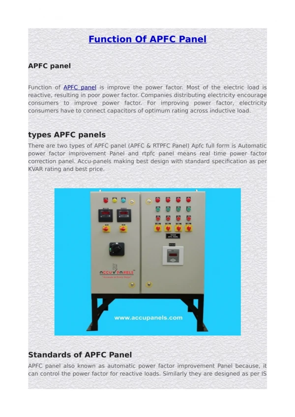
Download

1 / 20
200 likes | 294 Views
Squaring Away the panel function in lattice graphics. Andreas Krause Modeling and Simulation, Dept of Clinical Pharmacology Actelion Pharmaceuticals Allschwil, Switzerland. Trellis™. Some of the history. Included in S-Plus 3.3 for Windows (1995) and 3.4 for UNIX (1996)

E N D
Squaring Away the panel function in lattice graphics Andreas Krause Modeling and Simulation, Dept of Clinical Pharmacology Actelion PharmaceuticalsAllschwil, Switzerland
Trellis™ Some of the history Included in S-Plus 3.3 for Windows (1995) and 3.4 for UNIX (1996) Trellis Display: Modeling Data from Designed Experiments. W. S. Cleveland and M. Fuentes (1997). Technical Report, Bell Labs. The Visual Design and Control of Trellis Display. R. A. Becker, W. S. Cleveland, and M. J. Shyu (1996). Journal of Computational and Statistical Graphics, 5:123-155. Bill Cleveland’s web page: http://stat.bell-labs.com/wsc/webpapers.html
Lattice and Trellis Trademark owned by Statistical Sciences/ Mathsoft/ Insightful/ Tibco Trellis is a trademark owned by Tibco Inc Thus the term cannot be used freely Therefore, in R, the library is called lattice The functionality is essentially identical Lattice offers more functionality
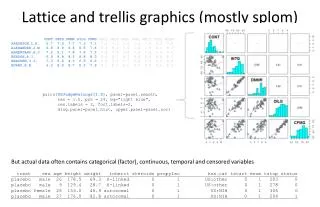
Lattice / Trellis™ What is it?
Lattice What is it? (2) A graphical analysis of structure in data Analysis of conditional structures What is the effect of the drug over time in males versus females What is the effect of the drug over time in males versus females in different studies?
Example Barley Data dotplot(site ~ yield, data=barley) # note the model-like syntax
Example Barley Data dotplot(site ~ yield | year, data=barley)
Example Barley Data dotplot(year ~ yield | site, data=barley)
Creating a series of graphs Lattice graphs can be stored as objects (Classical plots can not) graphs <- list() graphs[["histogram"]] <- histogram(~rnorm(1234)) graphs[["histograms uniform"]] <- histogram(~runif(1234)) graphs[["hist with title"]] <- update(graphs[["histogram"]], main="this is a histogram") print(graphs) # prints all graphs png(“graphs.%03d.png”)print(graphs)dev.off()# prints all graphs to files graphs.001.png, graphs.002.png, etc.
Panel FUnction dotplot(year ~ yield | site, data=barley) dotplot(year ~ yield | site, data=barley, panel=panel.dotplot)
Panel FUnction dotplot(year ~ yield | site, data=barley, panel=function(x, y, ...) { panel.grid(v=-1, h=0, col="darkgray") panel.dotplot(x, y, ..., col="red", pch="O") } )
Panel functions Use of additional data The lattice framework subsets the x and y data automatically Your panel function needs to take x and y as arguments and that’s it For additional data, you need to Pass it to the panel function Handle the subsetting
Panel Functions Use of additional data Biomarker over time by patient The color indicates the disease status (red-progressive, yellow-stable, green-response to treatment) The additional data is the disease status, the normal range, and the dose history
Panel functions Passing additional data: This is where the subscripts argument comes in This is where the subscripts argument to the panel function comes in xyplot(conc ~ time | ID, data=data, limit.up=data$limit.up, limit.low=data$limit.low, response=data$response, xlab=“time (days)”, etc. pp. panel=function(x, y, …, limit.up, limit.low, response, subscripts) { panel.abline(limit.up [subscripts]) panel.abline(limit.low[subscripts]) etc. } )
Panel functions Passing additional data: Method 2 xyplot(conc ~ time | ID, data=data, limit.up=data$limit.up, limit.low=data$limit.low, response=data$response, xlab=“time (days)”, etc. pp. panel=function(x, y, …, limit.up, limit.low, response, subscripts) { limit.up <- limit.up[subscripts] limit.low <- limit.low[subscripts] response <- response[subscripts] panel.abline(limit.up) panel.abline(limit.low) etc. } )
Panel functions Passing additional data: Method 3 xyplot(conc ~ time | ID, data=data, alldata=data, xlab=“time (days)”, etc. pp. panel=function(x, y, …, alldata, subscripts) { thisdata <- alldata[subscripts, ] panel.abline(thisdata$limit.up) panel.abline(thisdata$limit.low) etc. } )
Discussion Subscripts introduces many additional lines of code Any experience with panel functions? Any tricks to share? Any other alternatives to using additional data/ subscripts?
SAS SAS introduced the Trellis concept in version 9.1 Version 9.2 improves the implementation substantially ODS GRAPHICS ON / ANTIALIASMAX=10000 width=600px height=600px;PROC SGPANEL DATA=prdsale;PANELBY cntry product / COLUMNS=5 ROWS=3 NOVARNAME;LOESS X=yq Y=actual;RUN;ODS GRAPHICS OFF; Source: http://www.hollandnumerics.co.uk/pdf/Trellis_Graphs%28presentation%292.pdf