Download
1 / 32
350 likes | 902 Views
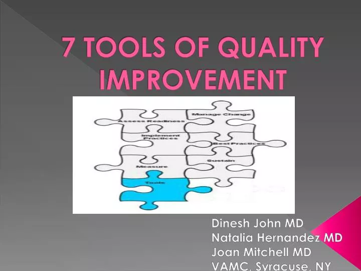
7 TOOLS OF QUALITY IMPROVEMENT. Dinesh John MD Natalia Hernandez MD Joan Mitchell MD VAMC, Syracuse, NY. 7 Tools of Quality Improvement. A fixed set of graphical techniques identified as being most helpful in troubleshooting issues related to quality

E N D
7 TOOLS OF QUALITY IMPROVEMENT Dinesh John MD Natalia Hernandez MD Joan Mitchell MD VAMC, Syracuse, NY
7 Tools of Quality Improvement • A fixed set of graphical techniques identified as being most helpful in troubleshooting issues related to quality • Suitable for troubleshooting most quality-related problems, and require little formal training in statistics
What Are These Tools? • Ishikawa (fishbone) diagram • Check sheet • Control chart • Histogram • Pareto chart • Scatter diagram • Flowchart/Flowmap
ISHIKAWA diagram • Popularized by Kaoru Ishikawa: pioneered quality management processes in Kawasaki Shipyards • A.K.A cause-and effect diagram, herringbone/fishbone diagram • Used to demonstrate cause of a specific event • Used mainly in product design and quality defect prevention, can also be used retrospectively
ISHIKAWA diagram • Causes grouped into major categories: 6M’s Manpower: Anyone involved with the process Methods: How process is performed and requirements for doing it, i.e. policies, procedures, rules. Machines: equipment, computers, tools, etc. Materials: Raw materials, parts used to produce final product Measurements: Data generated from process that are used to evaluate its quality Environment (Milieu) conditions, such as location, time, temperature, and culture in which process operates
A Fishbone Diagram was famously used prior to the manufacture of the Mazda Miata, which went on to be the best-selling 2 seat roaster in HISTORY!!
Make a Fishbone Diagram about the reasons why you think the ER always seems overcrowded using the ‘6M’ approach. Be as detailed as you can, listing as many causes as possible under the six categories Note to instructor: There is a Fishbone template MS Word file in Sharepoint
CHECK SHEET • A tally sheet to collect data on frequency of occurrence • Used when data can be observed and collected repeatedly by either the same person or the same location • Effective tool when collecting data on frequency and identifying patterns of events, problems, defects, and defect location, and for identifying defect causes.
Number of people in wait line at Registration Desk This helps to determine staffing needs and size of waiting room
CONTROL CHART • Pioneered by Walter Shewhart who worked at Bell Labs in the 1920’s • Helped to improve the reliability of the telephone transmission system at Bell
CONTROL CHART • Chronological plot of measurements of important variables • Upper and lower reference thresholds called control limits (3 Std. Deviations from Mean) are plotted: define natural range of variation within which plotted points should fall • Any points falling outside of control limits may indicate that all data were not produced by the same process, either because of lack of standardization or a change in the process may have occurred • Such changes could represent either quality improvement or quality deterioration, depending on which control limit is crossed • Useful both for monitoring if processes get worse and for testing and verifying improvement ideas http://www.coe.neu.edu/healthcare/pdfs/publications/C13-Use_of_Control_C.pdf
Upper & lower control limits indicate threshold at which process output is considered statistically 'unlikely' ; drawn 3 std. errors from the centre line i.e. mean of the variables Sometimes ‘warning lines are drawn 2 std. errors from center line
In 2005, the Robert Wood Johnson Hospital won the Malcolm Baldrige National Quality Award. Currently their ER LOS is 38 minutes for a discharged patient and 90 minutes for an admitted patient. They offer a 15-30 minute guarantee: see a nurse in 15 minutes and a doctor in 30. The quicker response time and LOS in their ER has brought increasing revenues each year, and another wing had to be added to the hospital to accommodate their ER admissions.
This is a hyperlink to an excellent video on how to make a statistical control chart on MS excel http://www.youtube.com/watch?v=uGgd3iiQrUI
HISTOGRAM • Introduced by Karl Pearson, the father of mathematical statistics • Etymology uncertain. Said to be derived from the Greek histos 'anything set upright' and gramma 'drawing, record, writing‘ • It is also said that Karl Pearson, who introduced the term in 1895, derived the name from "historical diagram".
HISTOGRAM • Frequency distribution shows how often each different value in a data set occurs • A histogram is the most commonly used graph to show frequency distributions (next slide) • Looks like a bar chart, but used for continuous data(as opposed to categorical data)
HISTOGRAM Continuous data, so there are no spaces in between the bars Data collected into categories of width 30 LB
Your preceptor will assign you a task involving data collection and using an MS Excel template to create a histogram
PARETO CHART • Concept introduced by Vilfredo Pareto, mathematician and economist • Built on observations of his such as that 80% of the land in Italy was owned by 20% of the population • The purpose is to highlight the most important among a (typically large) set of factors causing defects/delays
Lt. vertical axis: Frequency of occurrence Rt. vertical axis: cumulative percentage of total number of occurrences, GO AFTER THE 2 OR 3 MOST IMPORTANT FACTORS TO GET THE DESIRED RESULTS CRITICAL FEW TRIVIAL MANY
This is a hyperlink to a video on how to make a Pareto Chart on MS excel http://www.youtube.com/watch?v=TBtGI2z8V48
SCATTER DIAGRAM • When trying to identify potential root causes of problems. • After brainstorming causes and effects using a fishbone diagram, to determine objectively whether a particular cause and effect are related • Pairs of data where a relationship is suspected are plotted on the X axis(independent variable) and Y axis(dependent variable) • First described by Sir Francis Galton, English Mathematician(cousin of Darwin)
TYPES OF RELATIONSHIPS BETWEEN THE VARIABLES Pairs of data where a relationship is suspected are plotted on the X axis(independent variable) and Y axis(dependent variable)
There is a negative correlation between years of experience of MRI Techs and rate of repeat MRI scans(no surprise here!) DEPENDENT VARIABLE IINDEPENDENT VARIABLE
This is a link to a video on how to make a scatter plot in MS Excel http://www.youtube.com/watch?v=bYf6qO-iBW0
FLOW CHART/WORKFLOW DIAGRAM • Pioneered by Frank Gilbreth, Inspiration for the movie Cheaper by the Dozen • Diagram that represents a process, showing steps as boxes of various kinds, and their order by connecting them with arrows • Used in analyzing, designing, documenting or managing a process
START/STOP BOX DECISION DIAMOND PROCESS BOX CONNECTING ARROWS DETERMINE ORDER OF PROCESS