Download
1 / 12
150 likes | 348 Views
Textual Analysis. By Reece Halkett. Mojo - Publishers. Mojo is now published by Bauer, a German publishing group who are now based in Hamburg. The company was founded in 1875 and publishes many British music magazines as well as Mojo, such as Q and Kerrang!. Mojo - Information.

E N D
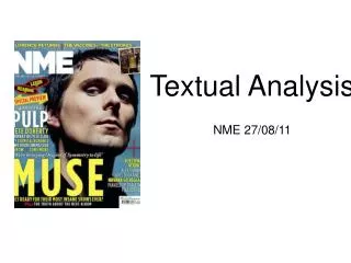
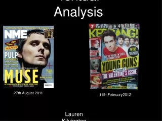
Textual Analysis • By Reece Halkett
Mojo - Publishers • Mojo is now published by Bauer, a German publishing group who are now based in Hamburg. The company was founded in 1875 and publishes many British music magazines as well as Mojo, such as Q and Kerrang!
Mojo - Information • Circulation: 100,507 • Readership: • The Mojo brand description, as listed on the Bauer website is the following - “Let MOJO take you to the heart and soul of music with unique depth, insight and passion. The Beatles to Battles, The Ramones to Radiohead. Classic sitting comfortably with cutting edge and quality being the one constant.” • The reader profile for Mojo as listed on the Bauer website is “Discerning and passionate music aficionados, the MOJO audience is predominately male (72%) and affluent (36% AB). These heavy consumers of music see their passion as discovery without boundaries, genre and decade being secondary to quality.”
The Masthead of the magazine is white and red, which contrasts well with the black background. The colour scheme follows the black, white and red house style throughout. The reason for this is that The White Stripes, who are featured on the front of the magazine dress only in Red, Black and White when performing. This is a juxtaposition that is reflected in the colour of the drum and guitar as well as the colour of the clothes The main picture features The White Stripes. They are pictured at eye-level, so that they are not looking down on the reader. The image also appears to have been shot using The Rule of Thirds, to make the image more visually interesting. The pose of Jack White is influential - it appeals to our aspirational hopes - the feeling of Esteem on Maslow’s hierarchy of needs. Both Jack and Meg White appeal to Laura Mulvey’s theory of the “Male Gaze” The text advertising the main story is different from the font in the rest of the cover. This helps to make the main story stand out, and it is placed in the middle to draw attention to it. The font simulates the effect of lights, playing on the saying about having your “name up in lights”. It is possible that this is also done to appeal to its readers aspirational needs, again fitting onto the Esteem section of Maslow’s Hierarchy of needs.
The majority of the Mojo contents page is made up of pictures relating to articles in the magazine. The largest image, of The White Stripes, relates to the main story of the issue. This image is placed furthest to the left, as this is where the eye is naturally drawn to. It is also features the starkest colours of all of the images, making it the most eye-catching. The reason that most of the contents page is pictures is to be more visually appealing and interesting than simply just text, like some magazines. By giving the reader a visual depiction of the article, which helps them to relate to it. It is also convenient - the reader can look at a picture which interests them, and then move straight on to the article by looking at the corresponding page number at the bottom of the image. This makes it easier to find and article that interests you rather than just reading text. The section of the contents page which explains the articles is in black and white, making it easy for the reader to see and identify which article is where. I think that this is a good idea, and may choose to incorporate this into my piece. Thedifference in colour scheme helps the reader to differentiate between the articles and makes the page much more visually interesting. It draws the readers into the story, particularly the colourful images, where the bright colours will attract readers.
The article features a dropcap - this effect is used at the beginning of an article to improve the look of the page. Quite unconventionally the dropcap is a different font to the rest of the article. This could be done to reflect the Indie/Alternative genre that the magazine covers. This is another feature that I may choose to incorporate into my magazine. The language used in the article is informal - it opens by describing the surroundings, and then continues with a unstructured interview. The writing style breaks one of Orwell’s six rules. The 2nd rule, which is “Never use a long word where a short one will do” The second page of the double-page spead is an image of the band that are the subjects of the article. This makes the article easy to identify, and also appeals to the “Male Gaze”. Many readers will aspire to be in a band like the White Stripes. The image will attract these readers and draw them in further to the article. The colours of the picture keep consistent with the red, black and white house style of the magazine. The article uses a “Pull Quote” to draw interest to the story, which is emphasized by enlargement and a different colour background.
Theories • Laura Mulvey - The Male Gaze: Mulvey put forward the theory of the male gaze in her report “Visual Pleasure and Narrative Cinema”. She states that women are looked at desirably by men, which is known as the male gaze. This applies to films where women are used as sex-symbols rather than being an important plot character. In trying to make men buy appearance-related products, advertisers realised that they needed images of male bodies that other men could aspire to. • Maslow’s Hierarchy of Needs: Maslow stated that human’s had a range of needs to be fulfilled. These needs begin with basic physiological needs, such as breathing, food, water and shelter, then move on to safety needs, such as health, order, and personal and financial security. After this the next needs are Love/belonging, such as friendship, love, family and intimacy and then the needs relating to esteem, for example self-esteem, achievement, prestige and recognition. Less is known about the final set of needs - Self-Actualization. These needs are peace, knowledge, personal growth and realization of personal potential. Maslow said that not all needs will be in the same order of importance for everyone. It is important for advertisers to know how to appeal to this needs, so that they can better sell their product.
NME - Publishers • IPC Media is based in the United Kingdom, and is owned as a subsidiary of Time Inc.
NME - Information • Circulation: 56, 284 • Readership: 411,000 • The brand description is on the IPC media website is as follows “NME has become a truly unique multi-platform media proposition. Across the magazine, nme.com, NMETV, NME Radio and the brand's live events and awards, NME reaches over one million music fans every week. NME is the longest published and most respected music weekly in the world. Every week it gives its readers the most exciting, most authoritative coverage of the very best in contemporary music, including award winning features, the latest releases, live reviews, the definitive guide to the best new bands in its Radar section, as well as a regular look back through the magazine's incredible 58 year heritage.” • 69% of NME readers are male, with an average age of 24. 65% also fit into the ABC1 social category. Over half work full-time, 7% work part-time and 29% of NME readers are still studying.
The Masthead of the magazine remains constant throughout all issues of NME. For this reason it is easily recognizable and allows the reader to quickly identify the magazine. The colour scheme of red and black is well-known and sets the scheme for the rest of the magazine - keeping a consistent house style throughout. Red is traditionally associated with passion - this could be reflected in the red in the Masthead - it could refer to it’s readers being passionate about music. Yellow is also used in the colour scheme, as it is as colour that contrasts well with black. Red and Black are used as they are two colours that compliment each other and create a visually appealing contrast. The main image featurs the band that will be the subject of the double page spread.This is done so that readers know the main feature of this issue. The image is framed well - it appears to have been shot using the rule of thirds. A Sans-serif font is used, this suggests an informal attitude adopted by the magazine, especially when combined with the informal layout of the pictures. The front cover uses colloquial language, to reinforce it’s informal image. This is evident in the phrase “Burning up the UK”